Tools of mapping

Following my Bob Ross “Paint the landscape” metaphor, there are a few choice brushes I reach for when you ask me to paint a picture.

Coloring

See also: data visualization & color

DEM

Source Files from, for example, 3DEP.

I’m fond of the wkp/country/wiki-scotland palette here.

_0b239ec1c312e88716fa80073df97630.png
surface <- terra::rast(file.path(path_to_basedata,"demo/HUC6_120901_dem.tif",fsep = .Platform$file.sep))

ggplot2::ggplot() +
  tidyterra::geom_spatraster(data = surface) +
  tidyterra::scale_fill_whitebox_c(name = "Elevation (m)") +
  ggplot2::theme_void()
<SpatRaster> resampled to 501380 cells.

Landscape processing to arrive at these: Terrain Analysis

Hillshade

surface <- terra::rast(file.path(path_to_basedata,"demo/HUC6_120901_dem.tif",fsep = .Platform$file.sep))

## DEM
ggplot2::ggplot() +
  tidyterra::geom_spatraster(data = surface) +
  tidyterra::scale_fill_whitebox_c(name = "Elevation (m)") +
  ggplot2::theme_void()
<SpatRaster> resampled to 501380 cells.

## SLOPE
# slope <- terra::terrain(surface, "slope", unit = "degrees")
# slope_pal <- RColorBrewer::brewer.pal(9, "YlGnBu")
# ggplot2::ggplot() +
#   tidyterra::geom_spatraster(data = slope) +
#   ggplot2::scale_fill_gradientn(colors = slope_pal, na.value = NA, name = "Slope (°)") +
#   ggplot2::theme_void()

## Combined
slope <- terra::terrain(surface, "slope", unit="radians") 

|---------|---------|---------|---------|
=========================================
                                          
aspect <- terra::terrain(surface, "aspect", unit="radians")

|---------|---------|---------|---------|
=========================================
                                          
hillshade <- terra::shade(slope, aspect, 40, 270) 

|---------|---------|---------|---------|
=========================================
                                          
ggplot2::ggplot() +
  tidyterra::geom_spatraster(data = hillshade) +
  ggplot2::scale_fill_gradient(low = "black", high = "white", na.value = NA, name = "Hillshade") +
  ggnewscale::new_scale_fill() +
  tidyterra::geom_spatraster(data = surface, alpha = 0.5) +
  tidyterra::scale_fill_whitebox_c(name = "Elevation") +
  ggplot2::theme_void()
<SpatRaster> resampled to 501380 cells.

_8e7ee7efe11d80763ed7086757b34621.png

Aspect

```{r}
pkgset <- '102702'
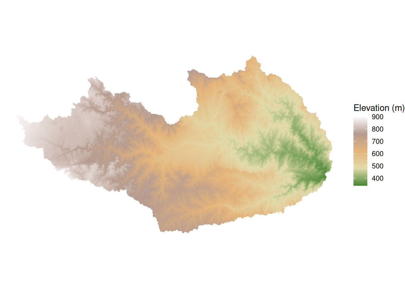
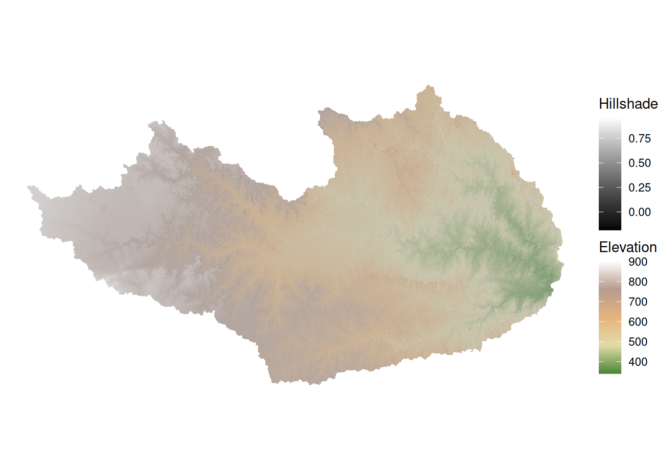
DEM <- glue::glue("~/data/raw/FIM4/inputs/dems/3dep_dems/10m_5070/20250320/HUC6_{substr(pkgset, 1, 6)}_dem.tif") |> terra::rast()

slope_rad <- terra::terrain(DEM, "slope", unit = "radians")
slope_pct <- tan(slope_rad) * 100
m <- c(0, 5, 10,
       5, 20, 20,
       20, 40, 30,
       40, max(terra::values(slope_pct),na.rm = T), 40)
rclmat <- matrix(m, ncol=3, byrow=TRUE)
slope_rcl <- terra::classify(slope_pct, rclmat, include.lowest=TRUE)
asp <- terra::terrain(DEM, v = "aspect", unit = "degrees")
m <- c(0,22.5,1,
       22.5,67.5,2,
       67.5,112.5,3,
       112.5,157.5,4,
       157.5,202.5,5,
       202.5,247.5,6,
       247.5,292.5,7,
       292.5,337.5,8,
       337.5,max(terra::values(asp),na.rm = T),1)
rclmat <- matrix(m, ncol=3, byrow=TRUE)
asp_rcl <- terra::classify(asp, rclmat, include.lowest=TRUE)
aspect_slope <- asp_rcl + slope_rcl

aspect_slope_colors <- c(
  "11"="#E1E1E1", "12"="#E1E1E1", "13"="#E1E1E1", "14"="#E1E1E1", 
  "15"="#E1E1E1", "16"="#E1E1E1", "17"="#E1E1E1", "18"="#E1E1E1", "19"="#E1E1E1", "20"="#E1E1E1",
  "21"="#ADC0A8", "22"="#ABD0D1", "23"="#B0C8D6", "24"="#B5BDD6", "25"="#B7B1C9", "26"="#C9B1B9", "27"="#D6B8B0", "28"="#D4C4AA",
  "31"="#6DA368", "32"="#68B1B6", "33"="#74A1C2", "34"="#7F8DC2", "35"="#8674A6", "36"="#A67484", "37"="#C28674", "38"="#BBA168",
  "41"="#24821E", "42"="#1D8E94", "43"="#317AA8", "44"="#435AA8", "45"="#543180", "46"="#80314C", "47"="#A84C31", "48"="#9E7A1D"
)

levels_df <- data.frame(ID = as.numeric(names(aspect_slope_colors)), 
                        category = names(aspect_slope_colors))

# 2. Set the raster as categorical without copying the whole object
levels(aspect_slope) <- levels_df

# 2. Use as.factor() inside the aes() call to fix the discrete vs continuous error
ggplot2::ggplot() +
  tidyterra::geom_spatraster(data = aspect_slope) + 
  ggplot2::scale_fill_manual(
    values = aspect_slope_colors, 
    na.value = "transparent",
    guide = "none" 
  ) +
  ggplot2::theme_void() +
  ggplot2::coord_sf(expand = FALSE)

```

Flow Direction

Blended

_b7fc57afd097034b03732421b557206b.png

HAND

See FIM for more details.


|---------|---------|---------|---------|
=========================================
                                          

|---------|---------|---------|---------|
=========================================
                                          
<SpatRaster> resampled to 500916 cells.
Coordinate system already present.
ℹ Adding new coordinate system, which will replace the existing one.

View setting

States (cookiecutter plot)

Also see the TIGER data page

Exporting

```{r}
#// Setup
#///////////////////////////////////////////////////////////////////////////////////////////////////////
base_width_in <- 10
base_title_size_pt <- 14
base_subtitle_size_pt <- 10
base_general_text_size_pt <- 12
get_aspect_ratio <- function(plot) {
  # Build the plot and extract the aspect ratio from the coordinate system
  p_build <- ggplot2::ggplot_build(plot); aspect_ratio <- p_build$layout$coord$aspect(p_build$layout$panel_params[[1]])
  
  # coord_sf returns NULL if the ratio is 1, so we'll default to 1
  if (is.null(aspect_ratio)) { return(1) } else { return(aspect_ratio) }
}

#// Each round
#///////////////////////////////////////////////////////////////////////////////////////////////////////
# export_plot <- basemaps::basemap_ggplot(CONUS_ext,map_service = "osm", map_type = "streets") +
  ggplot2::theme(text = ggplot2::element_text(family = "Helvetica", size = base_general_text_size_pt),
                 plot.title = ggplot2::element_text(size = base_title_size_pt, hjust = 0.5),
                 plot.subtitle = ggplot2::element_text(family = "mono", size = base_subtitle_size_pt, hjust = 0.5))

#// And Export
#///////////////////////////////////////////////////////
target_width_in <- 2 # I've designed these for a full page but want to stuff them into a 2  colum so 10 / 

plot_aspect_ratio <- get_aspect_ratio(export_plot)
scale_factor <- target_width_in / base_width_in
target_height_in <- target_width_in / plot_aspect_ratio

ggplot2::ggsave(filename = "_osm_streets_bm230.jpg", plot = 
                  
  export_plot +
    ggplot2::theme(
      text = ggplot2::element_text(size = base_general_text_size_pt * scale_factor),
      plot.title = ggplot2::element_text(size = base_title_size_pt * scale_factor),
      plot.subtitle = ggplot2::element_text(size = base_subtitle_size_pt * scale_factor)
    )
    
  ,path = file.path(temp_path,"sizefuck",fsep = .Platform$file.sep),
  width = target_width_in,height = target_height_in, units = "in", dpi=300)
knitr::plot_crop("./_bm_carto_voyage_ul.jpg")
#///////////////////////////////////////////////////////////////////////////////////////////////////////
```
```{r}
#// Setup
#///////////////////////////////////////////////////////////////////////////////////////////////////////
base_width_px <- 1920
base_height_px <- 1080
base_title_size_pt <- 14
base_subtitle_size_pt <- 10
base_general_text_size_pt <- 12
get_aspect_ratio <- function(plot) {
  # Build the plot and extract the aspect ratio from the coordinate system
  p_build <- ggplot2::ggplot_build(plot)
  aspect_ratio <- p_build$layout$coord$aspect(p_build$layout$panel_params[[1]])
  
  # coord_sf returns NULL if the ratio is 1, so we'll default to 1
  if (is.null(aspect_ratio)) { return(1) } else { return(aspect_ratio) }
}

#// Each round
#///////////////////////////////////////////////////////////////////////////////////////////////////////
# export_plot <- basemaps::basemap_ggplot(CONUS_ext,map_service = "carto", map_type = "voyager_labels_under") +
  ggplot2::labs(title = "Carto - Voyager under labels", subtitle = 'basemaps::basemap_ggplot(CONUS_ext,map_service = "carto", map_type = "voyager_labels_under")') +
  ggplot2::theme_void() +
  ggplot2::theme(text = ggplot2::element_text(family = "Helvetica", size = base_general_text_size_pt),
                 plot.title = ggplot2::element_text(size = base_title_size_pt, hjust = 0.5),
                 plot.subtitle = ggplot2::element_text(family = "mono", size = base_subtitle_size_pt, hjust = 0.5))

#// And Export
#///////////////////////////////////////////////////////
target_width_px <- 1920   # This is the full screen width in pixels

plot_aspect_ratio <- get_aspect_ratio(export_plot)
scale_factor <- target_width_px / base_width_px
target_height_px <- target_width_px / plot_aspect_ratio
ggplot2::ggsave(filename = "_bm_carto_voyage_ul.jpg", plot = 
                  
  export_plot +
    ggplot2::theme(
      text = ggplot2::element_text(size = base_general_text_size_pt * scale_factor),
      plot.title = ggplot2::element_text(size = base_title_size_pt * scale_factor),
      plot.subtitle = ggplot2::element_text(size = base_subtitle_size_pt * scale_factor)
    )
  
  ,path = ".",
  width = target_width_px, height = target_height_px, units = "px", dpi = 300)
knitr::plot_crop("./_bm_carto_voyage_ul.jpg")
#///////////////////////////////////////////////////////////////////////////////////////////////////////
```

From FINNSTATS

```{r}
p +
  ggplot2::theme(
    panel.background = ggplot2::element_rect(fill='transparent'), #transparent panel bg
    plot.background = ggplot2::element_rect(fill='transparent', color=NA), #transparent plot bg
    panel.grid.major = ggplot2::element_blank(), #remove major gridlines
    panel.grid.minor = ggplot2::element_blank(), #remove minor gridlines
    legend.background = ggplot2::element_rect(fill='transparent'), #transparent legend bg
    legend.box.background = ggplot2::element_rect(fill='transparent') #transparent legend panel
  )
```

Make sure to indicate that the backdrop should be translucent when exporting the plot with ggsave().

```{r}
ggplot2::ggsave('myplot.png', p, bg='transparent')
```
```{r}
#// Image control setup
#///////////////////////////////////////////////////////////////////////////////////////////////////////
presentation_prepend <- '_testdeck'
base_width_px <- 1920
base_height_px <- 1080
base_title_size_pt <- 14
base_subtitle_size_pt <- 10
base_general_text_size_pt <- 12
get_aspect_ratio <- function(plot) {
  # Build the plot and extract the aspect ratio from the coordinate system
  p_build <- ggplot2::ggplot_build(plot)
  aspect_ratio <- p_build$layout$coord$aspect(p_build$layout$panel_params[[1]])
  
  # coord_sf returns NULL if the ratio is 1, so we'll default to 1
  if (is.null(aspect_ratio)) { return(1) } else { return(aspect_ratio) }
}
#///////////////////////////////////////////////////////////////////////////////////////////////////////
```

And for a chunck

```{r}
#// And Export
#///////////////////////////////////////////////////////
filename <- paste0(presentation_prepend,"_stepimage.jpg")
target_width_px <- 1920

if(!file.exists(filename)) {

    #//////////////////////////////////////////////////////////
    existing_plot <- basemaps::basemap_ggplot(CONUS_ext,map_service = "carto", map_type = "voyager_labels_under") +
      ggplot2::labs(title = "Carto - Voyager under labels", subtitle = 'basemaps::basemap_ggplot(CONUS_ext,map_service = "carto", map_type = "voyager_labels_under")') +
      ggplot2::theme_void() +
      ggplot2::theme(text = ggplot2::element_text(family = "Helvetica", size = base_general_text_size_pt),
                     plot.title = ggplot2::element_text(size = base_title_size_pt, hjust = 0.5),
                     plot.subtitle = ggplot2::element_text(family = "mono", size = base_subtitle_size_pt, hjust = 0.5))
    #existing_plot
    #/////////////////////////////////////////////////////////

    plot_aspect_ratio <- get_aspect_ratio(existing_plot)
    scale_factor <- target_width_px / base_width_px
    target_height_px <- target_width_px / plot_aspect_ratio
    ggplot2::ggsave(filename = filename, plot = 
                      
                      existing_plot +
                      ggplot2::theme(
                        text = ggplot2::element_text(size = base_general_text_size_pt * scale_factor),
                        plot.title = ggplot2::element_text(size = base_title_size_pt * scale_factor),
                        plot.subtitle = ggplot2::element_text(size = base_subtitle_size_pt * scale_factor)
                      )
                    
                    ,path = ".",
                    width = target_width_px, height = target_height_px, units = "px", dpi = 300)
    knitr::plot_crop(filename)
}
#///////////////////////////////////////////////////////////////////////////////////////////////////////
```

![](r filename){.absolute left="7%" bottom="0%" height="90%"}

```{r}
unlink(file.path(output_folder_name,"SCHISM_based_FIM_domain_files"),recursive=TRUE)
    unlink(file.path(output_folder_name,"SCHISM_based_FIM_domain.html"))
    # m = leaflet(height=1000, width=1000) %>% 
    m = leaflet::leaflet(options = leafletOptions(preferCanvas = TRUE)) %>% 
      leaflet::addProviderTiles("OpenStreetMap",group = "OpenStreetMap") %>%
      leaflet::addProviderTiles("Stamen.Toner",group = "Stamen.Toner") %>%
      leaflet::addProviderTiles("Stamen.Terrain",group = "Stamen.Terrain") %>%
      leaflet::addProviderTiles("Esri.WorldStreetMap",group = "Esri.WorldStreetMap") %>%
      leaflet::addProviderTiles("Wikimedia",group = "Wikimedia") %>%
      leaflet::addProviderTiles("CartoDB.Positron",group = "CartoDB.Positron") %>%
      leaflet::addProviderTiles("Esri.WorldImagery",group = "Esri.WorldImagery") %>%
      leafgl::addGlPoints(unprocessed_nodes,fillColor = 'red',group = "pts") %>%
      leafgl::addGlPoints(processed_nodes,fillColor = 'green', group = "pts") %>%
      leafem::addFeatures(ahulls,opacity = 1,fillOpacity = 0,weight = 2,color = 'black', group = "huc") %>% 
      # leafgl::addGlPolygons(ahulls,fillOpacity = 0,stroke = TRUE,color = 'black',popup="huc10", group = "huc") %>%
      leaflet::addLegend("bottomright",colors = c("green","red"),
                         labels = c(paste0("SCHISM nodes: n=",processed_nodes_count), paste0("outside of huc bounds: n=",unprocessed_nodes_count)),
                         title = "SCHISM Domain (thinned)",opacity = 1) %>%
      leaflet::addLayersControl(
        baseGroups = c(
          "OpenStreetMap", "Stamen.Toner",
          "Stamen.Terrain", "Esri.WorldStreetMap",
          "Wikimedia", "CartoDB.Positron", "Esri.WorldImagery"
        ),
        position = "topleft",
        overlayGroups = c("pts","huc"))
    
mapview::mapshot(m,file.path(output_folder_name,'SCHISM_based_FIM_domain.html'))
```

tidyterra

Leaflet

Cartography with digital tools

If you’ve spent any time in this domain, you might find it becomes pretty easy to guess what tool was used to make a graph/map. Tools like matplotlib or ggplot are extensible but the styles tend to be pretty cookie-cutter. The following are my own cookie cutters that (should hopefully?) make slapping a map together using a standardized design language easier.

Making a map

The most basic map

A little more

Adding vector layers

Adding raster layers

That’s exactly what COG is; it has overviews built in and acts as a tile cache. COG has grown wildly in the last few years. COG use range requests to extract part of a raster file out of cloud storage, this includes those small overviews that act as a tile cache. The above map uses a 1.5GB National Land Cover raster and the associated color table. Only overviews or small sections are used to draw the map layer depending on zoom and extent. The entire file is never downloaded. The initial load of the above map downloads < 1M of raster data.

Adding map flair

Writing her out

Sharing

Sometimes Google thinks I’m shipping people viruses when trying to email HTML, if you zip it those tend to do a little better with the email filters.

Making a dashboard

Resources:

https://tomjenkins.netlify.app/tutorials/r-leaflet-introduction/

TMAP

https://rpubs.com/ials2un/dem_analysis

USGS Topo Maps

From the USGS map store.

Interactive

Other resources

https://nationalequityatlas.org/lab/get-started-data-visualization https://handsondataviz.org/ https://blog.mapbox.com/7-best-practices-for-mapping-a-pandemic-9f203576a132 https://rpubs.com/KingaHill/947744 https://environmentalinformatics-marburg.github.io/mapview/popups/html/popups.html https://flatgeobuf.org/examples/leaflet/filtered.html https://stackoverflow.com/questions/50111566/applying-leaflet-map-bounds-to-filter-data-within-shiny https://plugins.qgis.org/planet/user/29/tag/uncategorized/#:~:text=From%20the%20Print%20Layout%20toolbar,to%20a%20circular%20shape!).

Explanation

About Brutalist Cartography

fcc64f58866e4c4e53ea54437b3f21b2.png

Brutalist Cartography is a term of my own making which I use to describe the way I prepare the QGIS window for a screenshot. Even if you’ve mastered the toolset and have the eye for aesthetics, good cartography can take quite a while to assemble and present. That artistic flair is usually appreciated by all, but can slow the iteration process down quite substantially and is secondary to the main task of that map (for most of my use cases: see [[20240508224456]] Defining roles and goals]), which is to place a tractable example of a theoretical state of the data in front of someone else with the goal of exampling problems, placing extra geographic context on a piece of data, or simply adding a better looking (in my opinion) screenshot.

To accomplish the Brutalist cartography Aesthetic, one simply turns off most of the QGIS user interface while more prominently accentuation an organized legend, an overview window, and some of the more common map decoration items like the corner attribution image and the scale bar.

As a helpful note to future me, the panels that are typically turned on include:

Panels:

Toolbars:

The Final extra Step

Go to settings and turn font size to something larger like 24, close and reopen. The downside is that you have to close and reopen to change this back again, and unfortunately this makes many of the menus unusable since the monitor resolution remains fixed.

Old holdover

Although we could spend the day dissecting all the minute cartographic and stylistic errors the authors may have made in there initial map, the larger issue is the disingenuous presentation of the data. The map in the initial assessment, shown below and recreated for demonstration purposes, was the map provided for the impact assessment.

SLT_EJ_upscaled.png

image (1).png

The assessment makes it appear that only 1 census block of predominantly minority populations are affected, when looking at the breakdown of impacted population as a total of the study domain we see those are far closer to a 50/50 distribution.