Statistics
public
It’s AI in the investor’s news letter, it’s ML in the grant application, it’s non-parametic in the classroom, and it’s linear fit in practice.
Non-parametric statistics
This sentiment can be interpreted in a number of ways, but I really like to latch onto the fact that despite its simplicity, extrapolating in the short term works fairly well. While there’s nothing wrong with the practice, we can be a little better in that it’s not much harder to perform a non-parametric test on your data and get a much more statistically defensible and meaningfully interpretable result
- A post about Mann Kendall and Sens slope in GEE. At some point I’ll get around to doing something with this too.
Sens Slope
Mann Kendall
Curve fitting
(“The Broken Bridge Between Biologists and Statisticians A Collection of Self-Starters for Nonlinear Regression in R” n.d.) (“The Broken Bridge Between Biologists and Statisticians Self-starting Routines for Nonlinear Regression Models” n.d.)
The linear least-squares problem occurs in statistical regression analysis; it has a closed-form solution. The nonlinear problem is usually solved by iterative refinement; at each iteration the system is approximated by a linear one, and thus the core calculation is similar in both cases.
Occasionally we have to estimate a function which estimates a set of observations. Because observations are messy and we are modeling an otherwise interconnected system, the form that equation takes is not often particularly clear. Here’s a little template I use that sets up the calculation, reporting, and plotting of a range of curves. YMMV, and never show this to a mathematician.
Template
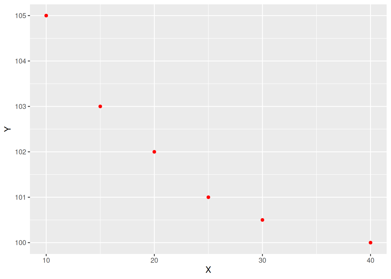
The first step you should take is to just plot the raw data. What form does that take?
Quick fit check
linear_fit <- stats::lm(Y ~ X, data = data)  ## $y = mX + b$
#braggs3_nls_fit <- stats::nls(Y ~ aomisc::NLS.bragg.3(X, b, d, e), data = data)

tryCatch( {
  result <- log("not a number"); print(res)
  },
  error = function(e) {
    ggplot2::ggplot() +
  ggplot2::geom_point(data = data, ggplot2::aes(x = X, y = Y), color = "red") +
  ggplot2::geom_text(
    data = data.frame(x = mean(data$X),y = mean(data$Y), label = "DID NOT CONVERGE"),
    ggplot2::aes(x, y, label = label),
    hjust = 0.5, vjust = 0.5, angle = 45, size = 11, color = "red",inherit.aes = FALSE) +
  cowplot::theme_half_open() +
  cowplot::background_grid()
    }
  )
Quick fit check
[1] "test"And for some slightly longer and more decorative explainers:
Curves
Bell curves
This function is connected to the normal (Gaussian) distribution and has a symmetric shape with a maximum equal to \(d\), that is reached when \(X=e\) and two inflection points. In this model, \(b\) relates to the slope at the inflection points; the response \(Y\) approaches 0 when X approaches \(±∞\): \(y = d * exp[-b*(X - e)^2]\), or with lower asymptotes \(c \ne 0\) as \(y = c + (d - c) * exp[-b*(X - e)^2]\)
Other useful tools:
- https://www.graphreader.com/
- https://mycurvefit.com/