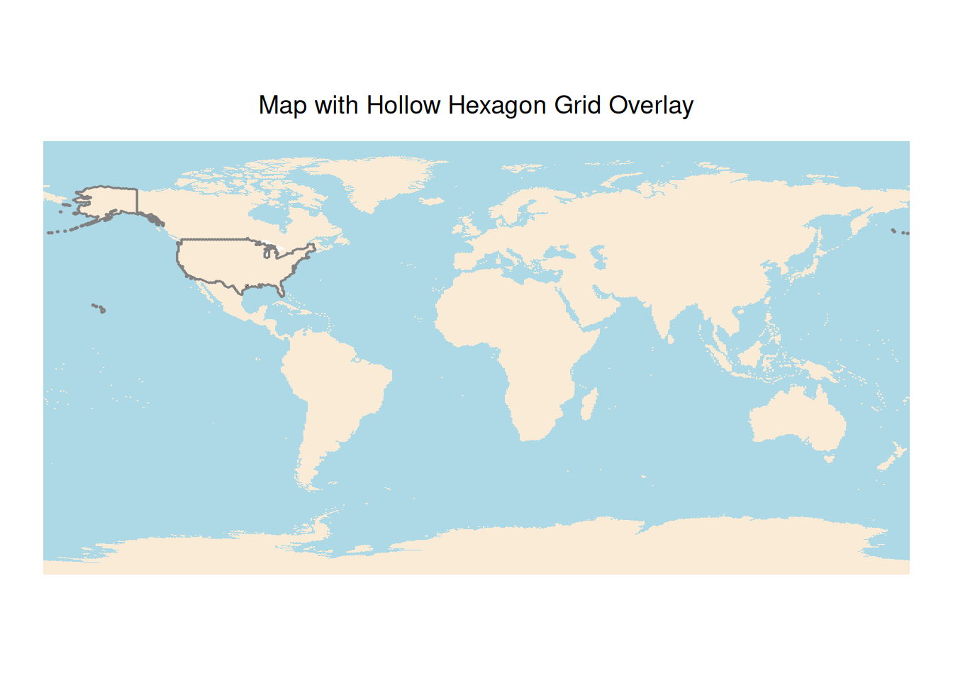
Cartography
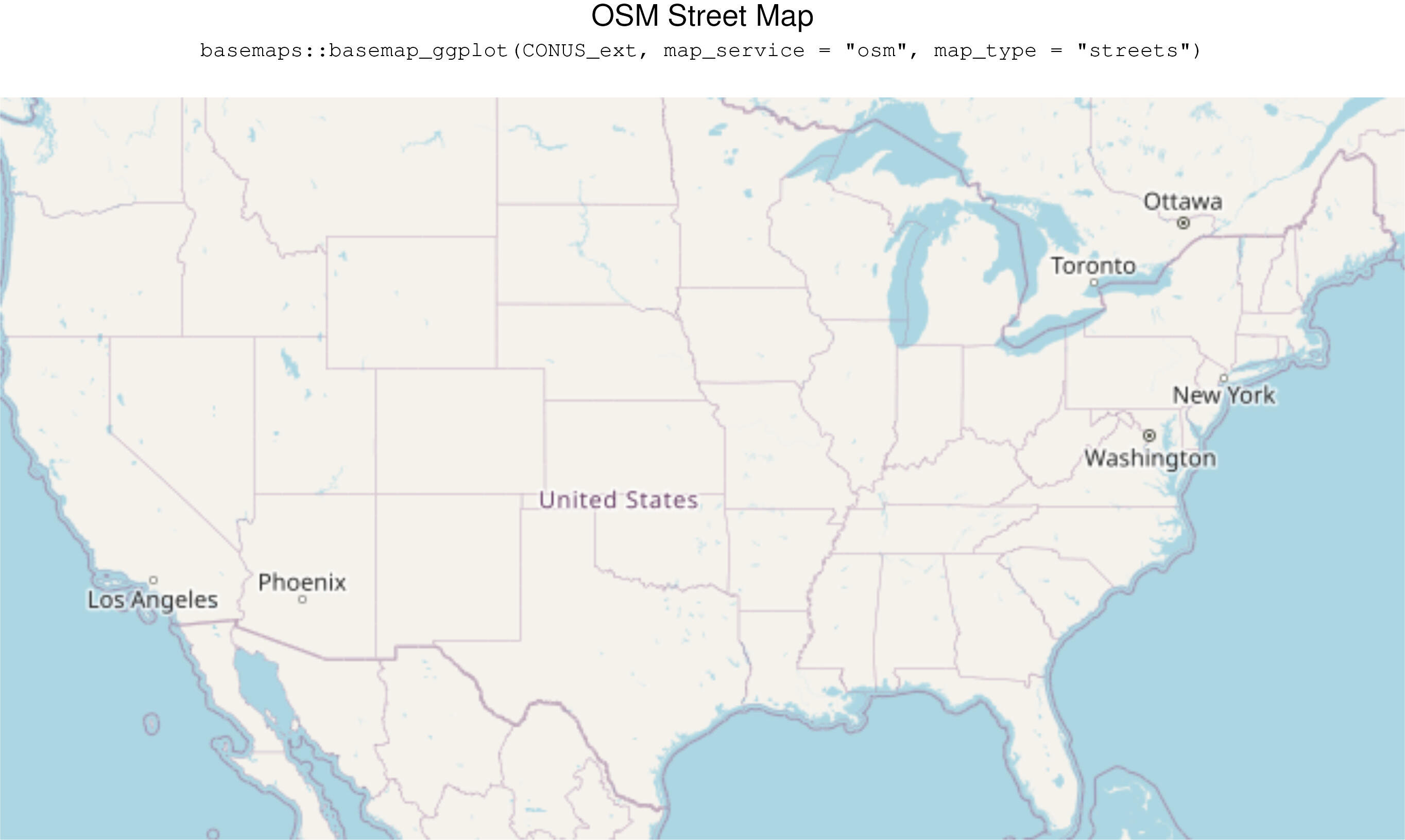
basemaps::basemap_ggplot(CONUS_ext,map_service = "osm", map_type = "streets")
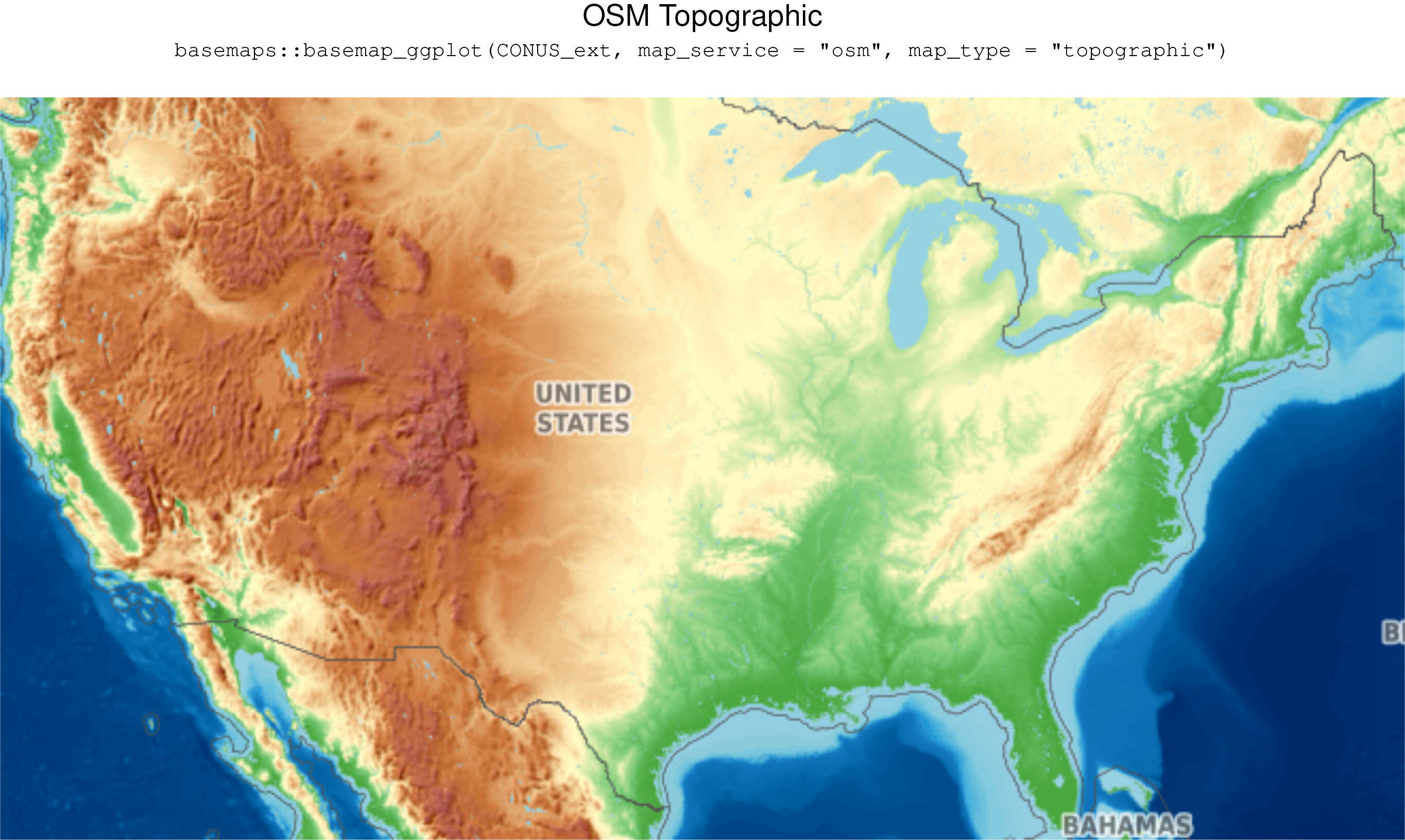
basemaps::basemap_ggplot(CONUS_ext,map_service = "osm", map_type = "topographic")
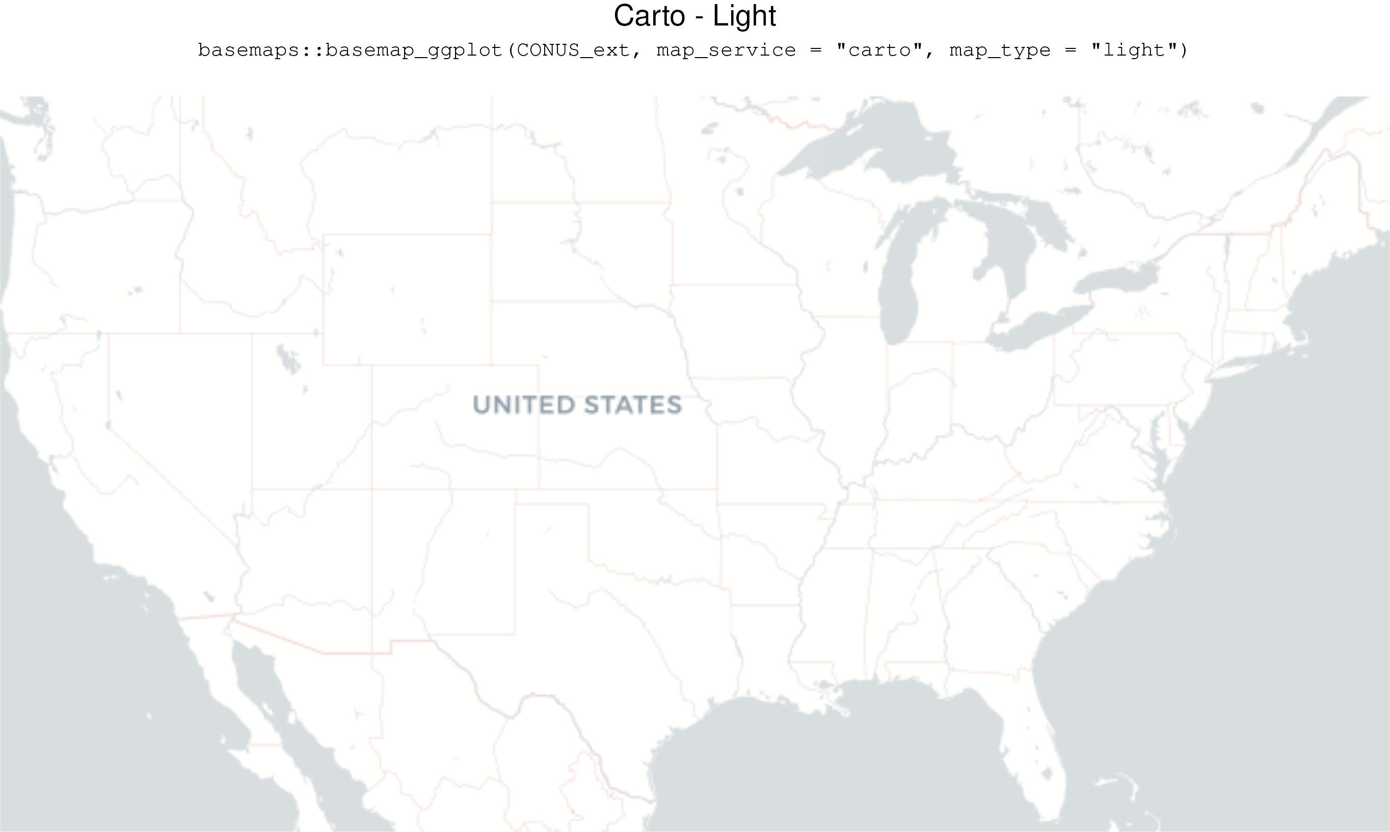
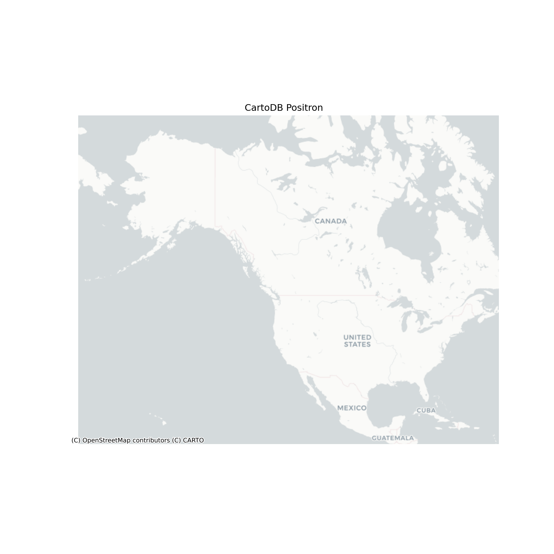
basemaps::basemap_ggplot(CONUS_ext,map_service = "carto", map_type = "light")
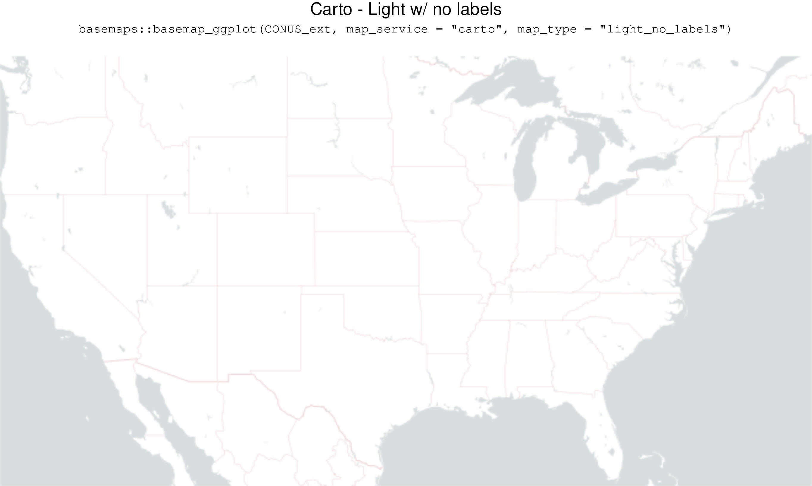
basemaps::basemap_ggplot(CONUS_ext,map_service = "carto", map_type = "light_no_labels")
basemaps::basemap_ggplot(CONUS_ext,map_service = "carto", map_type = "light_only_labels")
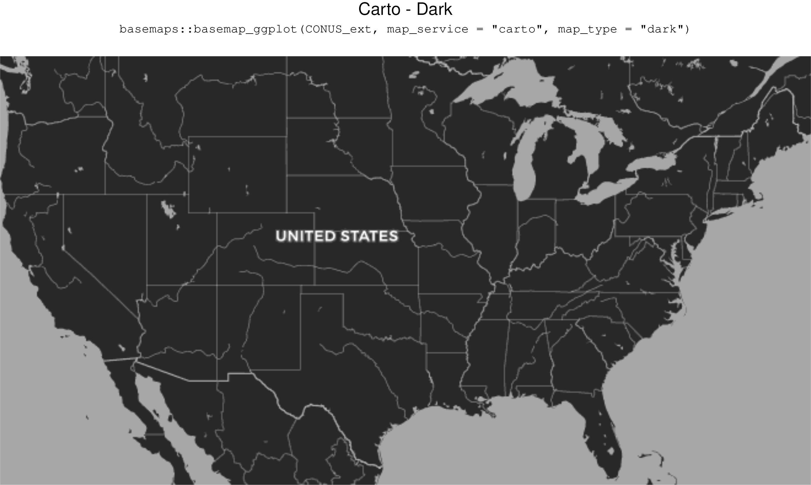
basemaps::basemap_ggplot(CONUS_ext,map_service = "carto", map_type = "dark")
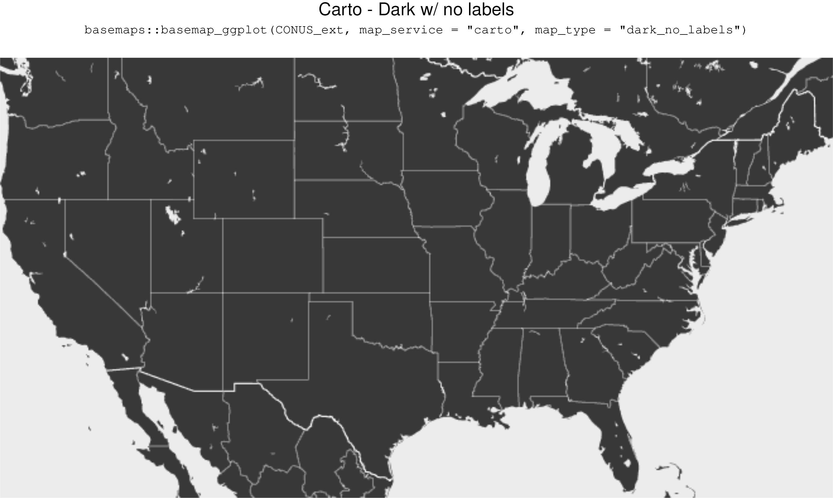
basemaps::basemap_ggplot(CONUS_ext,map_service = "carto", map_type = "dark_no_labels")
basemaps::basemap_ggplot(CONUS_ext,map_service = "carto", map_type = "dark_only_labels")
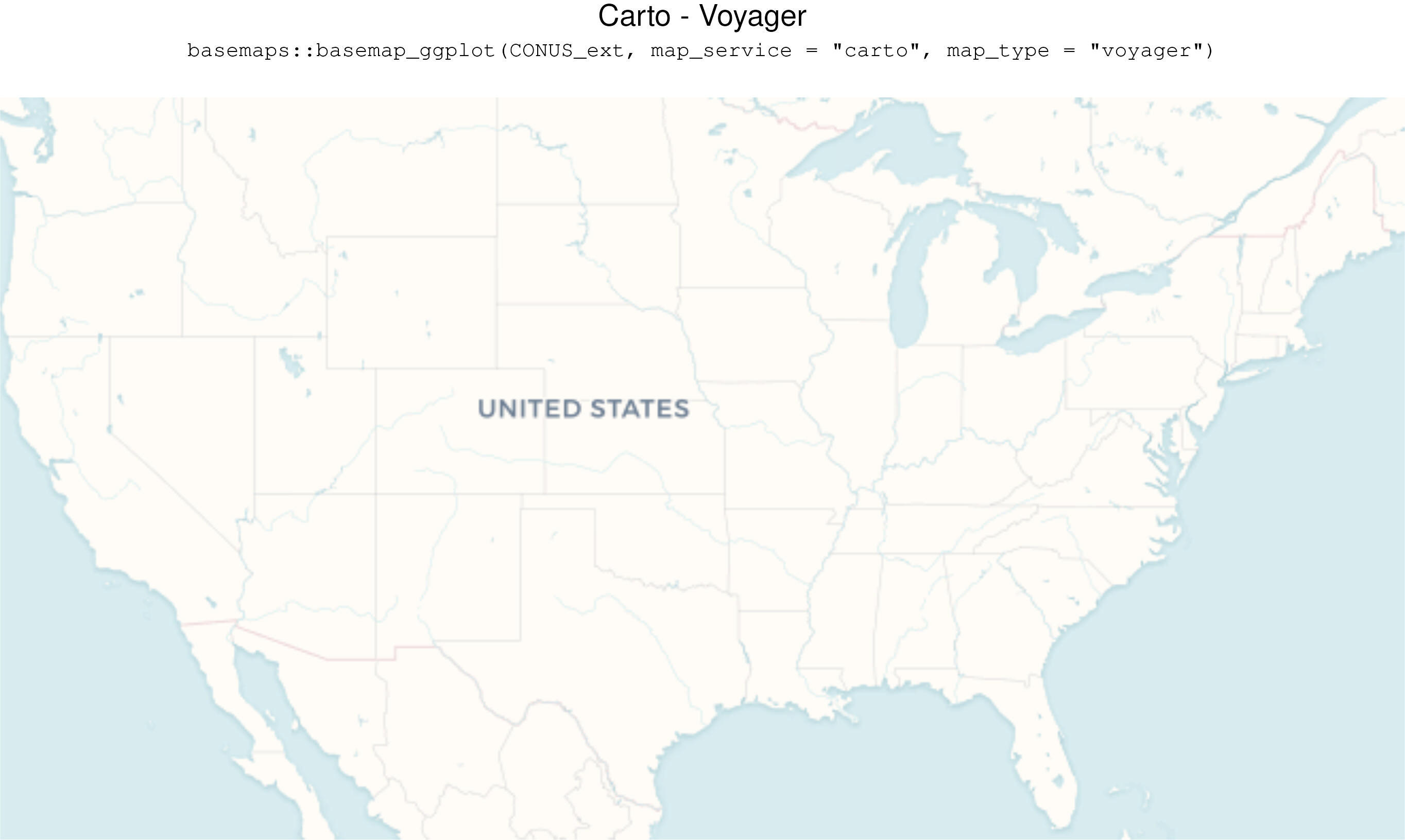
basemaps::basemap_ggplot(CONUS_ext,map_service = "carto", map_type = "voyager")
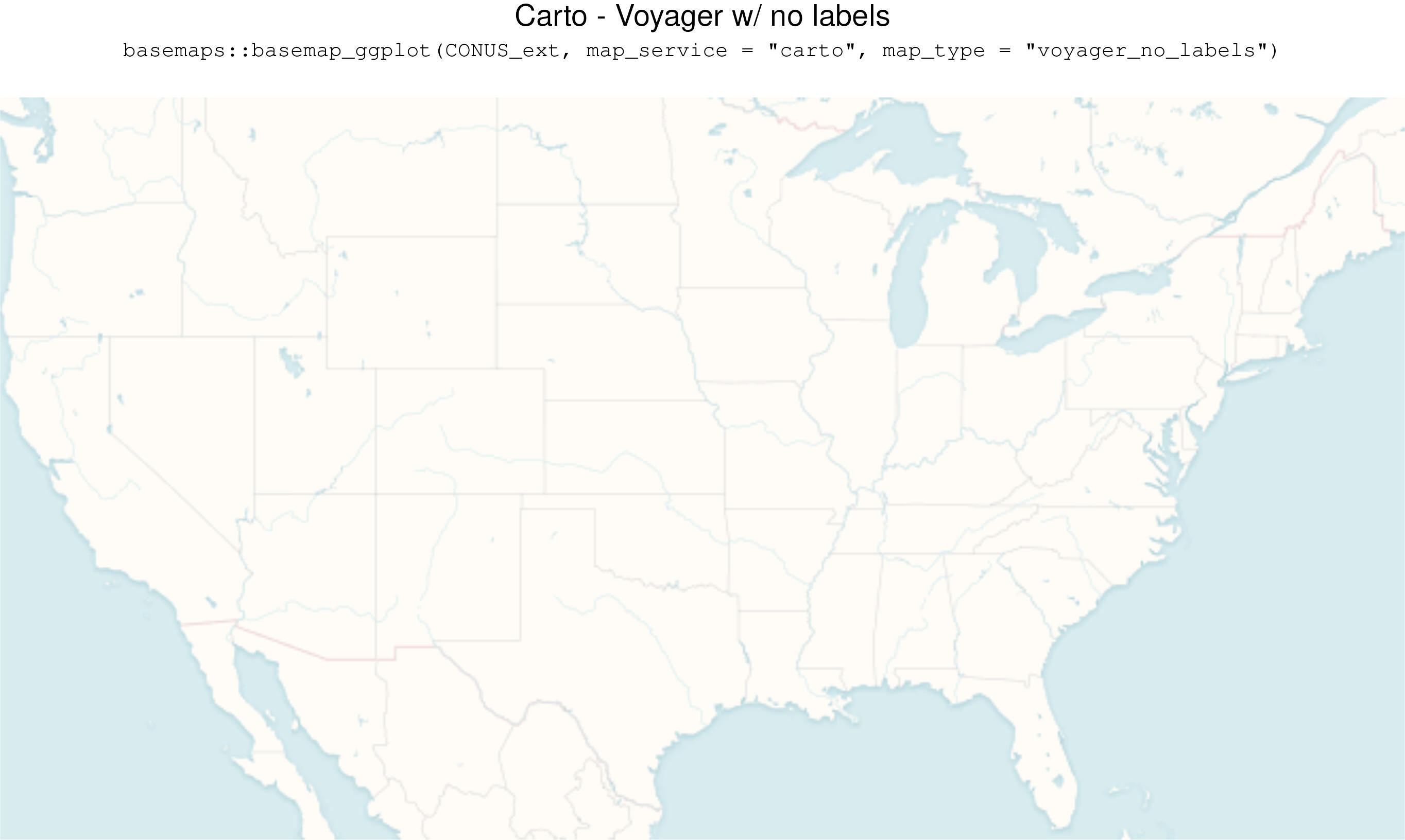
basemaps::basemap_ggplot(CONUS_ext,map_service = "carto", map_type = "voyager_no_labels")
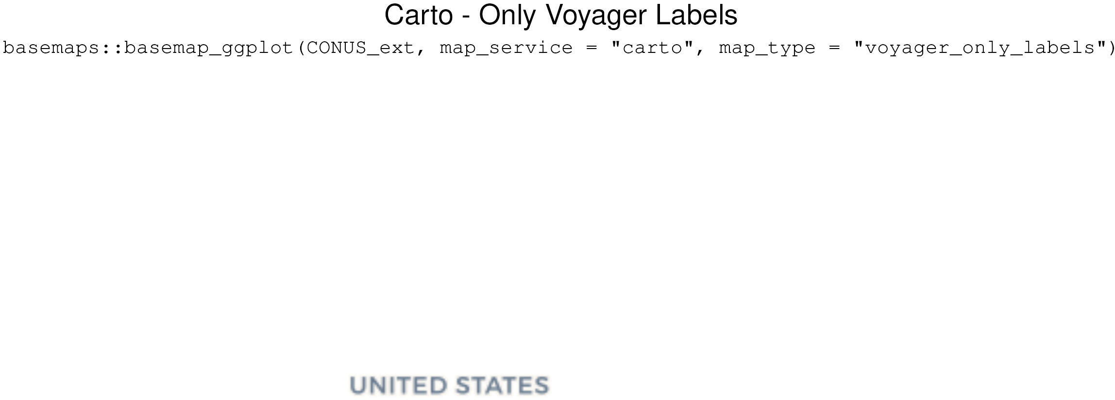
basemaps::basemap_ggplot(CONUS_ext,map_service = "carto", map_type = "voyager_only_labels")
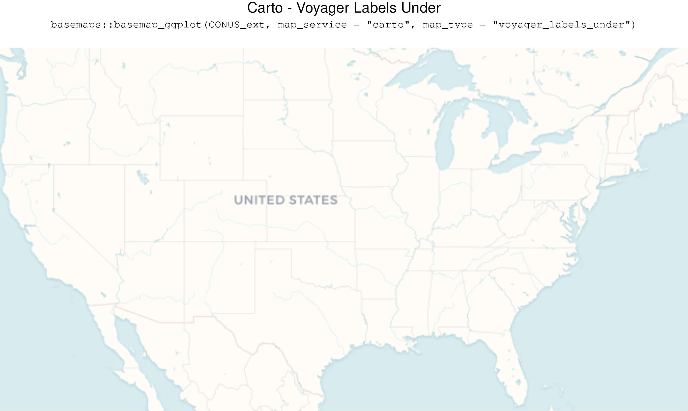
basemaps::basemap_ggplot(CONUS_ext,map_service = "carto", map_type = "voyager_labels_under")
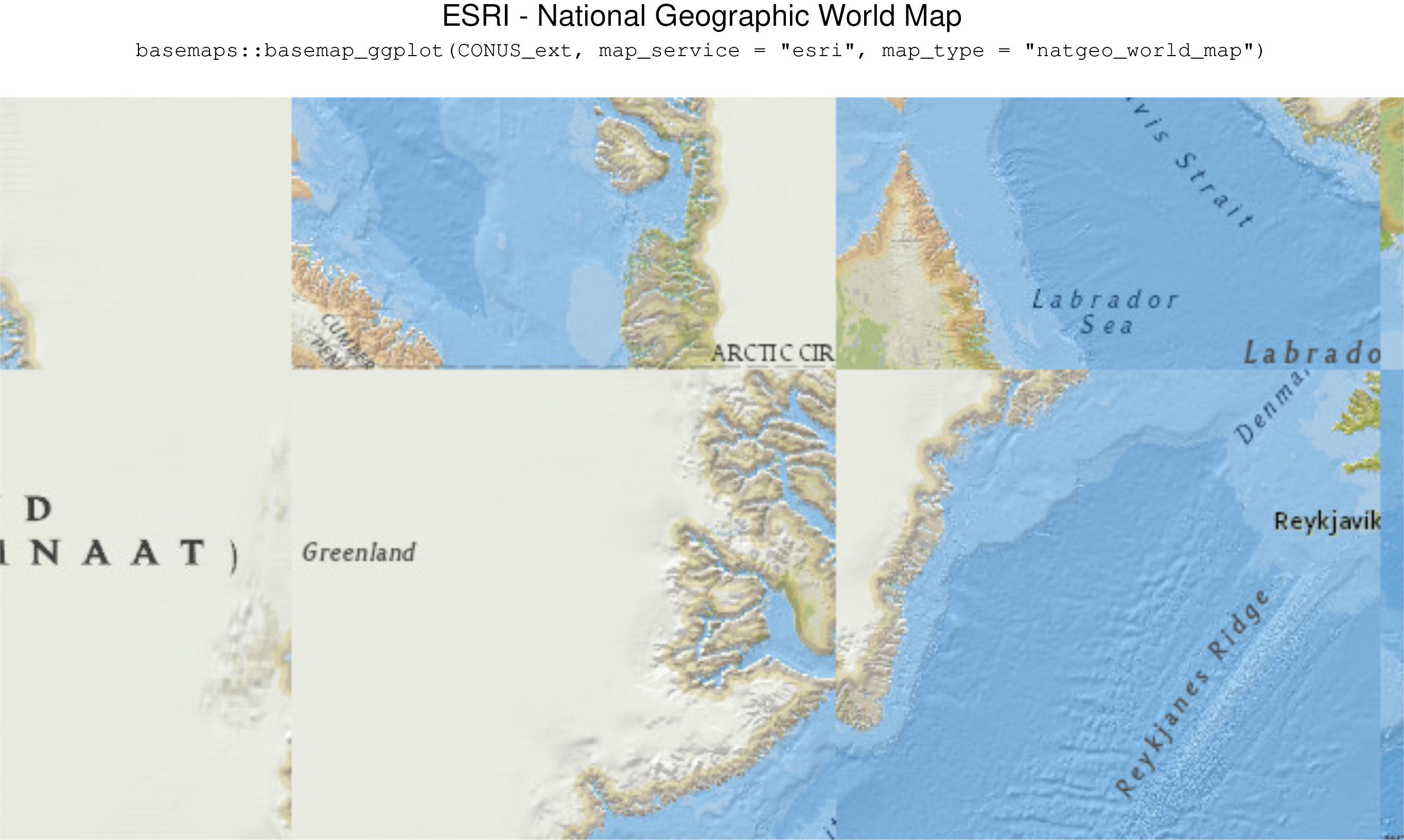
basemaps::basemap_ggplot(CONUS_ext,map_service = "esri", map_type = "natgeo_world_map")

basemaps::basemap_ggplot(CONUS_ext,map_service = "esri", map_type = "usa_topo_maps")
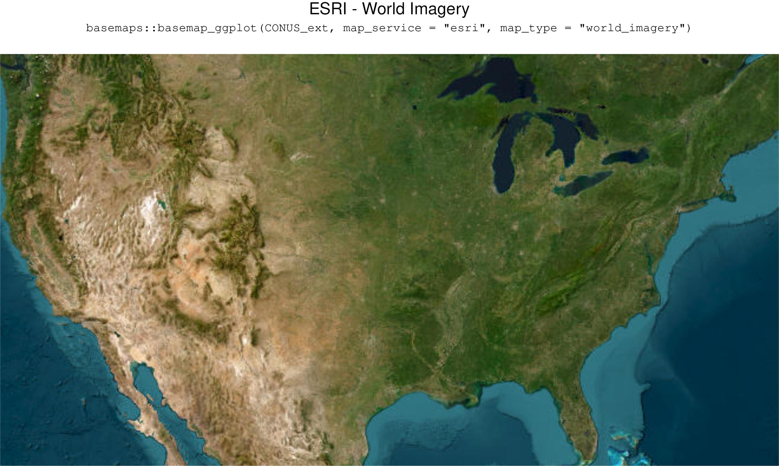
basemaps::basemap_ggplot(CONUS_ext,map_service = "esri", map_type = "world_imagery")
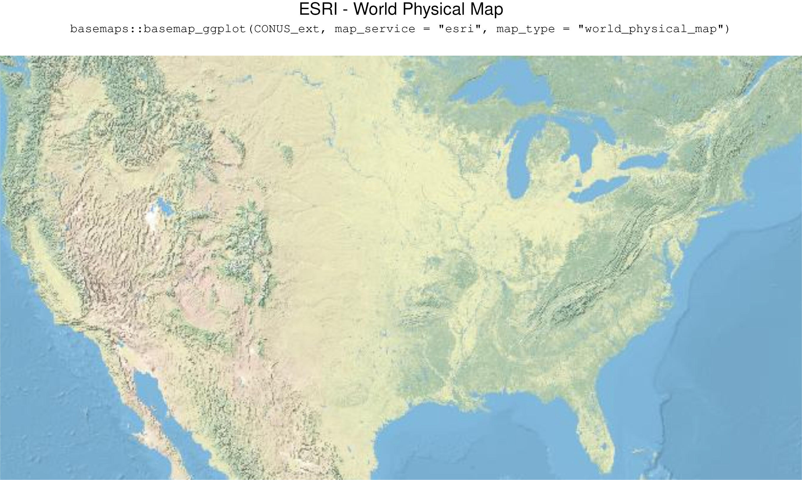
basemaps::basemap_ggplot(CONUS_ext,map_service = "esri", map_type = "world_physical_map")
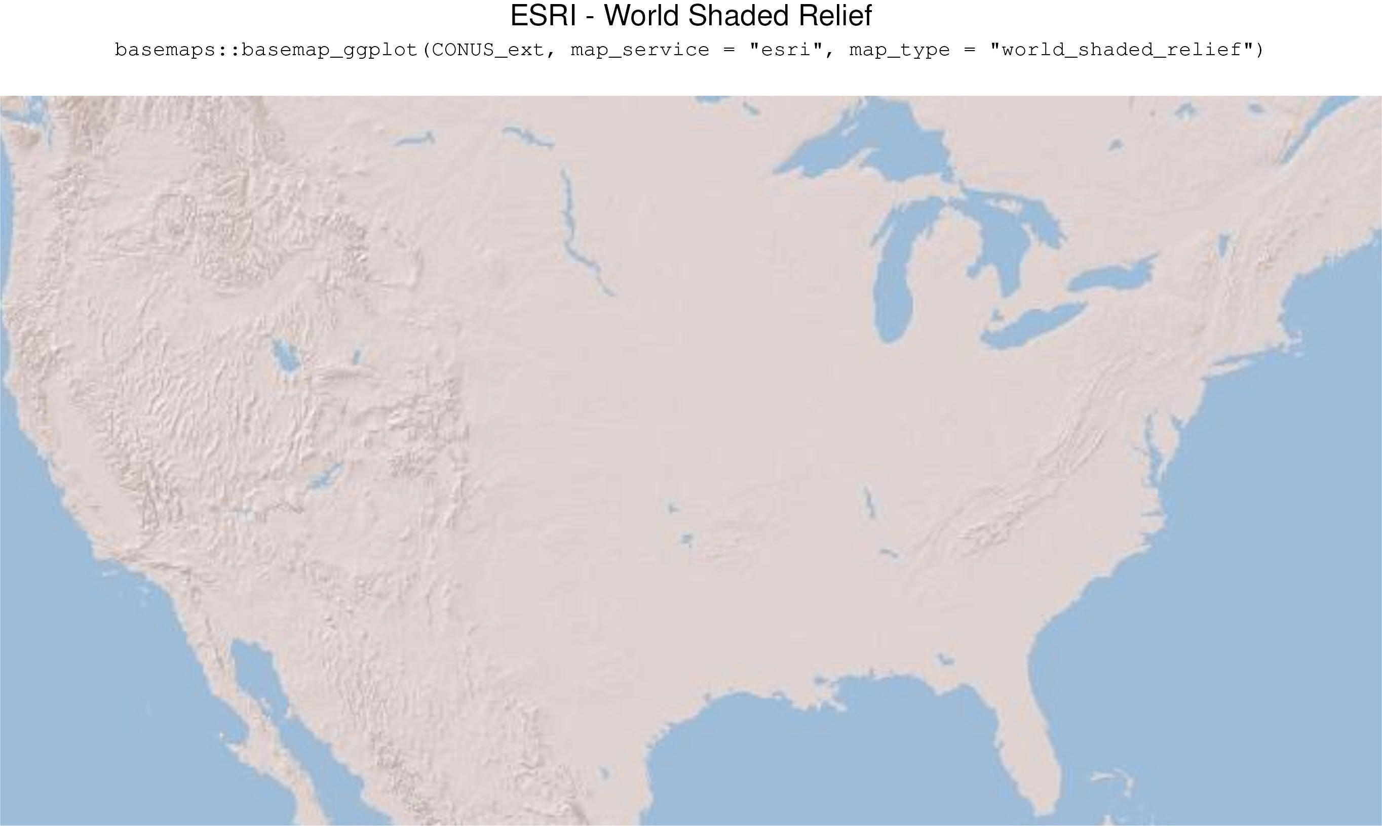
basemaps::basemap_ggplot(CONUS_ext,map_service = "esri", map_type = "world_shaded_relief")
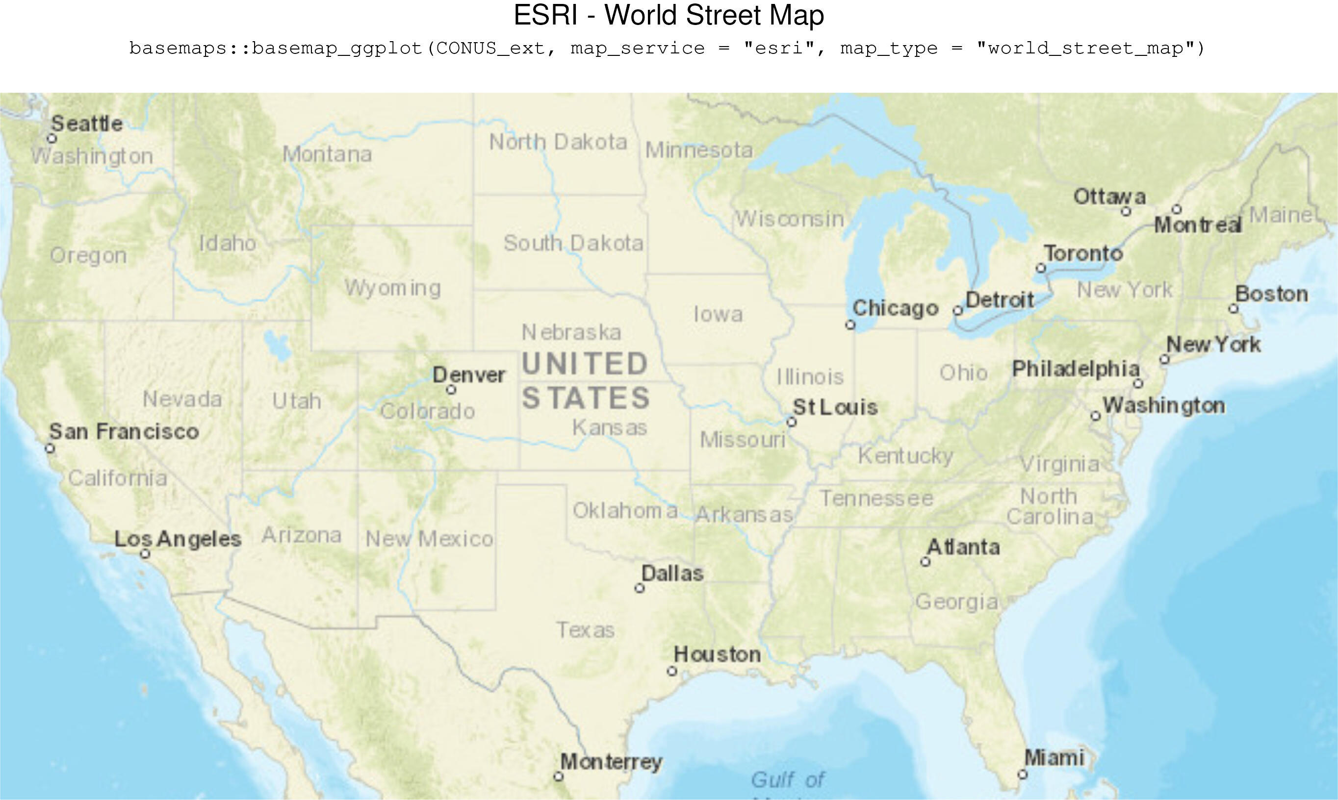
basemaps::basemap_ggplot(CONUS_ext,map_service = "esri", map_type = "world_street_map")
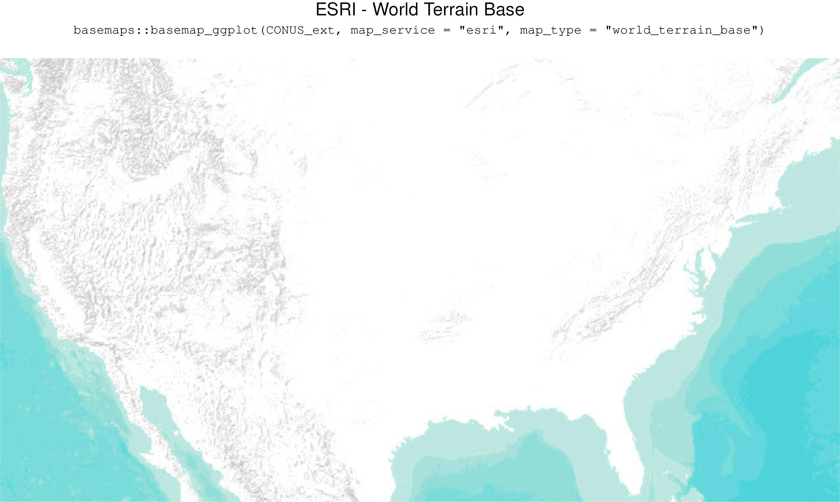
basemaps::basemap_ggplot(CONUS_ext,map_service = "esri", map_type = "world_terrain_base")
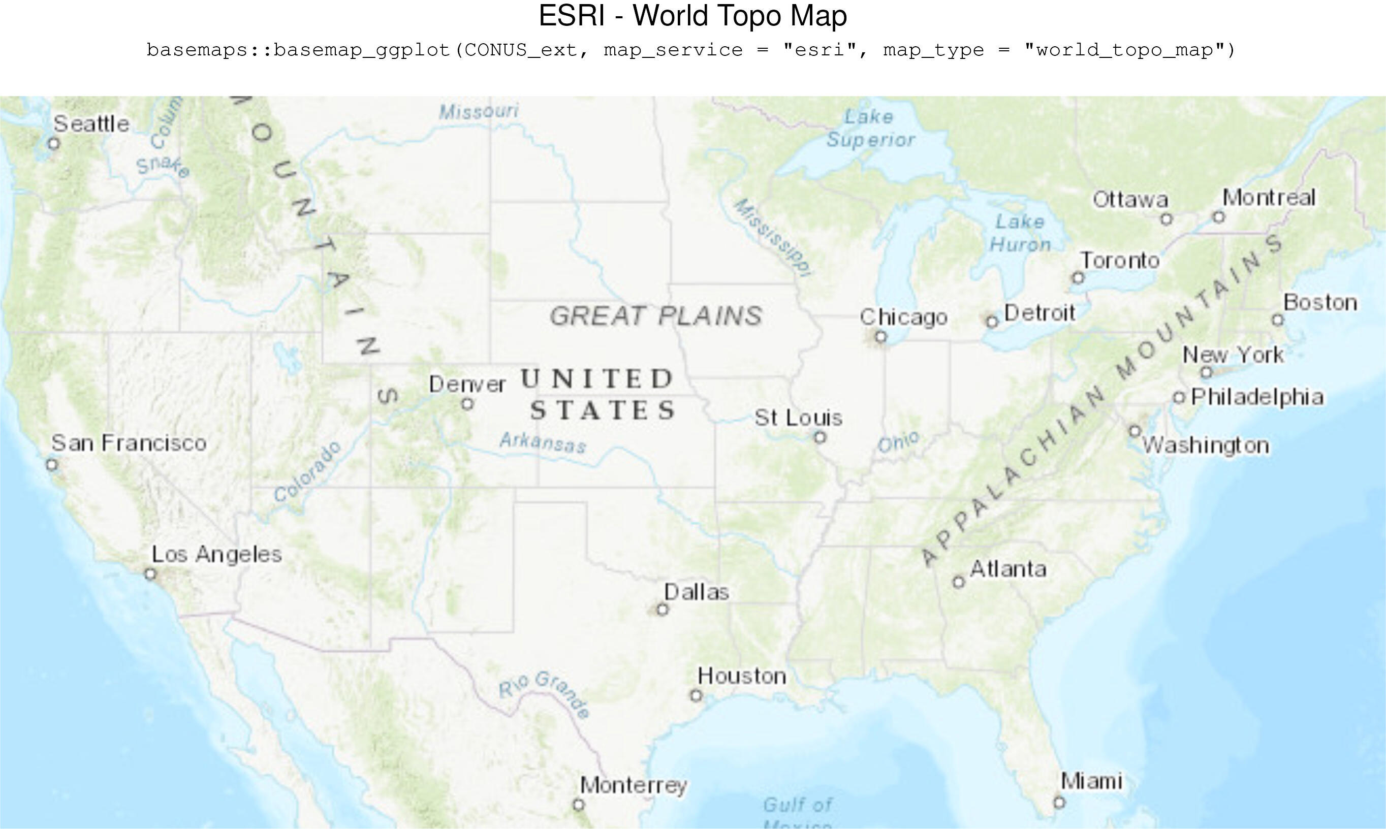
basemaps::basemap_ggplot(CONUS_ext,map_service = "esri", map_type = "world_topo_map")
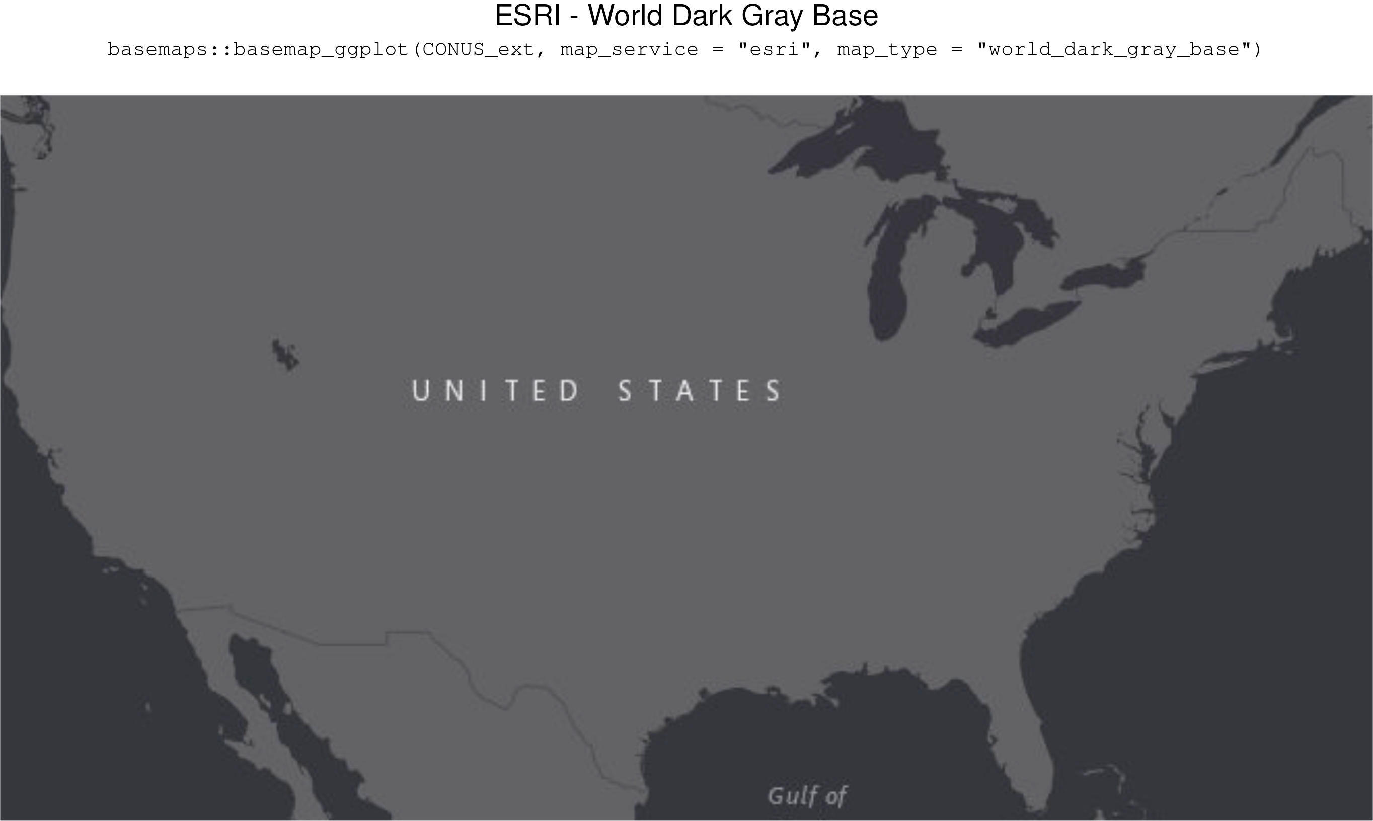
basemaps::basemap_ggplot(CONUS_ext,map_service = "esri", map_type = "world_dark_gray_base")
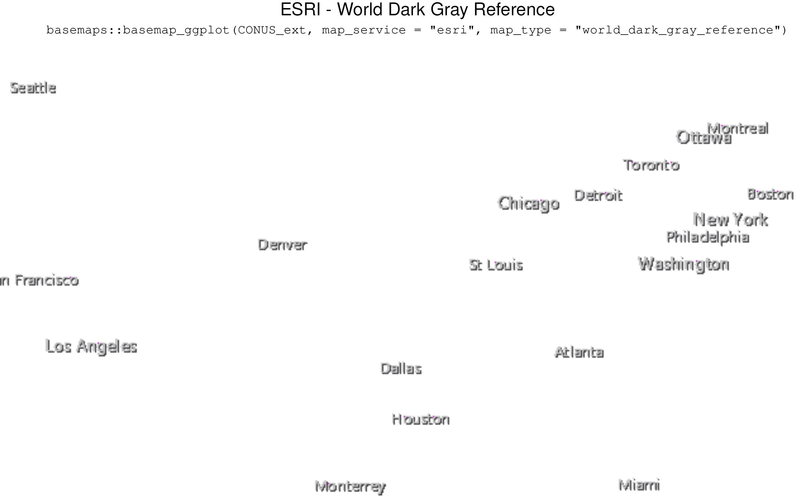
basemaps::basemap_ggplot(CONUS_ext,map_service = "esri", map_type = "world_dark_gray_reference")
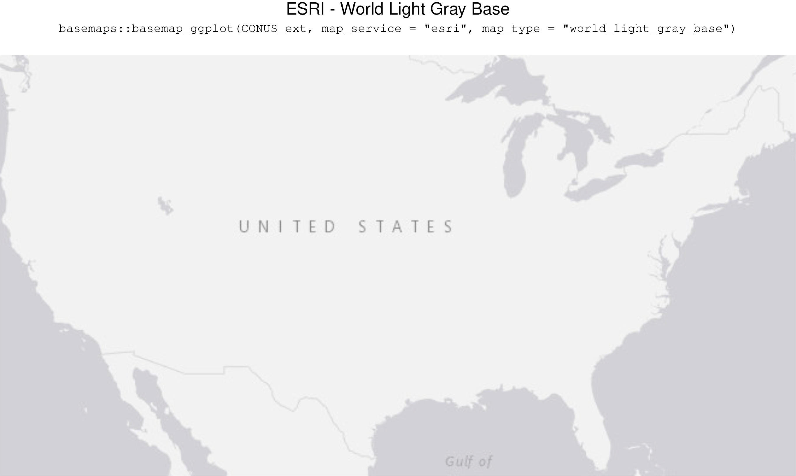
basemaps::basemap_ggplot(CONUS_ext,map_service = "esri", map_type = "world_light_gray_base")
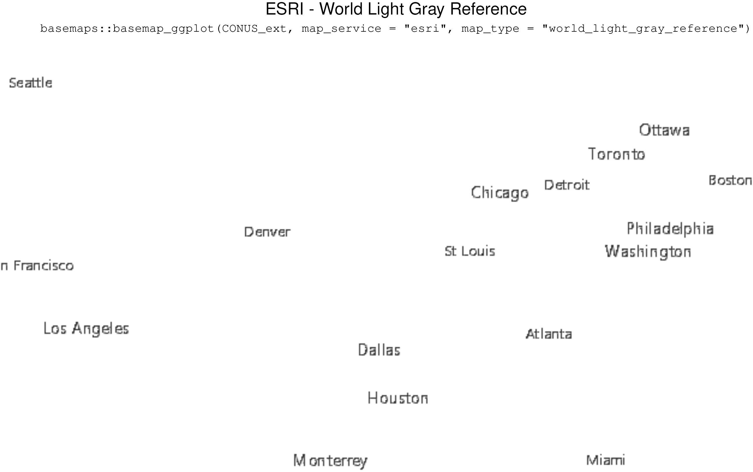
basemaps::basemap_ggplot(CONUS_ext,map_service = "esri", map_type = "world_light_gray_reference")
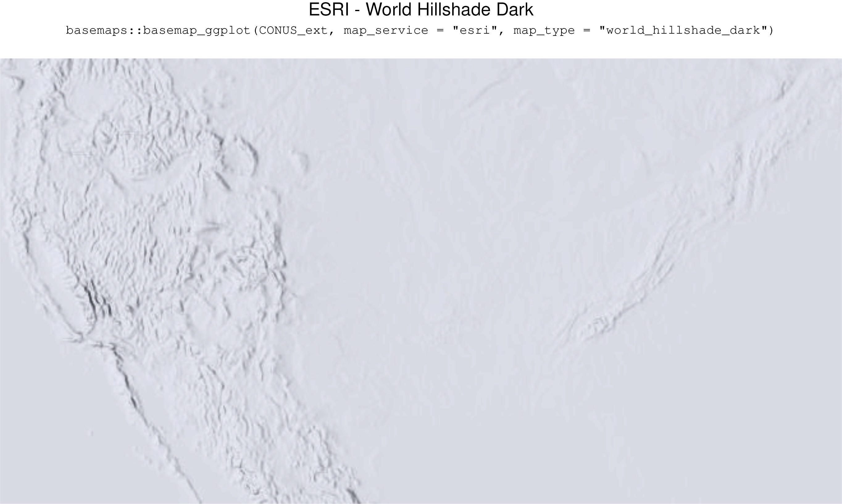
basemaps::basemap_ggplot(CONUS_ext,map_service = "esri", map_type = "world_hillshade_dark")
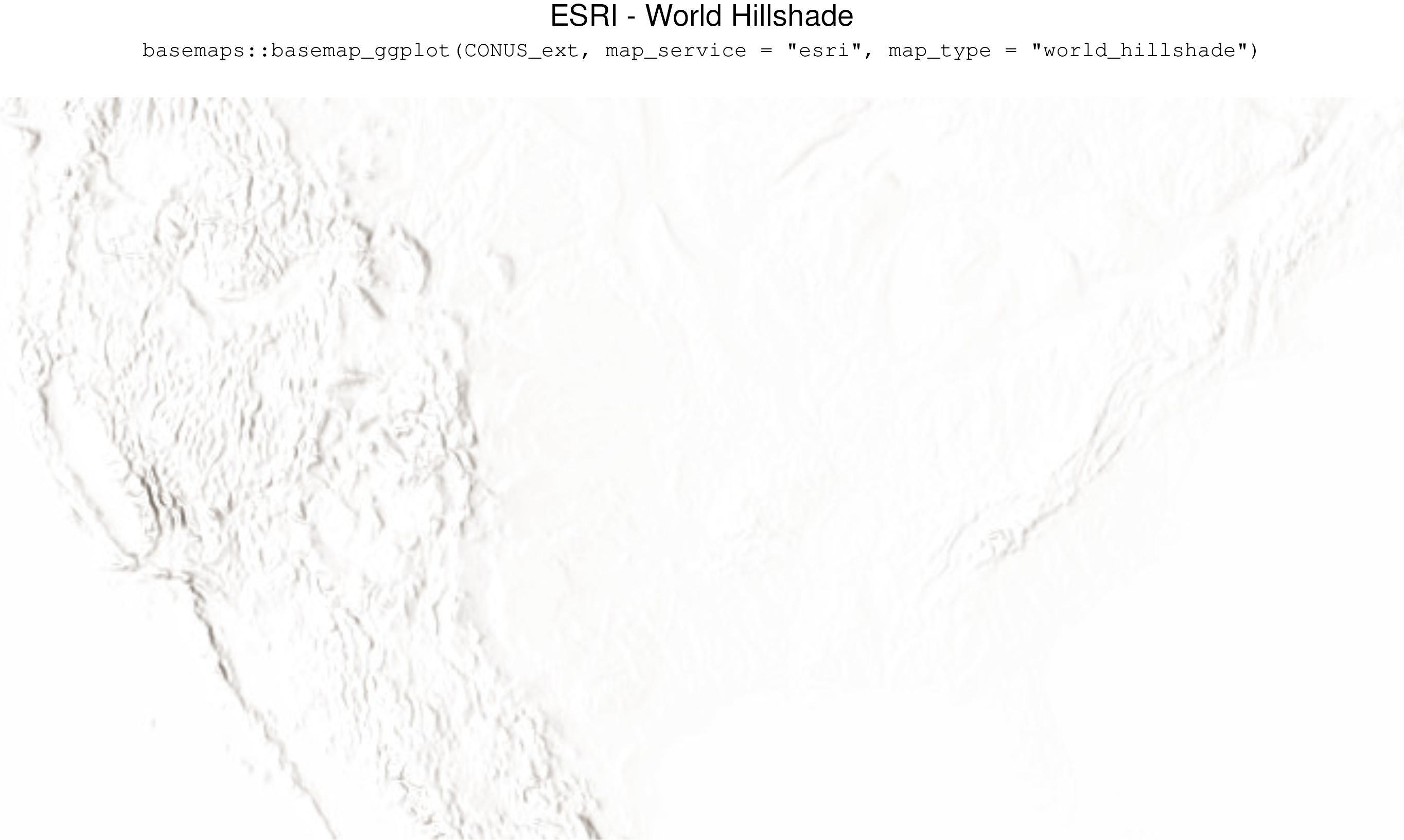
basemaps::basemap_ggplot(CONUS_ext,map_service = "esri", map_type = "world_hillshade")
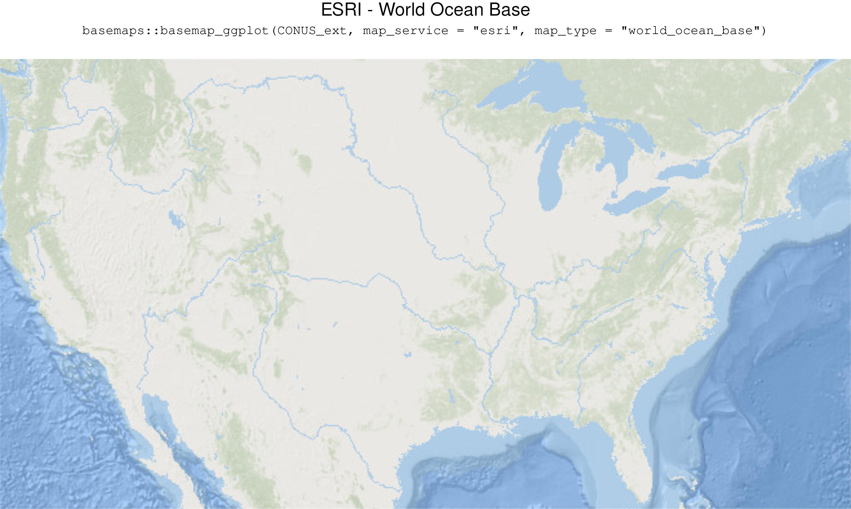
basemaps::basemap_ggplot(CONUS_ext,map_service = "esri", map_type = "world_ocean_base")
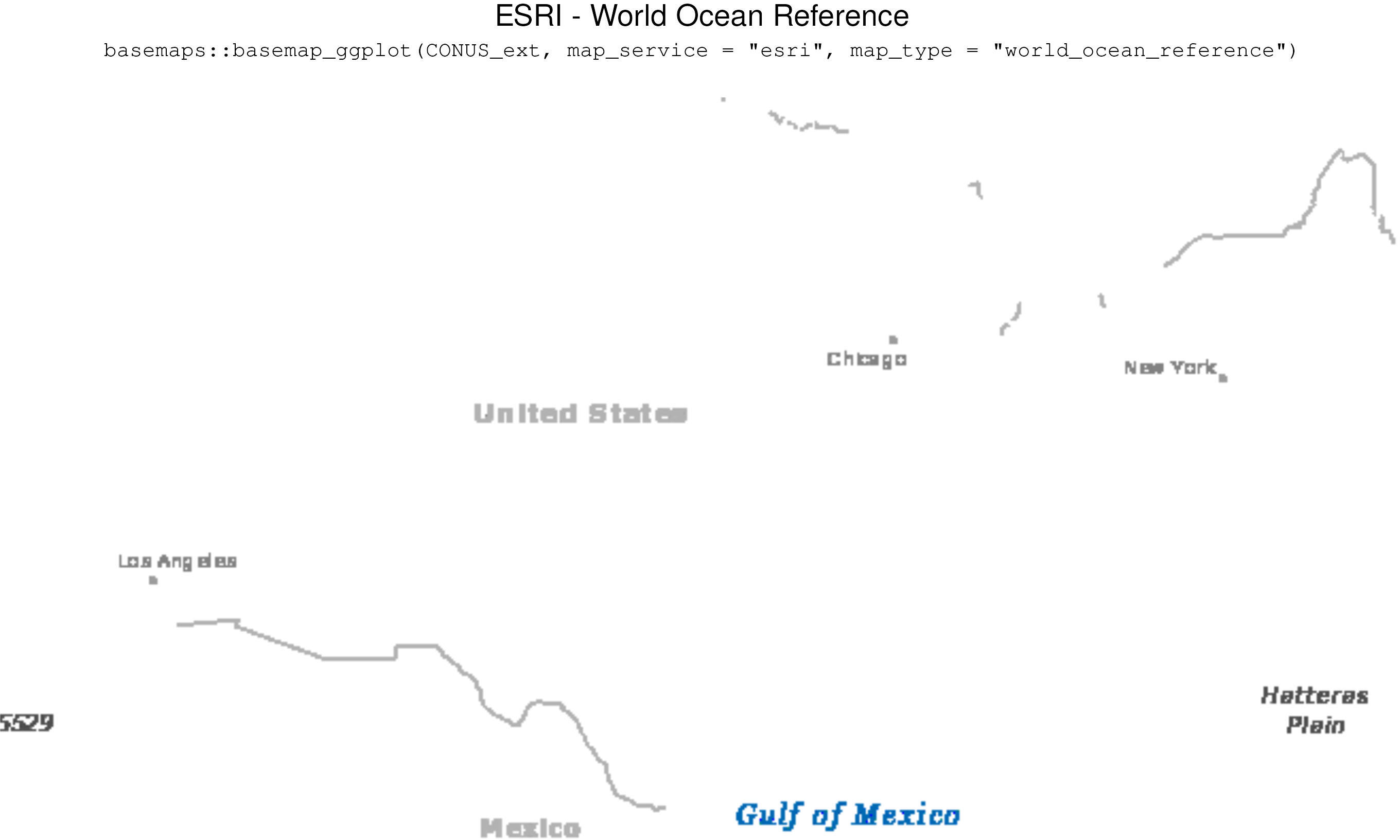
basemaps::basemap_ggplot(CONUS_ext,map_service = "esri", map_type = "world_ocean_reference")

basemaps::basemap_ggplot(CONUS_ext,map_service = "esri", map_type = "arctic_ocean_reference")
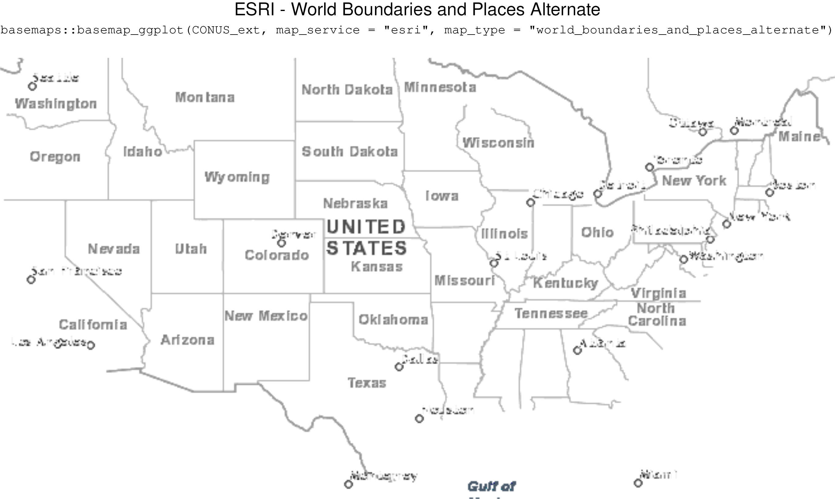
basemaps::basemap_ggplot(CONUS_ext,map_service = "esri", map_type = "world_boundaries_and_places_alternate")
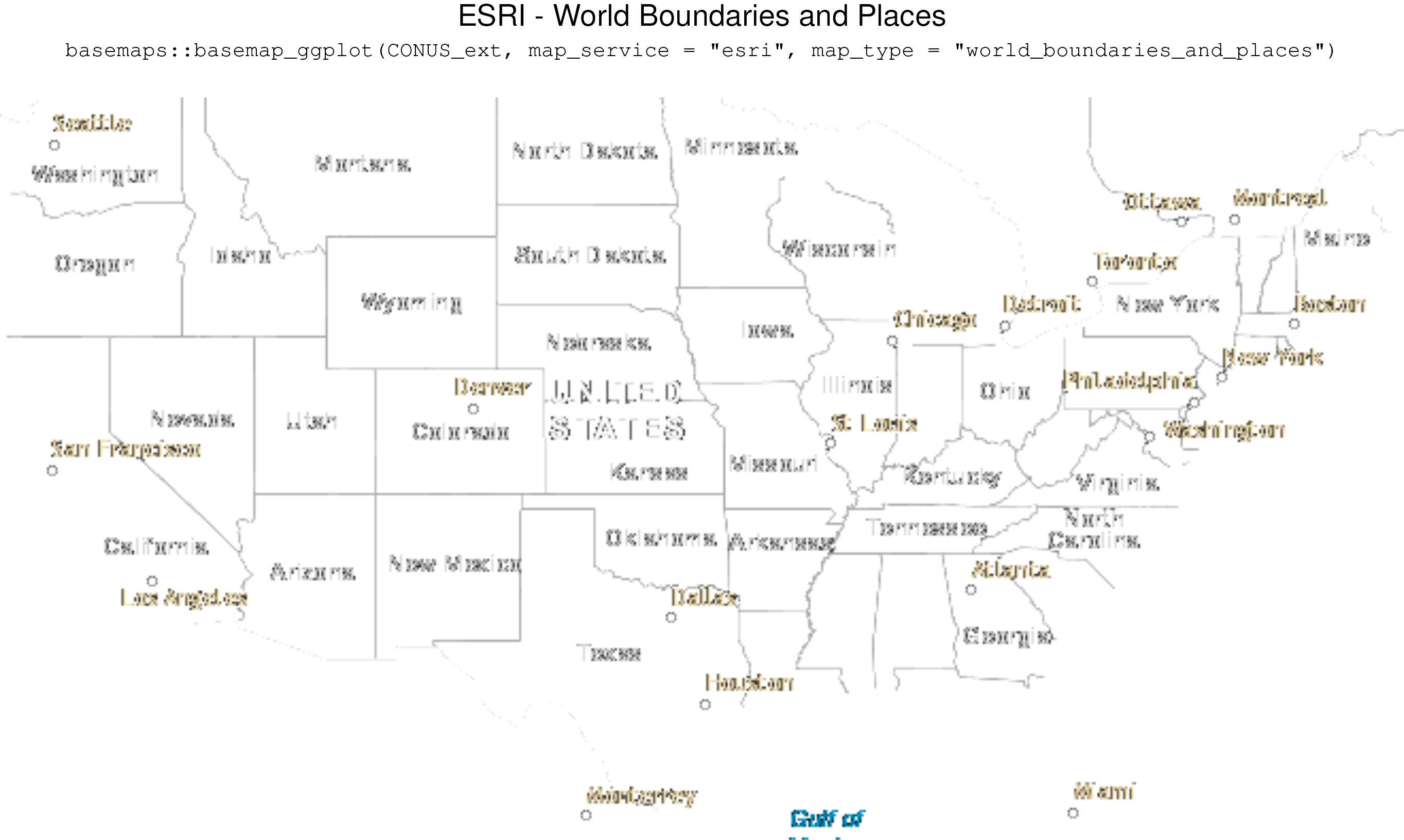
basemaps::basemap_ggplot(CONUS_ext,map_service = "esri", map_type = "world_boundaries_and_places")
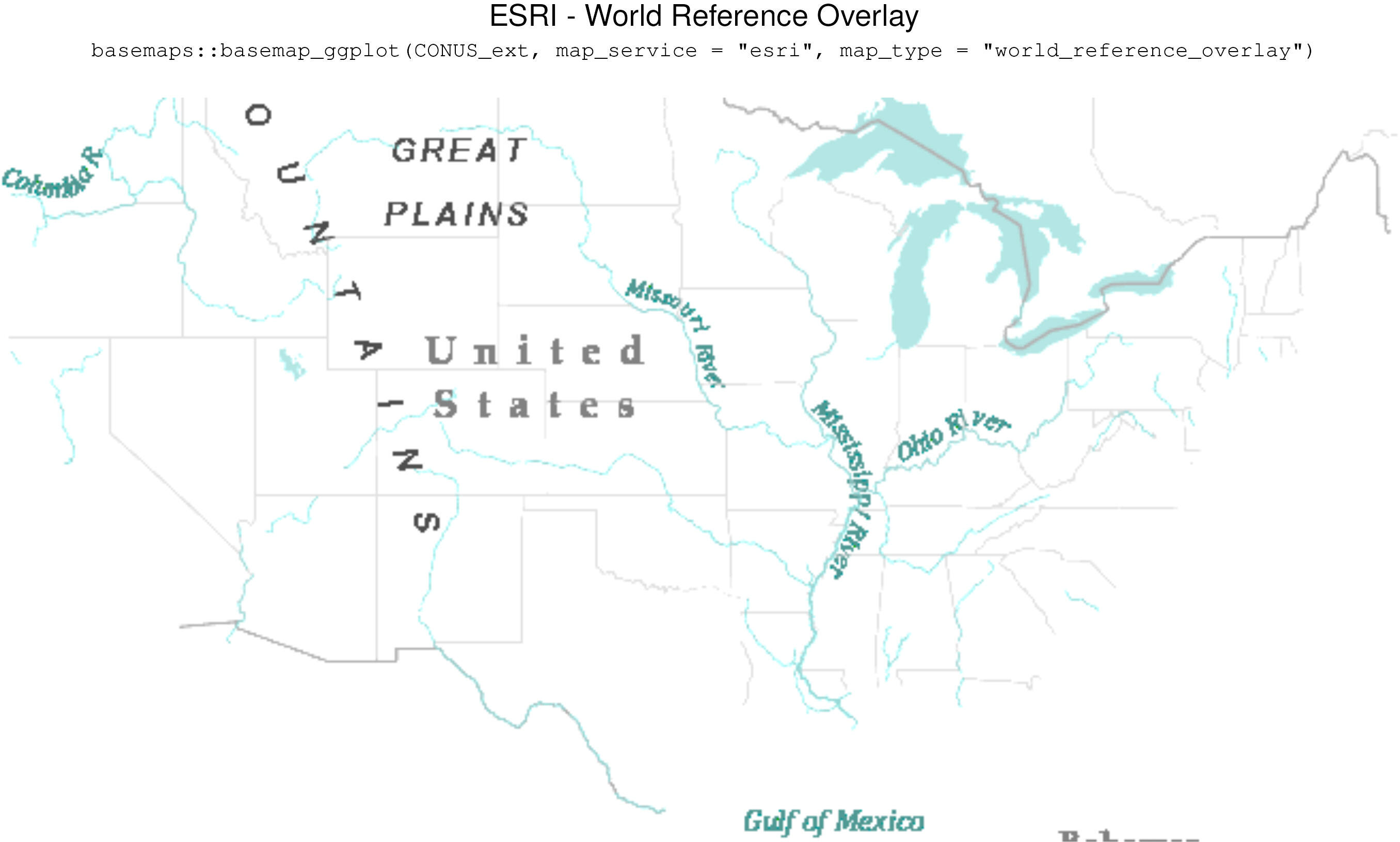
basemaps::basemap_ggplot(CONUS_ext,map_service = "esri", map_type = "world_reference_overlay")
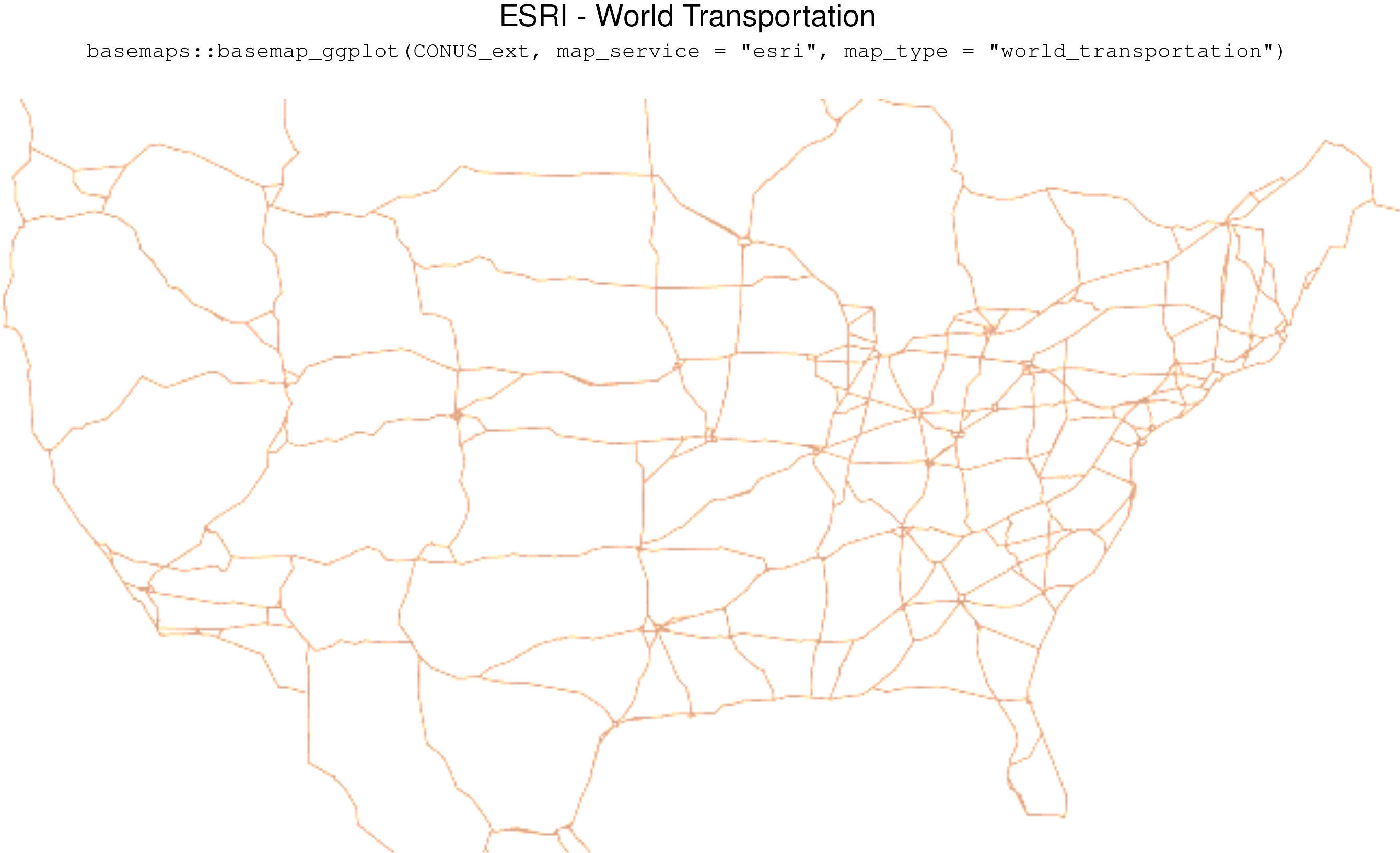
basemaps::basemap_ggplot(CONUS_ext,map_service = "esri", map_type = "world_transportation")
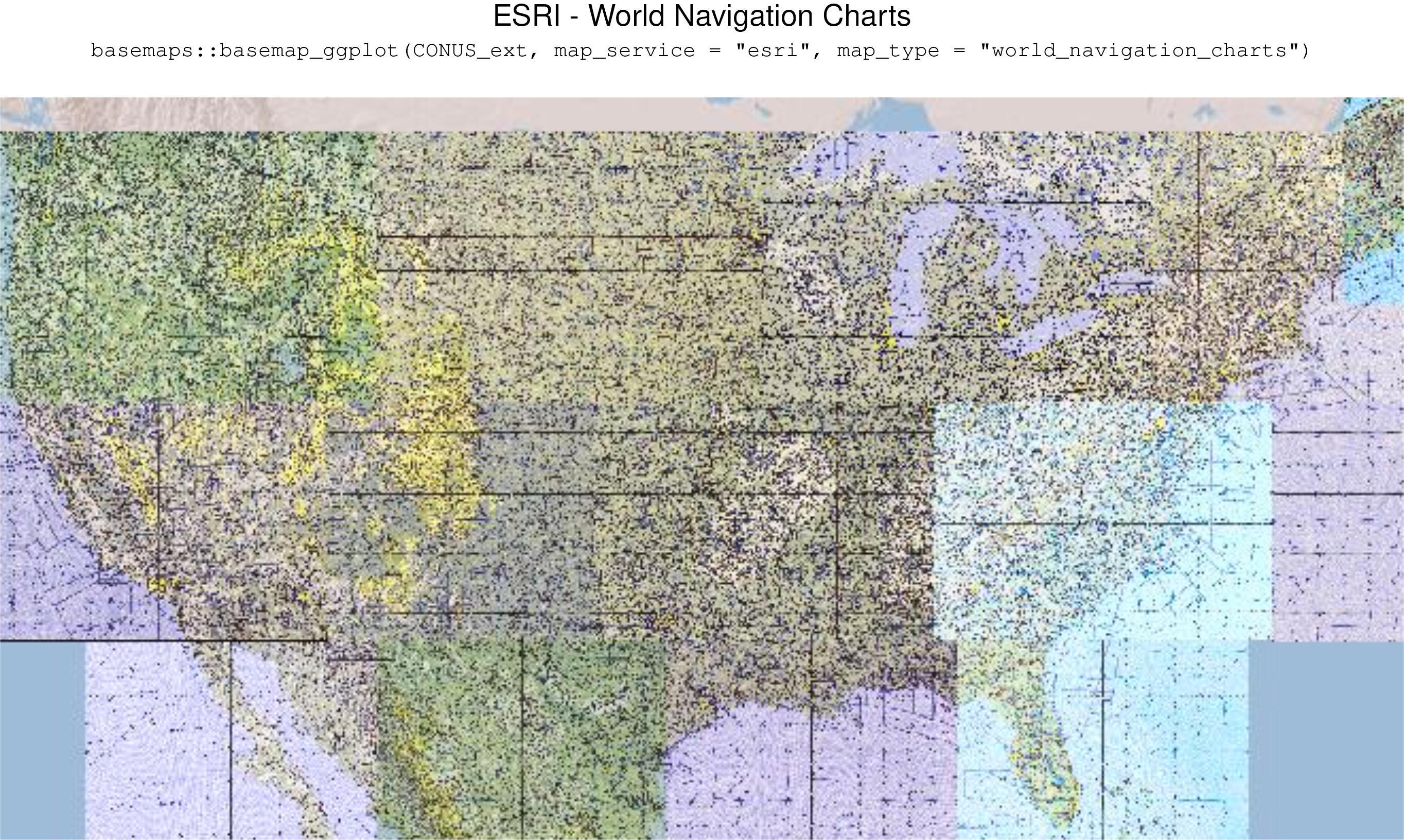
basemaps::basemap_ggplot(CONUS_ext,map_service = "esri", map_type = "world_navigation_charts")

basemaps::basemap_ggplot(CONUS_ext,map_service = "osm", map_type = "streets")
basemaps::basemap_ggplot(CONUS_ext,map_service = "osm", map_type = "topographic")
basemaps::basemap_ggplot(CONUS_ext,map_service = "carto", map_type = "light")
basemaps::basemap_ggplot(CONUS_ext,map_service = "carto", map_type = "voyager")
basemaps::basemap_ggplot(CONUS_ext,map_service = "carto", map_type = "dark")
basemaps::basemap_ggplot(CONUS_ext,map_service = "carto", map_type = "light_no_labels")
basemaps::basemap_ggplot(CONUS_ext,map_service = "carto", map_type = "voyager_no_labels")
basemaps::basemap_ggplot(CONUS_ext,map_service = "carto", map_type = "dark_no_labels")
basemaps::basemap_ggplot(CONUS_ext,map_service = "carto", map_type = "light_only_labels")
basemaps::basemap_ggplot(CONUS_ext,map_service = "carto", map_type = "voyager_only_labels")
basemaps::basemap_ggplot(CONUS_ext,map_service = "carto", map_type = "dark_only_labels")
basemaps::basemap_ggplot(CONUS_ext,map_service = "carto", map_type = "voyager_labels_under")
basemaps::basemap_ggplot(CONUS_ext,map_service = "esri", map_type = "world_terrain_base")
basemaps::basemap_ggplot(CONUS_ext,map_service = "esri", map_type = "world_imagery")
basemaps::basemap_ggplot(CONUS_ext,map_service = "esri", map_type = "world_street_map")
basemaps::basemap_ggplot(CONUS_ext,map_service = "esri", map_type = "world_physical_map")
basemaps::basemap_ggplot(CONUS_ext,map_service = "esri", map_type = "world_topo_map")
basemaps::basemap_ggplot(CONUS_ext,map_service = "esri", map_type = "world_shaded_relief")
basemaps::basemap_ggplot(CONUS_ext,map_service = "esri", map_type = "world_light_gray_base")
basemaps::basemap_ggplot(CONUS_ext,map_service = "esri", map_type = "world_dark_gray_base")
basemaps::basemap_ggplot(CONUS_ext,map_service = "esri", map_type = "world_light_gray_reference")
basemaps::basemap_ggplot(CONUS_ext,map_service = "esri", map_type = "world_dark_gray_reference")
basemaps::basemap_ggplot(CONUS_ext,map_service = "esri", map_type = "world_hillshade")
basemaps::basemap_ggplot(CONUS_ext,map_service = "esri", map_type = "world_hillshade_dark")
basemaps::basemap_ggplot(CONUS_ext,map_service = "esri", map_type = "natgeo_world_map")
basemaps::basemap_ggplot(CONUS_ext,map_service = "esri", map_type = "world_navigation_charts")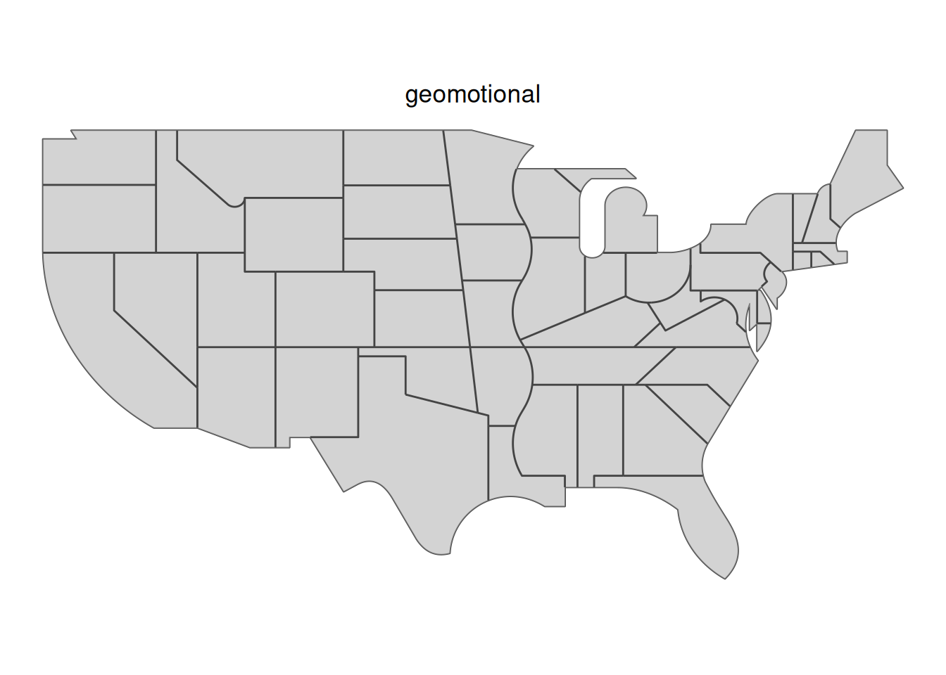


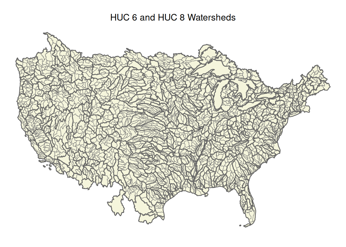
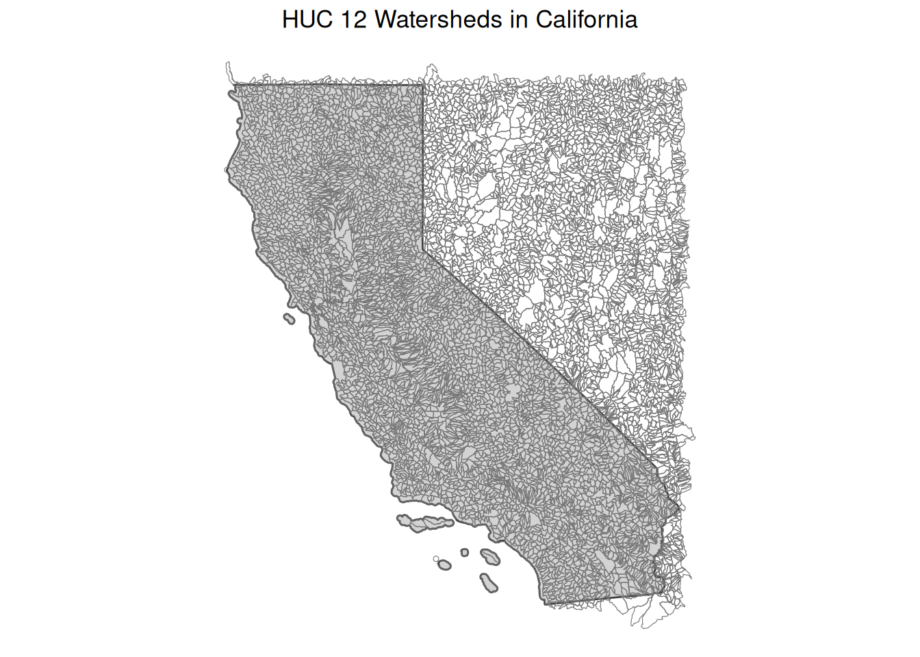
See also: Hydrography
Warning in st_point_on_surface.sfc(sf::st_zm(x)): st_point_on_surface may not
give correct results for longitude/latitude data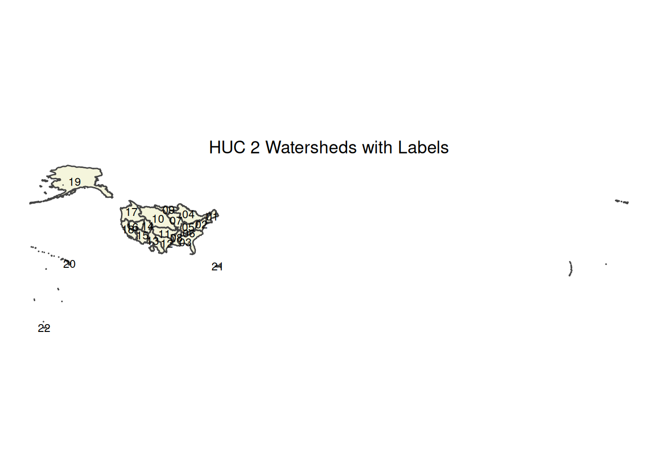
Python (Contextily)
In Python, contextily provides functionality similar to basemaps. It fetches tiles and adds them to a matplotlib plot.
Basemap Provider Reference
Common contextily providers that match the R basemaps list:
- OSM:
cx.providers.OpenStreetMap.Mapnik - Carto Light:
cx.providers.CartoDB.Positron - Carto Dark:
cx.providers.CartoDB.DarkMatter - Carto Voyager:
cx.providers.CartoDB.Voyager - Esri Imagery:
cx.providers.Esri.WorldImagery - Esri Street:
cx.providers.Esri.WorldStreetMap
Watermarks
From https://datavizpyr.com/how-to-add-water-mark-on-a-ggplot/
cowplot::ggdraw(export_plot) +
  cowplot::draw_label("Draft",
             color = "lightgray",
             size = 100,
             angle = 45)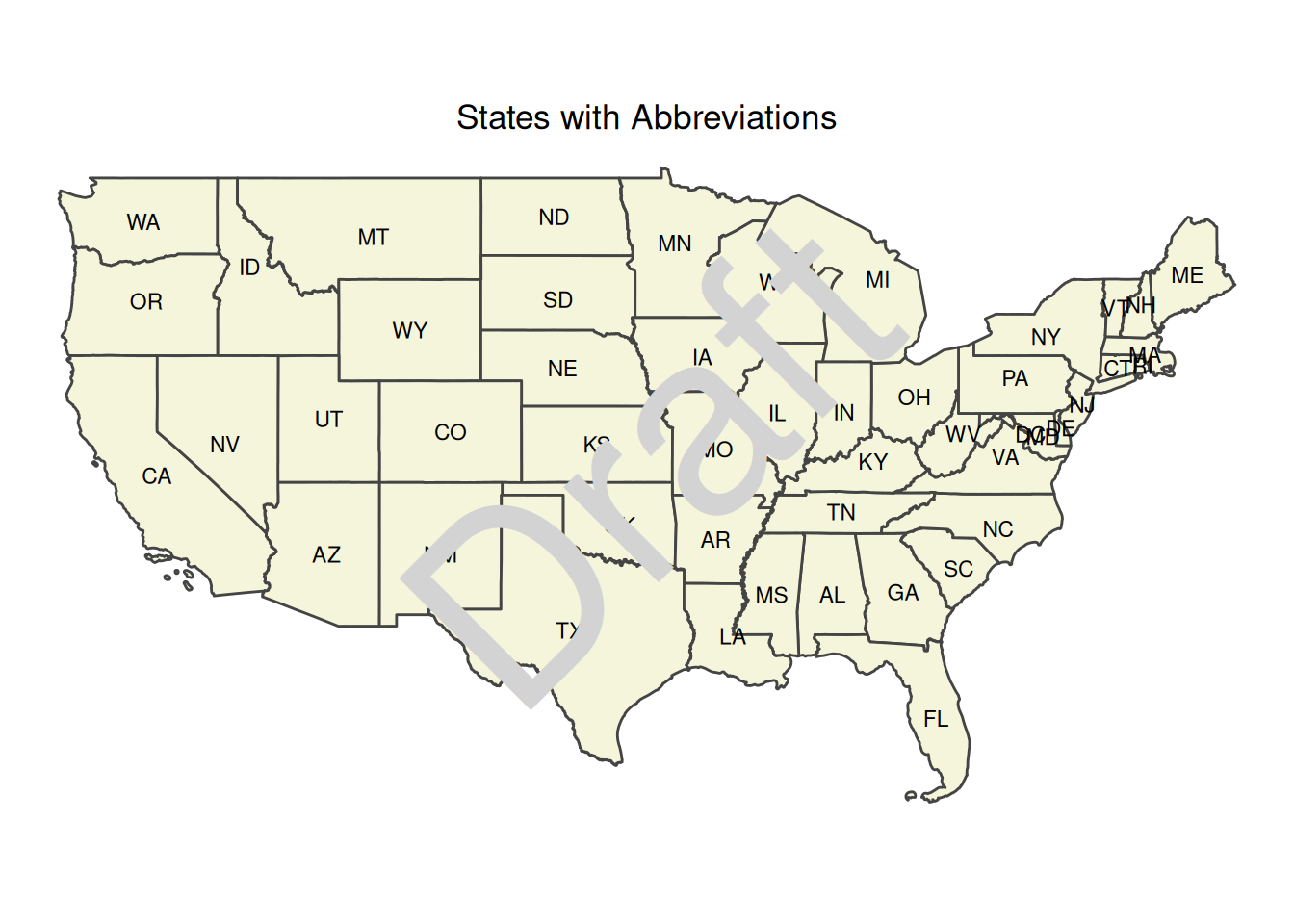
cowplot::ggdraw(export_plot) +
 ggplot2::geom_text(
    data = data.frame(x = 0.5,
                      y = 0.5, label = "Draft"),
    ggplot2::aes(x, y, label = label),
    hjust = 0.5, vjust = 0.5, angle = 45, size = 100/ggplot2::.pt,
    color = "lightgray",
    inherit.aes = FALSE
  )