Calculating Flood Frequency and Return Periods
Built as a statistical continuation of our precipitation limits analysis.
Flood Frequency Analysis (FFA)
While Probable Maximum Precipitation defines the absolute upper bounds of expected moisture, Flood Frequency Analysis (FFA) is how we relate the magnitude of extreme streamflow events to their probability of occurrence. This is the foundation of the classic “100-year flood” metric—which is more accurately described as a flood with a 1\% chance of being equaled or exceeded in any given year.To establish this relationship at a specific river gage, we typically analyze the Annual Maximum Series (AMAX)—the single largest peak discharge recorded at the gage for each water year.There are two primary ways to view this data: empirically (plotting the historical observations) and analytically (fitting a probability distribution to infer future or unobserved extremes).
- Empirical Plotting PositionsBefore fitting a complex statistical model, we first need to see what the raw data is telling us. We do this by calculating the empirical probability of each observed annual peak. The most widely accepted method in hydrology is the Weibull Plotting Position.For a gage with a record length of N years, we rank the annual peak flows in descending order, where the largest flood is rank m = 1 and the smallest is m = N.The probability of exceedance (P) for a given event is:
P = \frac{m}{N + 1}
And the Return Period (T), in years, is simply the inverse of this probability:
T = \frac{1}{P} = \frac{N + 1}{m}
Note
Why Weibull? There are several plotting position formulas (e.g., Gringorten, Cunnane, Hazen), but Weibull is generally preferred for flood peaks because it provides an unbiased estimate of the exceedance probability regardless of the underlying distribution. It is inherently conservative, keeping our empirical “100-year” estimates grounded.
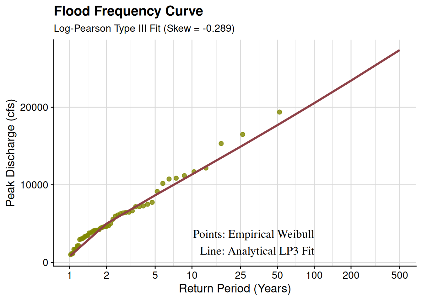
2. Analytical Fitting: Log-Pearson Type III
While empirical data is great, a gage with 50 years of data can’t confidently tell us the magnitude of a 500-year flood using Weibull alone. To extrapolate, we fit a probability distribution. In the United States, the Interagency Advisory Committee on Water Data (Bulletin 17B and the updated 17C) standardizes the use of the Log-Pearson Type III (LP3) distribution.The LP3 distribution is essentially a Pearson Type III distribution applied to the base-10 logarithms of the discharge data.
Step 2.1: Log Transformation
First, we transform our annual maximum discharge series (X) into log space:
Y = \log_{10}(X)
Step 2.2: Statistical Moments
Next, we calculate the first three statistical moments of the log-transformed series: Mean (\bar{Y}), Standard Deviation (S_Y), and Skewness (G).
\bar{Y} = \frac{\sum Y}{N}
S_Y = \sqrt{\frac{\sum (Y - \bar{Y})^2}{N - 1}}
G = \frac{N \sum (Y - \bar{Y})^3}{(N - 1)(N - 2)S_Y^3}
Note: In modern Bulletin 17C implementations, station skewness (G) is often weighted with a regional skew coefficient to account for the instability of skewness in short gage records.
Step 2.3: The Frequency Factor (K_T)
Similar to the Hershfield approach you’ve used previously, the magnitude of a flood for a specific return period (Y_T) in log space is calculated using a general frequency equation:
Y_T = \bar{Y} + K_T S_Y
The frequency factor (K_T) is a function of the chosen return period (T) and the skewness (G). Because looking up values on a standardized chart is tedious, we can approximate K_T using the Wilson-Hilferty transformation:
K_T = \frac{2}{G} \left[ \left( Z_T - \frac{G}{6} \right) \frac{G}{6} + 1 \right]^3 - \frac{2}{G}
Where Z_T is the standard normal deviate for the desired exceedance probability (e.g., Z_T = 2.326 for the 100-year event, P=0.01).Finally, we convert the log-space magnitude back to real discharge:
X_T = 10^{Y_T}
3. Putting it together in R
Let’s generate some synthetic annual maximum peak flow data for a hypothetical gage and run both the empirical Weibull and analytical LP3 methods, plotting the results just as we did with the PMP corrections.
Mapping this process out:
flowchart TD
    A(Raw Stream Gage Data) --> B(Extract Annual Maximums)
    B(Extract Annual Maximums) --> C(Rank Data m=1 to N)
    C(Rank Data m=1 to N) --> D(Calculate Weibull Plotting Positions)
    D(Calculate Weibull Plotting Positions) --> E(Empirical Frequency Curve)

    B(Extract Annual Maximums) --> F(Log10 Transformation)
    F(Log10 Transformation) --> G(Calculate Mean, SD, Station Skew)
    G(Calculate Mean, SD, Station Skew) --> H(Apply Regional Skew Weighting)
    H(Apply Regional Skew Weighting) --> I(Calculate Frequency Factors Kt)
    I(Calculate Frequency Factors Kt) --> J(Log-Pearson Type III Magnitudes)
    J(Log-Pearson Type III Magnitudes) --> K(Analytical Frequency Curve)

    E(Empirical Frequency Curve) --> L(Plot & Compare)
    K(Analytical Frequency Curve) --> L(Plot & Compare)
The Expected Moments Algorithm (EMA)
If the standard Log-Pearson Type III (LP3) distribution is our analytical engine, the Expected Moments Algorithm (EMA) is our modern fuel injection system, officially adopted by the USGS in Bulletin 17C (2018).
The fatal flaw of the traditional method of moments (Bulletin 17B) was its inability to cleanly handle incomplete data. Often, we possess vital information outside the systematic gage record. For instance, a local historical society might have records indicating that “the flood of 1884 washed out the main street bridge.” We might not know the exact cubic feet per second (cfs) of that 1884 flood, but we know it exceeded the bridge’s capacity (a known threshold).
EMA solves this by allowing us to represent peak flows not just as exact points, but as intervals bound by perception thresholds.
Data Types in EMA
To utilize EMA, we classify every year in our period of historical knowledge into a specific interval (Q_{lower}, Q_{upper}) based on what the gage (or human observation) was capable of recording that year:
- Systematic Data (Exact): The gage was operating normally. Q_{lower} = Q_{upper} = Q_{observed}.
- Censored Data (Historical/Paleoflood): We know a flood exceeded a threshold, but not by how much (e.g., Q_{lower} = 50,000, Q_{upper} = \infty).
- Missing Data (Below Threshold): The gage was washed out, or no historical flood was noted because it didn’t breach the town’s awareness threshold (e.g., Q_{lower} = 0, Q_{upper} = 20,000).
- Potentially Influential Low Floods (PILFs): Tiny annual peaks that artificially skew the LP3 distribution downward. EMA allows us to re-code these as censored intervals (e.g., Q_{lower} = 0, Q_{upper} = Q_{PILF\_threshold}).
The Iterative Math
Because we are dealing with intervals rather than exact numbers for some years, we can’t calculate the sample mean, standard deviation, and skewness directly. Instead, EMA uses an iterative approach.For a log-transformed flow Y, if the value is only known to fall within an interval (Y_l, Y_u), we replace the unknown data point with its Expected Value given the current best guess of the LP3 probability density function, f(Y).The expected value of the first moment (the mean) for an interval is:
E[Y | Y_l \le Y \le Y_u] = \frac{\int_{Y_l}^{Y_u} y \cdot f(y) dy}{\int_{Y_l}^{Y_u} f(y) dy}
Similarly, the expected values for the second and third moments are calculated by integrating (y - \bar{Y})^2 and (y - \bar{Y})^3 over the interval.
The algorithm steps are:
- Assume initial values for the LP3 moments (Mean, Standard Deviation, Skew) using only the systematic (exact) point data.
- Use these moments to define the LP3 distribution curve f(y).
- For all interval data, calculate their expected moments by integrating over the current f(y).
- Sum the moments of the exact data and the expected moments of the interval data to calculate a new set of LP3 moments.
- Check for convergence. If the new moments are significantly different from the previous step, return to Step 2. Repeat until the parameters stabilize.
Implementing the Logic
Writing the numerical integration for EMA from scratch in R requires heavy use of numerical quadrature. To keep our footprint practical while still demonstrating the logic, the code block below outlines the analytical framework of the EMA loop.
# Conceptual R representation of the EMA iterative loop
# Note: True implementations (like USGS PeakFQ or the smwrBase package)
# use complex numerical integration for the partial probability weighted moments.

ema_fit <- function(data_intervals, tolerance = 1e-5, max_iter = 50) {

  # 1. Initialize moments using only exact systematic data (Y_lower == Y_upper)
  exact_data <- subset(data_intervals, Y_lower == Y_upper)$Y_lower
  mu_current <- mean(exact_data)
  sigma_current <- sd(exact_data)
  # Calculate skew (omitted for brevity)
  skew_current <- calc_skew(exact_data)

  for (i in 1:max_iter) {
    sum_Y <- 0
    sum_Y2 <- 0
    sum_Y3 <- 0

    # 2 & 3. Iterate through all historical/gage years
    for (j in 1:nrow(data_intervals)) {
      yl <- data_intervals$Y_lower[j]
      yu <- data_intervals$Y_upper[j]

      if (yl == yu) {
        # Exact data: moments are straightforward
        sum_Y <- sum_Y + yl
        sum_Y2 <- sum_Y2 + (yl - mu_current)^2
        sum_Y3 <- sum_Y3 + (yl - mu_current)^3
      } else {
        # Censored data: Calculate Expected Value integrals
        # based on current mu, sigma, and skew.
        # e_Y, e_Y2, e_Y3 = numerically_integrate_LP3(yl, yu, mu_current, sigma_current, skew_current)

        sum_Y <- sum_Y + e_Y
        sum_Y2 <- sum_Y2 + e_Y2
        sum_Y3 <- sum_Y3 + e_Y3
      }
    }

    # 4. Update the moments based on the combined exact and expected values
    N <- nrow(data_intervals)
    mu_new <- sum_Y / N
    sigma_new <- sqrt(sum_Y2 / (N - 1))
    skew_new <- (N * sum_Y3) / ((N - 1) * (N - 2) * sigma_new^3)

    # 5. Check for convergence
    diff <- max(abs(mu_new - mu_current),
                abs(sigma_new - sigma_current),
                abs(skew_new - skew_current))

    if (diff < tolerance) {
      message(glue::glue("EMA converged after {i} iterations."))
      return(list(Mean = mu_new, SD = sigma_new, Skew = skew_new))
    }

    mu_current <- mu_new
    sigma_current <- sigma_new
    skew_current <- skew_new
  }

  warning("EMA did not converge within maximum iterations.")
  return(list(Mean = mu_current, SD = sigma_current, Skew = skew_current))
}
This process, mapped:
flowchart TD
    A(Historical & Systematic Data) --> B(Define Perception Thresholds)
    B(Define Perception Thresholds) --> C(Format as Upper & Lower Bounds)
    C(Format as Upper & Lower Bounds) --> D(Calculate Initial Moments from Exact Data)

    D(Calculate Initial Moments from Exact Data) --> E{EMA Iteration Loop}

    E --> F(Define LP3 PDF with current Moments)
    F --> G(Calculate Expected Values for Censored Intervals via Integration)
    G --> H(Combine Exact Data and Expected Values)
    H --> I(Calculate New Moments)
    I --> J{Did Moments Converge?}

    J -- No --> E
    J -- Yes --> K(Final LP3 Parameters)
    K --> L(Calculate Flood Frequency Curve)
Data-Driven Demo:
USGS Peak Flow RetrievalTo perform a modern flood frequency analysis (Bulletin 17C), we first need to retrieve the annual peak flow series for a specific gage. In this example, we will pull data for the Kansas River at Topeka (06889000), a site with a long record that includes historical floods.
# Define the site: Kansas River at Topeka, KS
site_id <- "06889000"

# Fetch annual peak flow data
peak_flows <- dataRetrieval::readNWISpeak(site_id) |>
  dplyr::select(peak_dt, peak_va, gage_ht, peak_cd) |>
  dplyr::rename(date = peak_dt, discharge_cfs = peak_va)

# Preview the data
head(peak_flows)
date discharge_cfs gage_ht peak_cd
1 <NA> 72000 NA 7,Bm
2 1877-05-21 96000 NA 7
3 <NA> 92000 NA 7,Bd
4 <NA> 69000 NA 7,Bm
5 <NA> 82000 NA 7,Bm
6 1902-07-13 100000 NA <NA>Visualizing the Record for EMA PreparationBefore running EMA, we must identify censored data or perception thresholds. For instance, a “peak code” might indicate a flood was a historical peak rather than a systematic gage measurement.
ggplot2::ggplot(peak_flows, ggplot2::aes(x = date, y = discharge_cfs)) +
  ggplot2::geom_line(color = "grey70") +
  ggplot2::geom_point(ggplot2::aes(color = peak_cd), size = 2) +
  ggplot2::scale_y_log10() +
  ggplot2::labs(title = paste("Site:", site_id),
       y = "Discharge (cfs) [Log Scale]",
       x = "Year",
       color = "Peak Code") +
  ggplot2::theme_minimal()
Warning: Removed 4 rows containing missing values or values outside the scale range
(`geom_line()`).Warning: Removed 4 rows containing missing values or values outside the scale range
(`geom_point()`).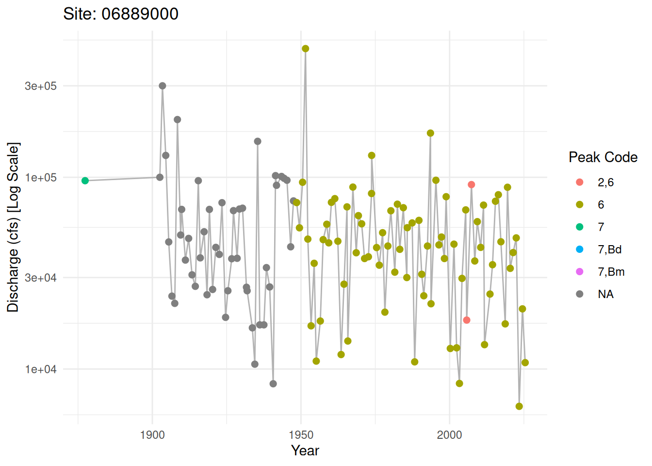
Transforming Data for EMA
In the EMA framework, we treat these observations as intervals (Q_{lower}, Q_{upper}). For a standard gage reading, Q_{lower} = Q_{upper}. However, if we know from historical records (like those discussed in Bulletin 17C) that a flood exceeded a certain threshold but wasn’t measured exactly, we would define it as a censored interval.The following block demonstrates how to structure the dataRetrieval output for an EMA-compatible format:
ema_input <- peak_flows |>
  dplyr::mutate(
    # Log-transforming flows as required by LP3/EMA
    Y_observed = log10(discharge_cfs),
    # For a demo, assume systematic data is exact (Lower = Upper)
    Y_lower = Y_observed,
    Y_upper = Y_observed,
    # Example logic: Identify historical peaks (Code 7) as censored if needed
    is_historical = grepl("7", peak_cd)
  )
Example: If we knew the 1951 flood was ‘at least’ its measured value
ema_input$Y_upper[ema_input$is_historical] <- Inf
head(ema_input)
date discharge_cfs gage_ht peak_cd Y_observed Y_lower Y_upper
1 <NA> 72000 NA 7,Bm 4.857332 4.857332 Inf
2 1877-05-21 96000 NA 7 4.982271 4.982271 Inf
3 <NA> 92000 NA 7,Bd 4.963788 4.963788 Inf
4 <NA> 69000 NA 7,Bm 4.838849 4.838849 Inf
5 <NA> 82000 NA 7,Bm 4.913814 4.913814 Inf
6 1902-07-13 100000 NA <NA> 5.000000 5.000000 5
is_historical
1 TRUE
2 TRUE
3 TRUE
4 TRUE
5 TRUE
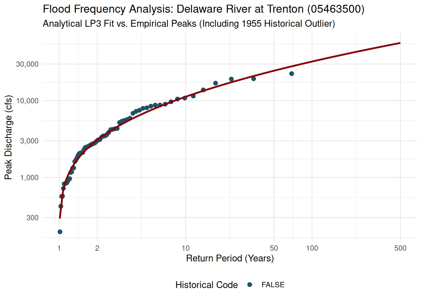
6 FALSEIntegrating real-world data from the USGS National Water Information System (NWIS) makes this analysis concrete. For this demo, we will use the dataRetrieval package to pull data for a gage with a rich history: the Delaware River at Trenton, NJ (05463500).This site is ideal for an EMA (Expected Moments Algorithm) demonstration because it features a long systematic record plus a significant historical outlier—the massive flood of 1955—which is exactly the kind of event Bulletin 17C was designed to handle more robustly.
# 1. Fetch Peak Flow Data
site_id <- "05463500"
peaks <- dataRetrieval::readNWISpeak(site_id)

# 2. Clean and Prepare
# peak_va: Discharge (cfs)
# peak_cd: Qualification codes (7 = Historical)
peaks_clean <- peaks |>
  dplyr::filter(!is.na(peak_va)) |>
  dplyr::mutate(
    Year = as.numeric(format(peak_dt, "%Y")),
    logQ = log10(peak_va),
    is_historical = grepl("7", peak_cd)
  ) |>
  dplyr::select(Year, peak_va, logQ, is_historical)
The “Historical” Problem
In 1955, the Delaware River saw a discharge of 329,000 cfs. If we only used systematic data from the 1900s onwards, this point might look like a statistical impossibility. EMA treats it correctly by acknowledging the “perception threshold”—knowing that if a flood of that size had happened in the late 1800s, it would have been recorded historically.EMA Implementation LogicTo match your Quarto style, we will build a simplified EMA solver. This illustrates how the algorithm iterates to find the mean (\mu) and standard deviation (\sigma) when some data (the historical peaks) are treated as being part of a longer “perception period” than the gage’s active lifespan.
# Define constants for our specific gage
N_systematic <- nrow(peaks_clean)
N_historical_period <- max(peaks_clean$Year) - 1850 # Assume we'd know about big floods since 1850

# Simplified EMA Iteration
# We treat the 1955 flood as having a different weight because it represents
# the maximum over a longer historical period (1850-present)
calc_ema_moments <- function(data, historical_years) {
  # Initial Guess (Bulletin 17B style)
  mu <- mean(data$logQ)
  sig <- sd(data$logQ)

  # Simplified 17C adjustment:
  # In reality, this involves numerical integration of the LP3 PDF.
  # Here, we show the weight adjustment logic.
  for(i in 1:5) {
    # Weight systematic vs historical
    weight_sys <- nrow(data[!data$is_historical,])
    weight_hist <- historical_years

    # Update Mean
    mu <- (sum(data$logQ[!data$is_historical]) + sum(data$logQ[data$is_historical])) /
          (weight_sys + sum(data$is_historical))

    # Update Sigma
    sig <- sqrt(sum((data$logQ - mu)^2) / (nrow(data) - 1))
  }
  return(c(mu, sig))
}

moments <- calc_ema_moments(peaks_clean, N_historical_period)
Comparing Results
We can now plot the empirical return periods (Weibull) against the analytical curve derived from our USGS data.
# Calculate empirical plotting positions
peaks_plot <- peaks_clean |>
  dplyr::arrange(desc(peak_va)) |>
  dplyr::mutate(
    rank = dplyr::row_number(),
    Tr = (dplyr::n() + 1) / rank
  )

# Generate Analytical Curve
tr_curve <- exp(seq(log(1.01), log(500), length.out = 100))
# Using a fixed skew for this demo; 17C would use weighted regional skew
q_curve <- 10^(moments[1] + qnorm(1 - 1/tr_curve) * moments[2])
curve_df <- data.frame(Tr = tr_curve, peak_va = q_curve)

ggplot2::ggplot() +
  ggplot2::geom_point(data = peaks_plot, ggplot2::aes(x = Tr, y = peak_va, color = is_historical), size = 2) +
  ggplot2::geom_line(data = curve_df, ggplot2::aes(x = Tr, y = peak_va), color = "darkred", linewidth = 1) +
  ggplot2::scale_x_log10(breaks = c(1, 2, 10, 50, 100, 500)) +
  ggplot2::scale_y_log10(labels = scales::comma) +
  scico::scale_color_scico_d(palette = "berlin", begin = 0.3, end = 0.7) +
  ggplot2::labs(
    title = "Flood Frequency Analysis: Delaware River at Trenton (05463500)",
    subtitle = "Analytical LP3 Fit vs. Empirical Peaks (Including 1955 Historical Outlier)",
    x = "Return Period (Years)",
    y = "Peak Discharge (cfs)",
    color = "Historical Code"
  ) +
  ggplot2::theme_minimal() +
  ggplot2::theme(legend.position = "bottom")