RAS2FIM version explainer
Parent model
V1
What does the model look like?
A map…
What are the Rating Curves?
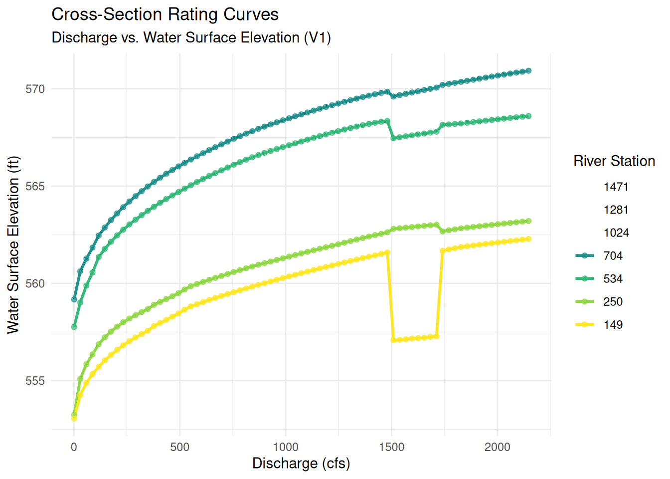
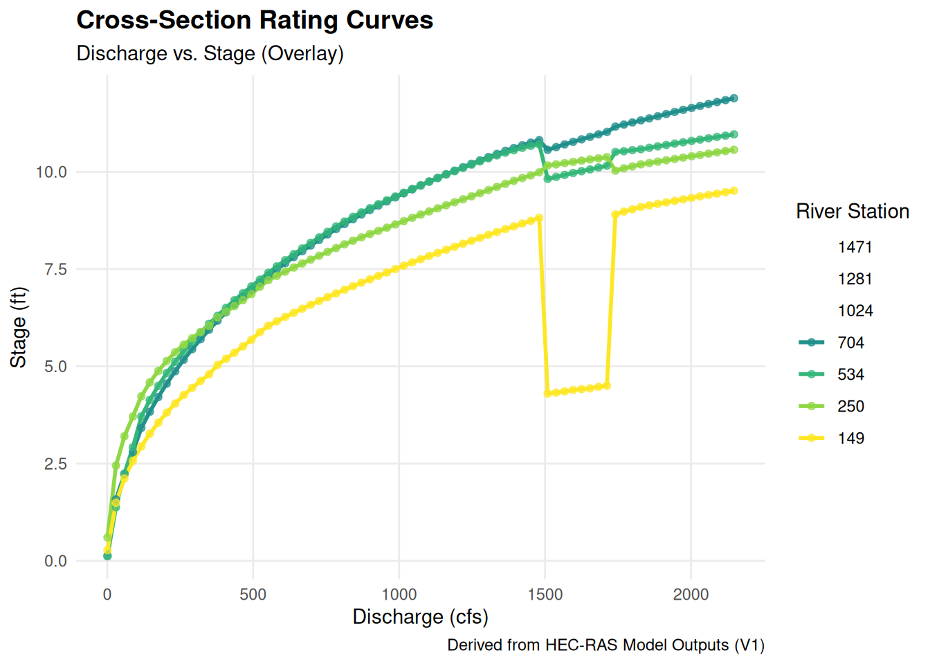
Zoom: 16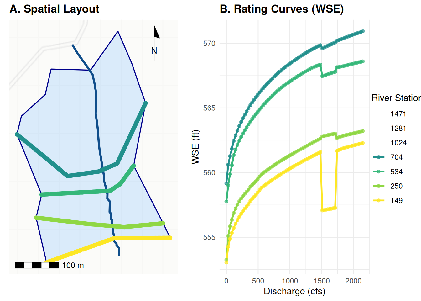
Longitudinal model profiles
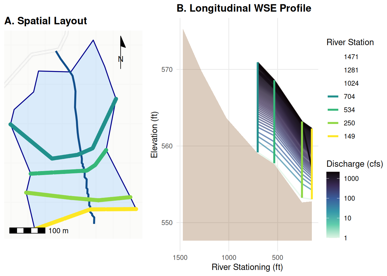
V2
What does the model look like?
A map…
What are the Rating Curves?
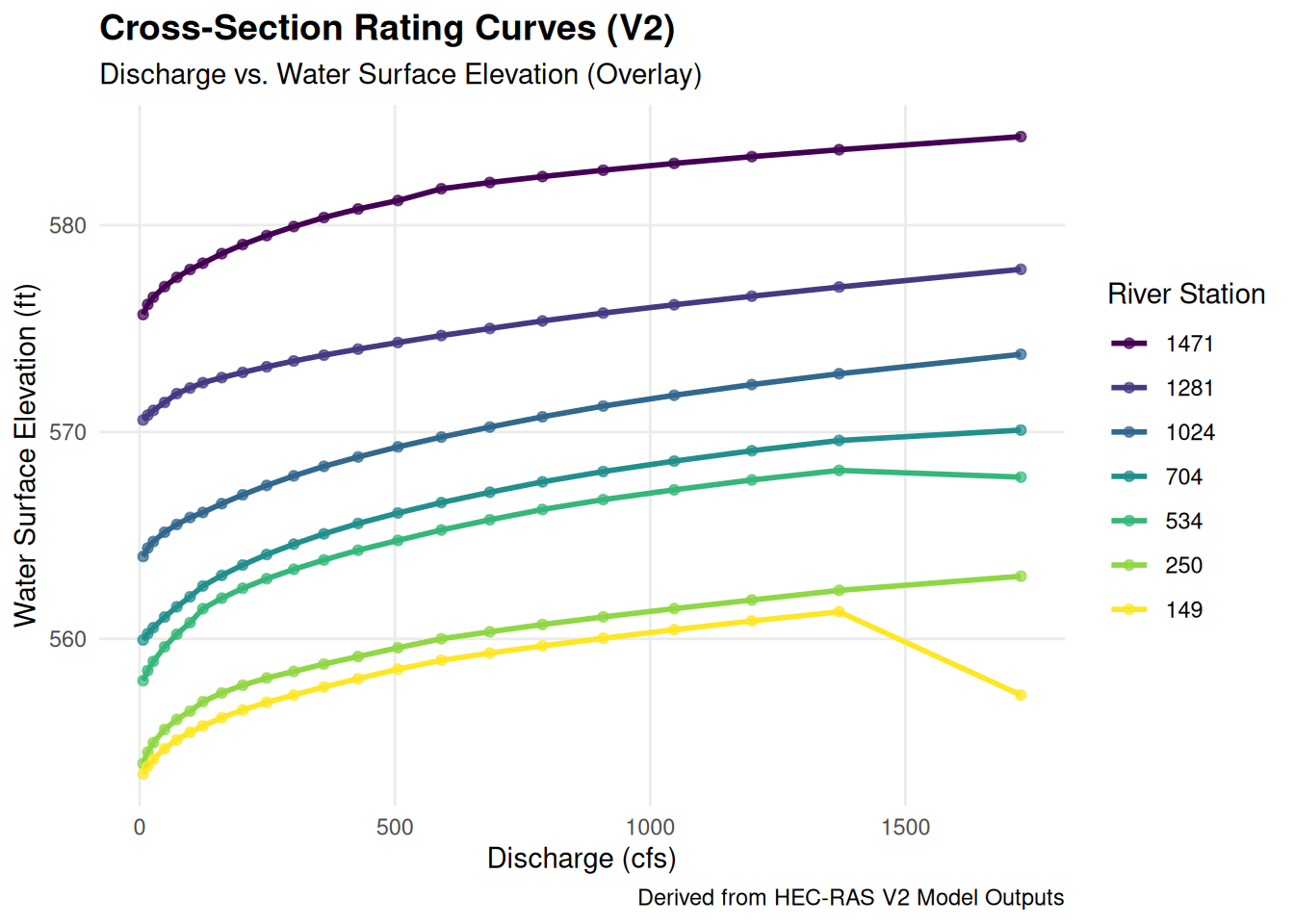
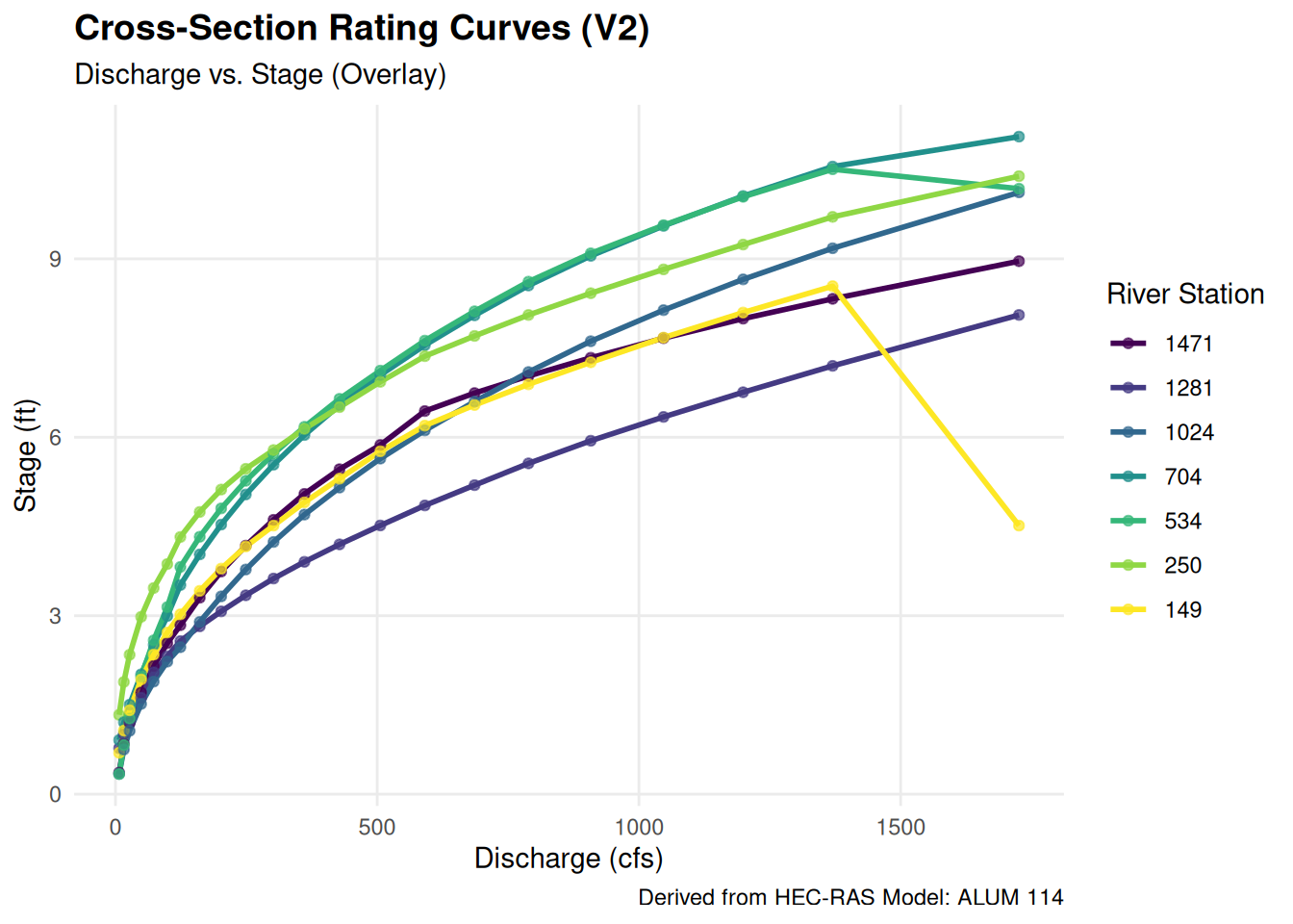
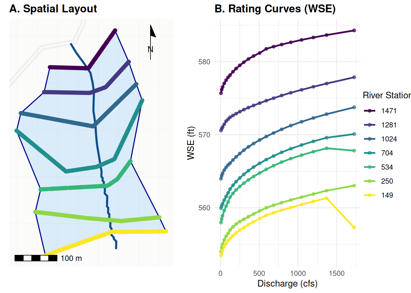
Longitudinal model profiles
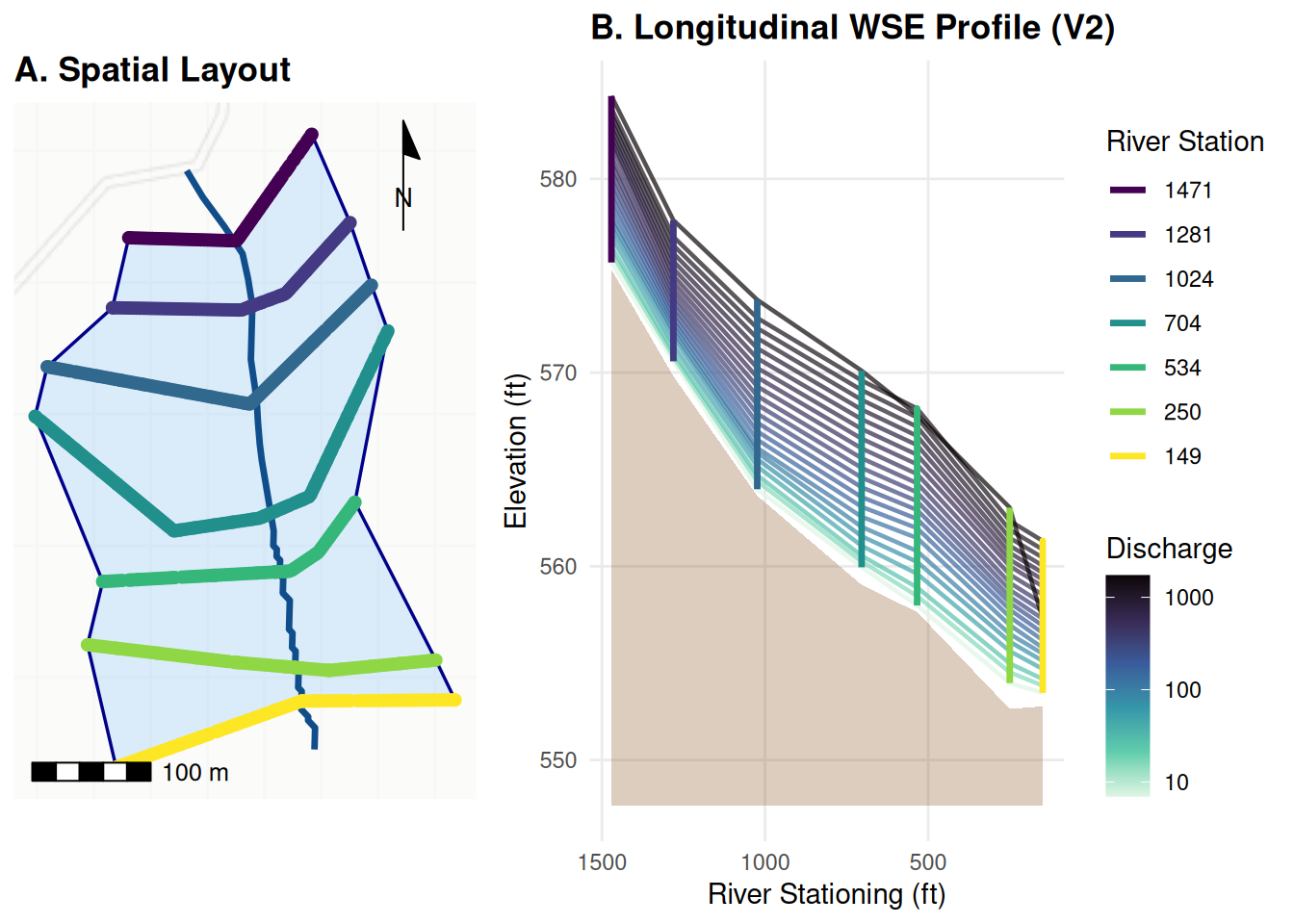
Compairing otherwise identical models
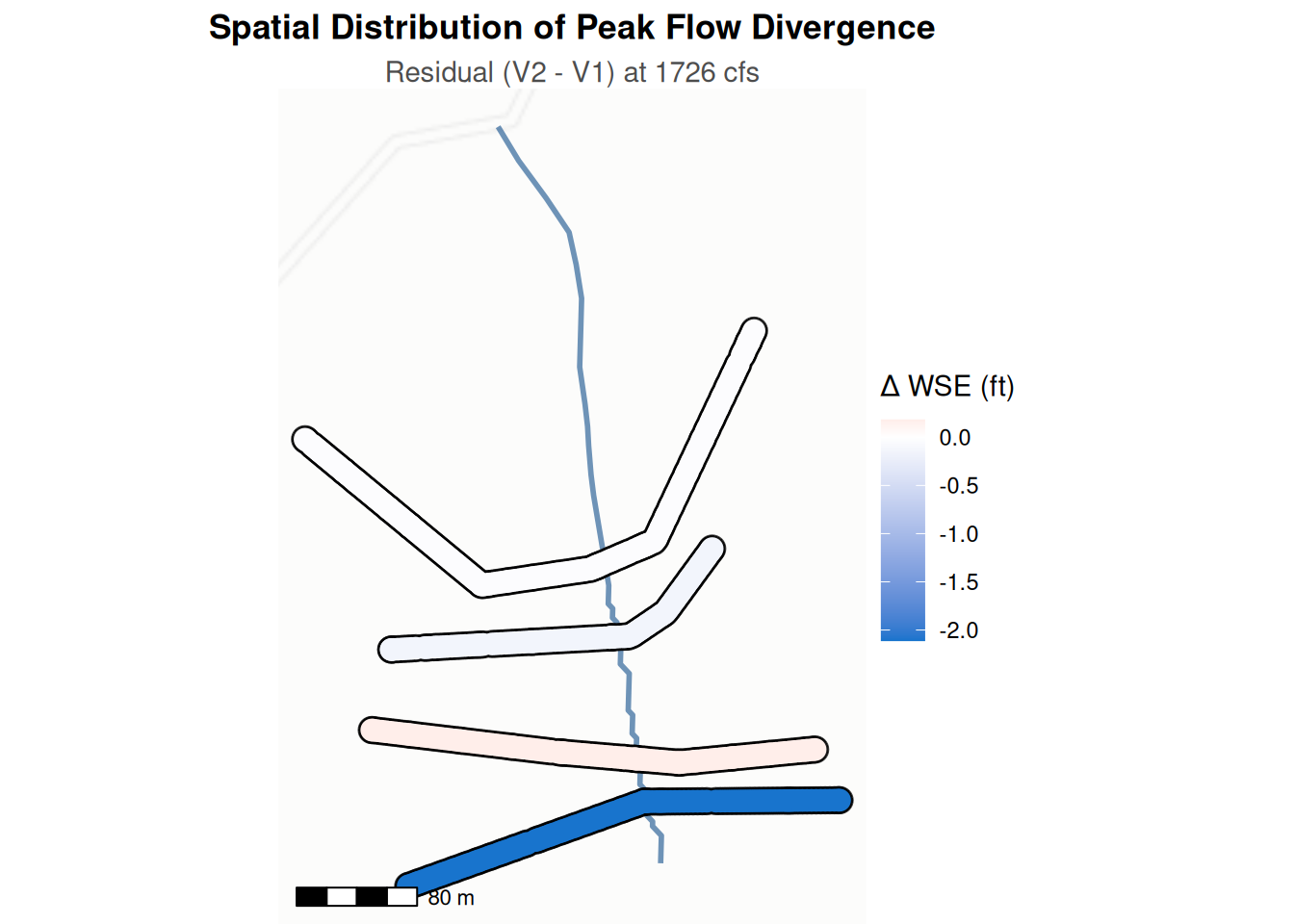
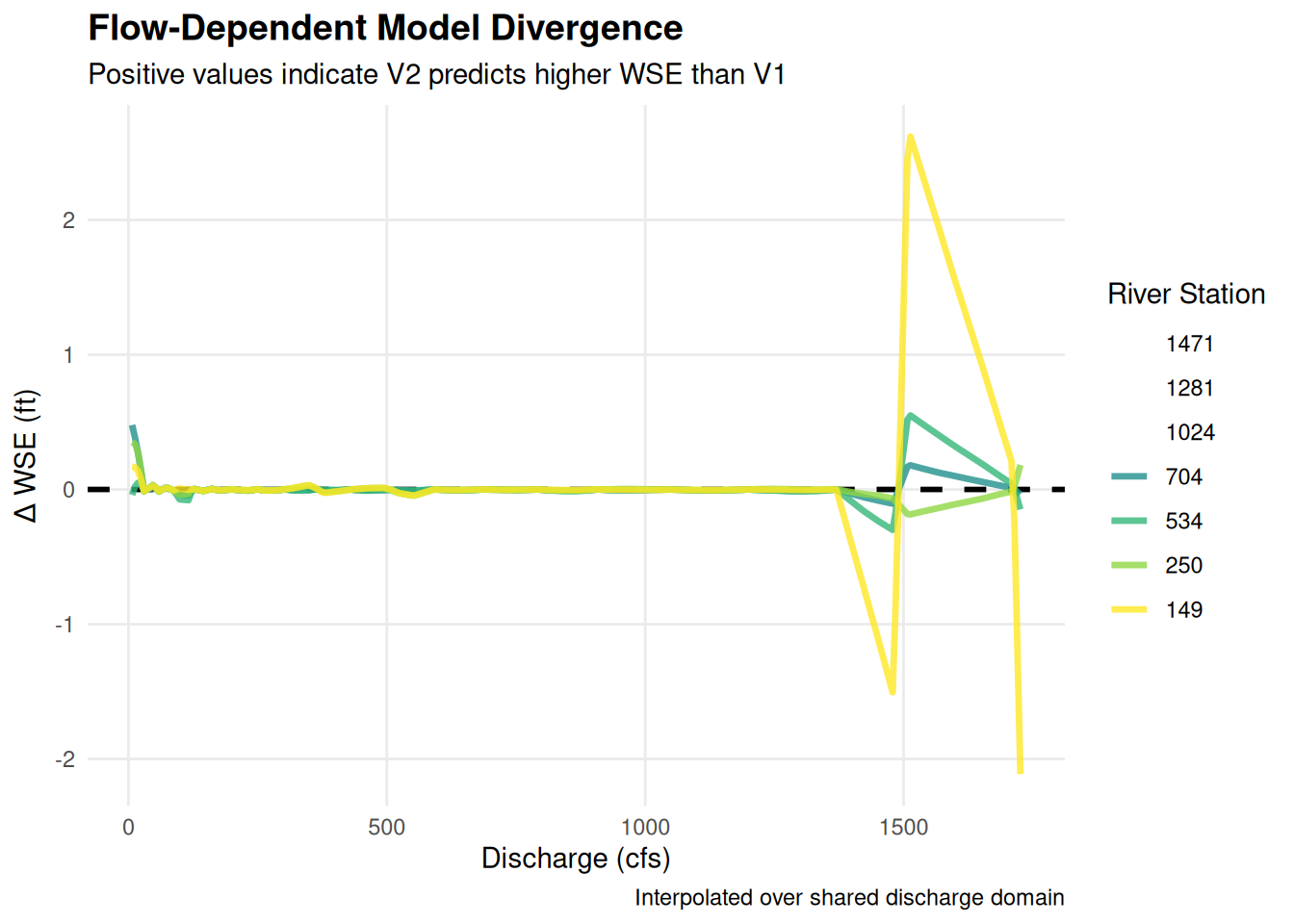
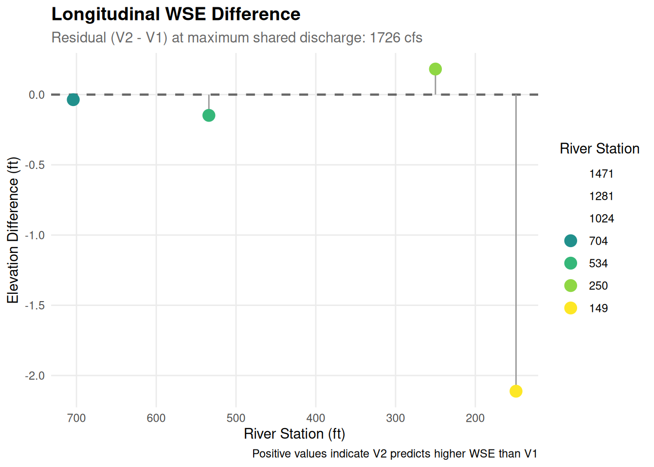
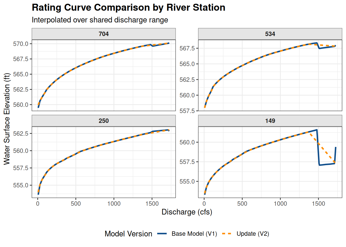
Hydraulic models have an incredible number of parameters. Comparing them directly requires harmonizing their outputs across a shared domain.
| Model Comparison Metrics | ||||
| Analysis of WSE Residuals (V2 - V1) across interpolated flow range | ||||
| River Stationing | MAE (ft) | RMSE (ft) | Mean Bias (ft) | Max Absolute Diff (ft) |
|---|---|---|---|---|
| 704 | 0.024 | 0.057 | 0.008 | 0.478 |
| 534 | 0.055 | 0.129 | 0.022 | 0.549 |
| 250 | 0.026 | 0.057 | −0.014 | 0.351 |
| 149 | 0.252 | 0.631 | 0.117 | 2.618 |
| Metrics calculated over the shared discharge domain. | ||||
global_max_width <- max(ras_xs$xid_d, na.rm = TRUE)
y_range <- range(common_q_seq)

ras_xs_mapped <- ras_xs |>
  dplyr::left_join(crosswalk, by = "xid") |>
  dplyr::filter(Xsection_name_mapped %in% stations_numeric) |>
  # CRITICAL FIX: Arrange by station and then relative distance
  # to ensure the path is drawn monotonically from one bank to the other.
  dplyr::arrange(Xsection_name_mapped, xid_d) |>
  dplyr::group_by(Xsection_name_mapped) |>
  dplyr::mutate(
    y_geom = y_range[1] + (xid_d / global_max_width) * (y_range[2] - y_range[1]),
    z_ft = z * 3.28084,
    z_stage = z_ft - min(z_ft),
    # explicitly map the factor here so Plotly can use it for coloring
    XS_Factor = factor(Xsection_name_mapped, levels = ordered_levels)
  ) |>
  dplyr::ungroup()

merged_3d_plot <- plotly::plot_ly() |>
  # V1 Surface (Base)
  plotly::add_surface(
    x = ~stations_numeric, y = ~common_q_seq, z = ~v1_interp_matrix,
    name = "Base Model (V1)", opacity = 0.3,
    colorscale = list(c(0, 1), c("#2c7bb6", "#2c7bb6")), showscale = FALSE,
    legendgroup = "V1", showlegend = TRUE
  ) |>
  # V2 Surface (Update) with Delta Color
  plotly::add_surface(
    x = ~stations_numeric, y = ~common_q_seq, z = ~v2_interp_matrix,
    surfacecolor = ~diff_matrix, name = "Update (V2) Delta",
    opacity = 0.8, colorscale = "RdBu", reversescale = TRUE,
    colorbar = list(title = "Delta (ft)"),
    legendgroup = "V2", showlegend = TRUE
  ) |>
  # Physical Cross-Sections (The "Walls")
  plotly::add_paths(
    data = ras_xs_mapped,
    x = ~Xsection_name_mapped, y = ~y_geom, z = ~z_stage,
    split = ~XS_Factor,
    color = ~XS_Factor,                          # Map color to the station factor
    colors = global_xs_colors,                   # Apply the predefined named viridis palette
    name = ~paste("XS", Xsection_name_mapped),   # Creates clean legend names (e.g., "XS 114")
    line = list(width = 4),                      # Keep width, remove hardcoded color
    legendgroup = "XS",                          # Keeps them grouped for the toggle click
    showlegend = TRUE
  ) |>
  plotly::layout(
    scene = list(
      xaxis = list(title = "Stationing (ft)", autorange = "reversed"),
      yaxis = list(title = "Relative Width (ft)"),
      zaxis = list(title = "Stage (ft)"),
      aspectmode = "manual",
      aspectratio = list(x = 1, y = 1, z = 0.5)
    ),
    # This allows you to toggle ALL cross-sections by clicking ANY single XS legend item
    legend = list(groupclick = "toggleitem")
  )

merged_3d_plot