Lab 05 - GIS introduction
This lab is a gratefully modified version of lab 5 from Bradley A. Shellito’s Introduction to Geospatial Technologies
This lab introduces you to some of the basic features of GIS. You will be using a free open source program, QGIS, to navigate a GIS environment and begin working with geospatial data. The labs in Chapters 6 and 7 will show you how to utilize several more GIS features; the aim of this lab is to familiarize you with the basic GIS functions of the software. The goals for you to take away from this lab:
- Familiarize yourself with the GIS software environment of your choice, including basic navigation and tool use with both the Map and Browser
- Examine characteristics of geospatial data, such as the coordinate system, datum, and projection information
- Familiarize yourself with adding data and manipulating data layer properties, including changing the symbology and appearance of geospatial data
- Familiarize yourself with data attribute tables in QGIS
- Join a table of non-spatial data to a layer’s attribute table in QGIS
- Make measurements between objects in QGIS
Outline:
| Data Name | Description |
|---|---|
| GEOG111_Lab05Questions.docx | Handout to turn in |
| rawdata/ACSDT5Y2019.B01003_2021-04-18T051624.zip | Population estimates for Kansas Counties from ACS - 2019 |
| rawdata/GOVTUNIT_Kansas_State_GDB.zip | Kansas boundaries from the National Map |
| rawdata/STRUCT_Kansas_State_GDB.zip | Kansas structures from the National Map |
| rawdata/TRAN_Kansas_State_GDB.zip | Kansas transportation layer from the National Map |
You are answering the questions (laid out in the word doc above and also included in the tutorial below) as you work through the lab. Use full sentences as necessary to answer the prompts and submit it to blackboard.
In this lab we’ll use data from two of the most common sources in the US, the National Map and the Census bureau. I’ve gone and downloaded the data for Kansas for you to use, but if you want to do this for a state you are more interested in…
- We’ll get started in the National Map. This provides easy access to a number of data sets at useful geographic units. Start by defining an AOI (Area of Interest), the simplest is a point within the boundaries of your state.
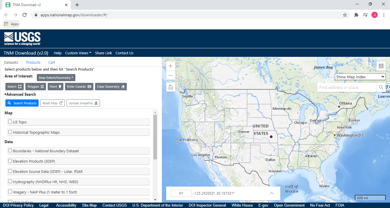
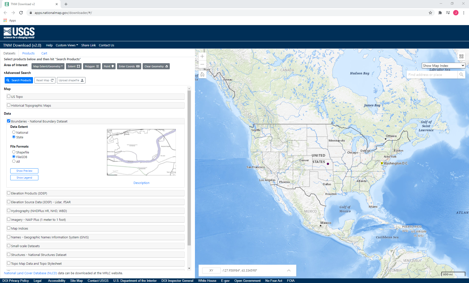
- Next, select the Boundaries - National Boundary Dataset check box and within that the State and FileGDB radio buttons.
- Do the same for the Structures - National Structures Dataset and Transportation layers.
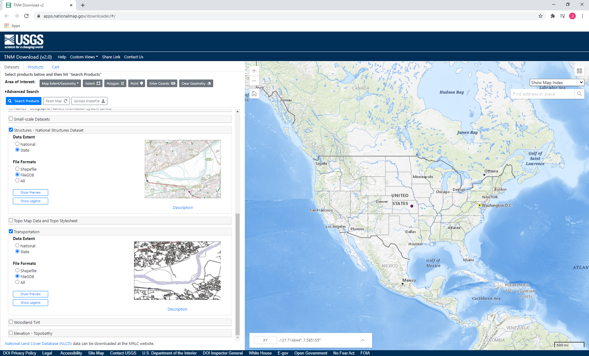
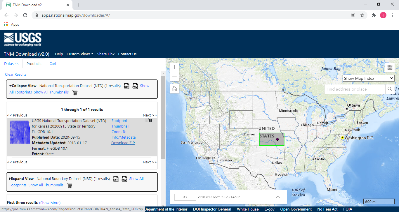
- After you’ve done that click the Search products button at the top. This will filter the data into the requested selections and take you to the Products tab. For each of the requested data sets, you can click the Expand View prompt, and then the Download ZIP prompt to get the data.
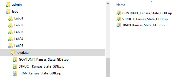
- You should save these in a new folder, preferable in a separate folder. I typically create a folder called rawdata that I place data into. This folder serves as a place to keep data that comes directly from a provider, and I don’t touch it afterwards. Although this might seem a bit overkill, you’ll thank yourself down the road as you grow as a data scientist.
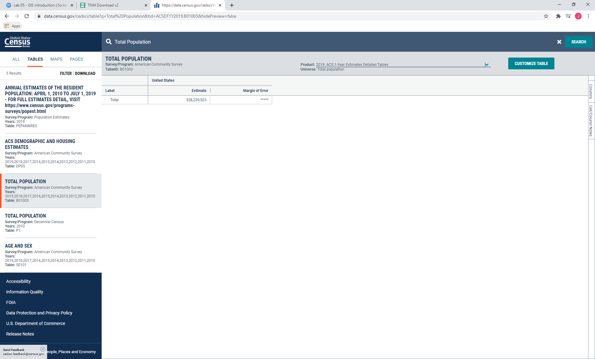
- Finally, we’d like to add population data, and for that, the Census is King? We cover census data in much more detail in future classes but in essence, the census is a rich collection of data hidden behind difficult data conventions, obscure naming schema, and a poor interface that is frustrating for even advanced users to gather and process. Fortunately, grabbing population data is almost straightforward. Starting at the U.S. Census data portal, search for “Total Population” and locate the TOTAL POPULATION table from the American Community Survey.
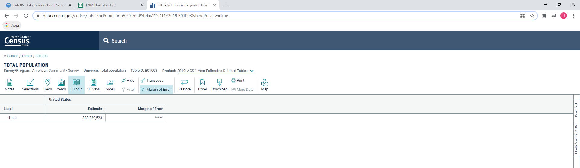
- Click CUSTOMIZE TABLE to find table view, and you should be taken to this page.
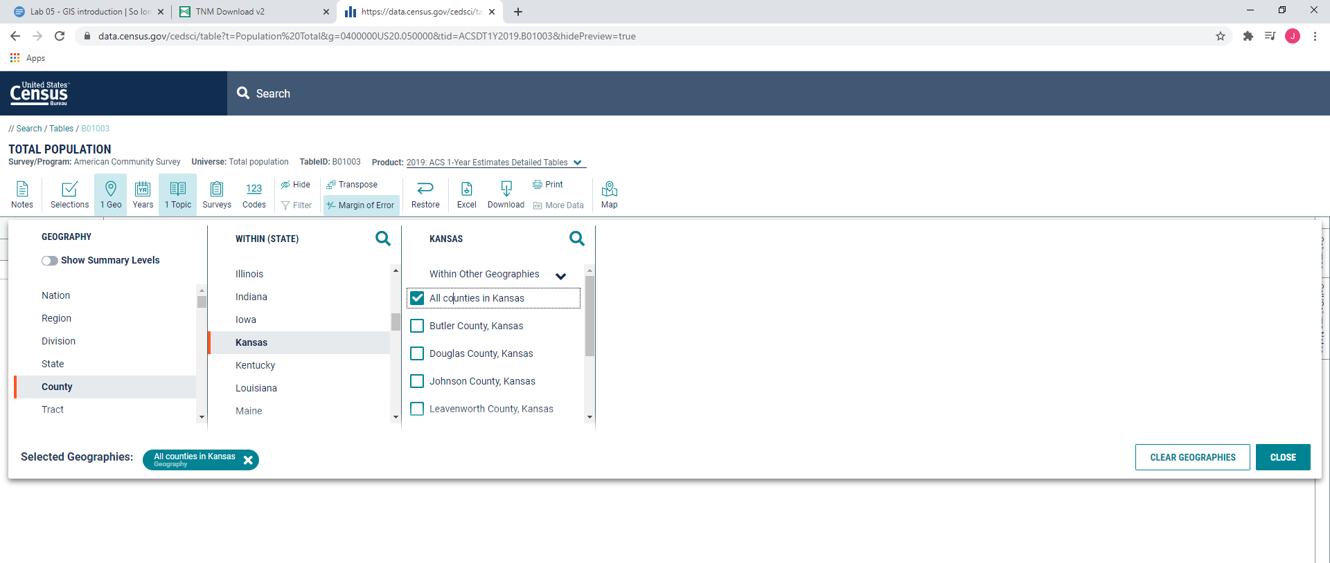
- First, click on the Geo button. We want County populations within your selected states, and we want all counties, like so:
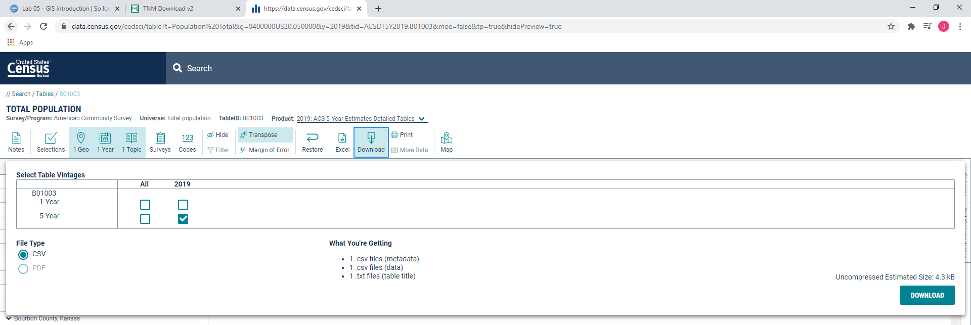
- We can turn off the Margin of Error, and turn on Transpose, and then change the Product to the 5 year estimate. Finally, change the Year tab to the most recent year.
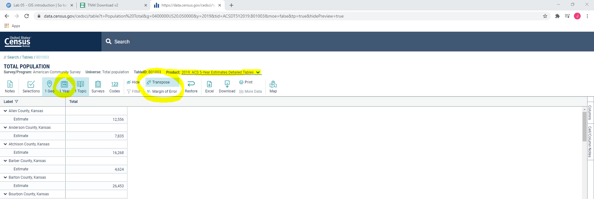
- You can now click Download and save the data to your relevant folder.
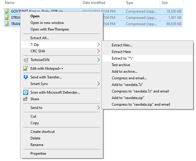
- As you become more versed in the geographic sciences, you’ll slowly learn how data needs to be formatted. One of these is that the Census data we downloaded has an extra row which we’ll need to remove before it’s ready to be used. To do this we first need to unzip the files we’ve downloaded. You can do this one at a time with the standard extract feature built into windows, but I recommend 7-Zip. If you highlight all three and right click > 7-Zip > Extract to “*" it will put them in that same location with the same name.
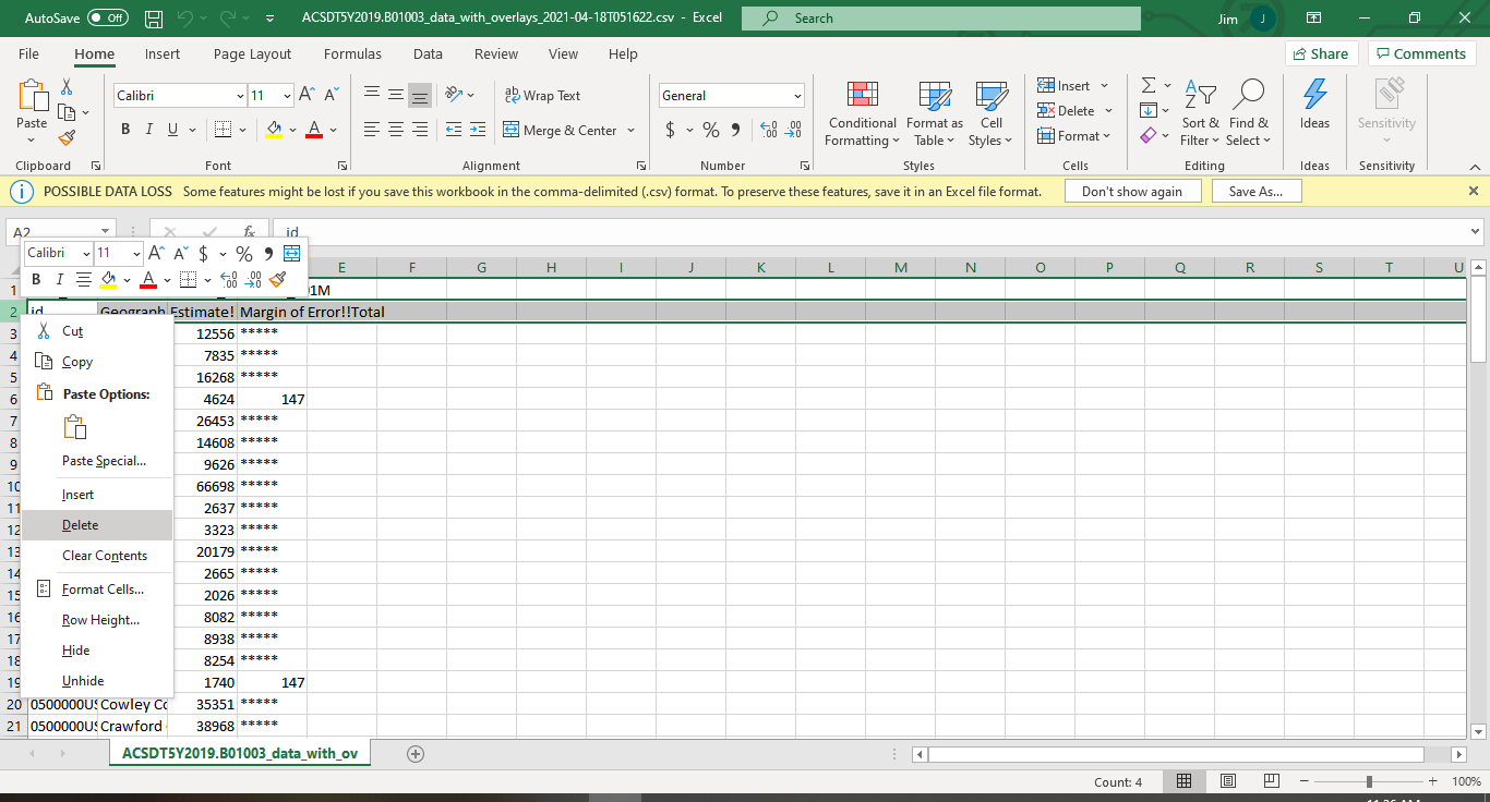
- Recall that we’re working in the “rawdata” folder, but we are about to (irreversibly) modify the data, so we should create a new folder. In general, I create a “storedata” folder for these intermediate products. So, create that folder and then copy the ****data_with_overlays file into it.
- Open it up (Excel is fine), and remove the second row by right clicking on the row number and press delete, and the save it and make sure it’s saved in a .csv format.
Use the start menu to open up your software of choice.
- In the Windows search bar type in “ArcGIS Pro” and open the program.
- In the top right corner make sure you are signed in to your ESRI account.
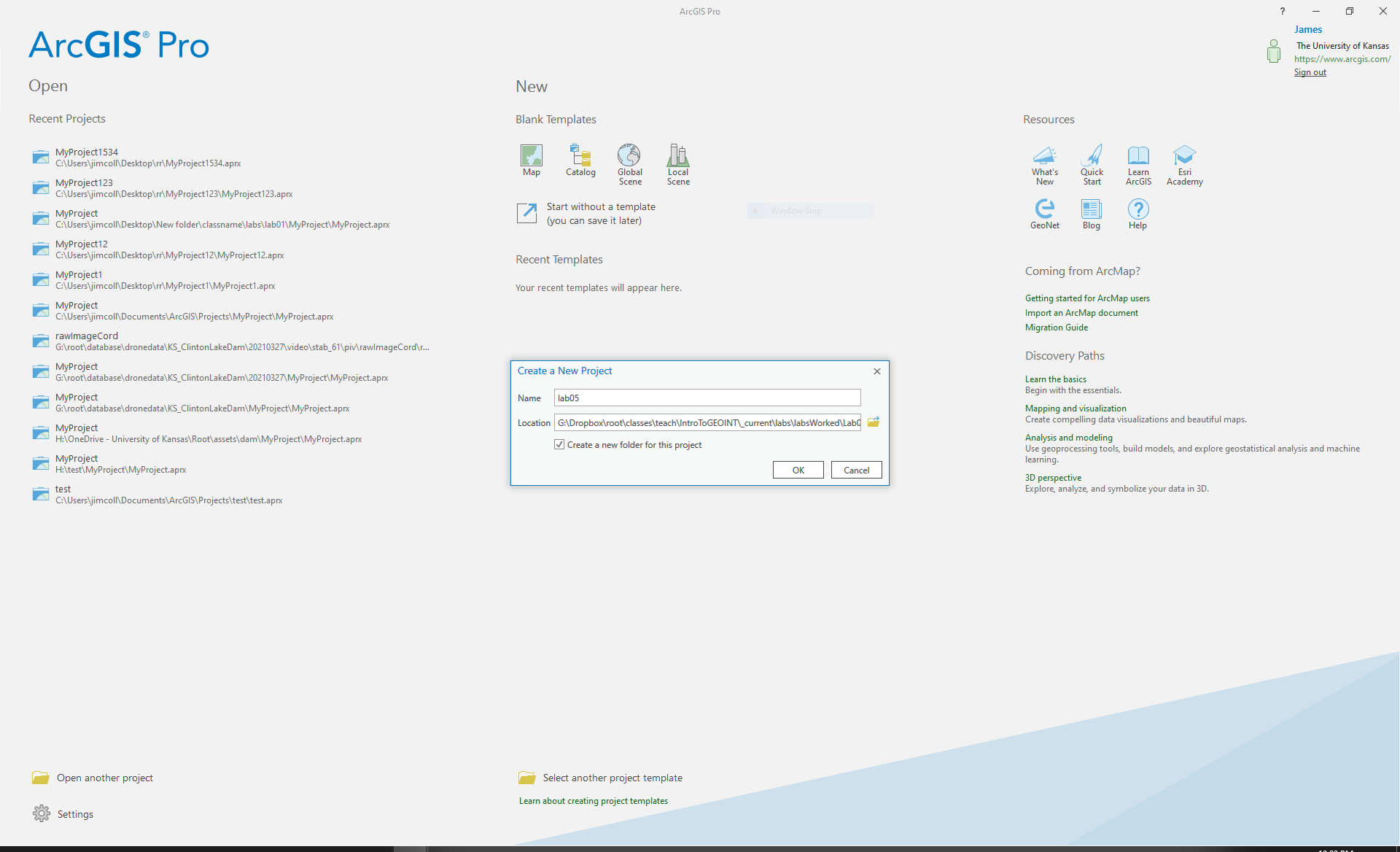
- ArcGIS Pro opens and asks how you want to proceed. You can either open an existing project, begin using a blank project template, or start without a project template. In ArcGIS Pro, a “project” is the means by which you organize all the various layers, tables, maps, and so on of your work, and a “template” is how a project starts when you begin working with ArcGIS Pro. If you were just going to do something quick like examine a GIS layer, you wouldn’t need to use a template. However, as you’ll be doing several things in this lab and to get into the good habit of being digitally organized, click on Map in the New Blank Templates options.
- You are now prompted to give your project a name and indicate where it will be located. Let’s call this project “lab05” and save it in the lab05 folder. Finally, click OK.
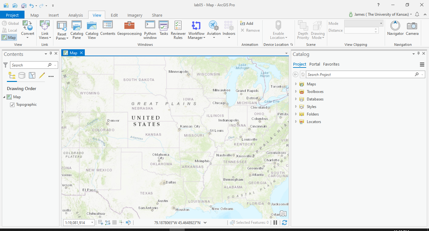
- ArcGIS Pro opens to your project. The large area in the center is referred to as the View. Because you chose the Map template, ArcGIS Pro opened with a new Map for you to add your data to. You can see a new tab called Map in the View, and it contains a topographic map of the United States. In ArcGIS Pro, you add GIS data to a Map so you can work with it. You can have multiple different tabs in the View and switch back and forth between them as needed. For instance, you can have several Maps available at once, each containing different data. You can also have tabs open for one or more Layouts. For this lab, you’ll be using only this one Map.
- Along the top of the window you’ll find the toolbar area. This, along with the toolbox which we’ll cover later, are the primary means of interacting with your data.
- You see a Catalog pane on the right-hand side of the screen and a Contents pane on the left-hand side of the screen (with the word Contents at the top). The Contents pane shows what is contained in the tab that is currently being used. As you add items to whatever you’re working with, you’ll see them available in the Contents pane.
Don’t see them? Click on the view tab at the top and click Reset Panels > Reset Panels for Mapping (default)
 8. With several Maps or tabs open, it’s easy to lose track of what the various tabs contain. Even though you’re using only one Map in this exercise, for ease of use, you can change its name to something more distinctive than “Map.” With the Map tab in the View selected, return to the Contents pane. Right-click on Map and choose Properties.
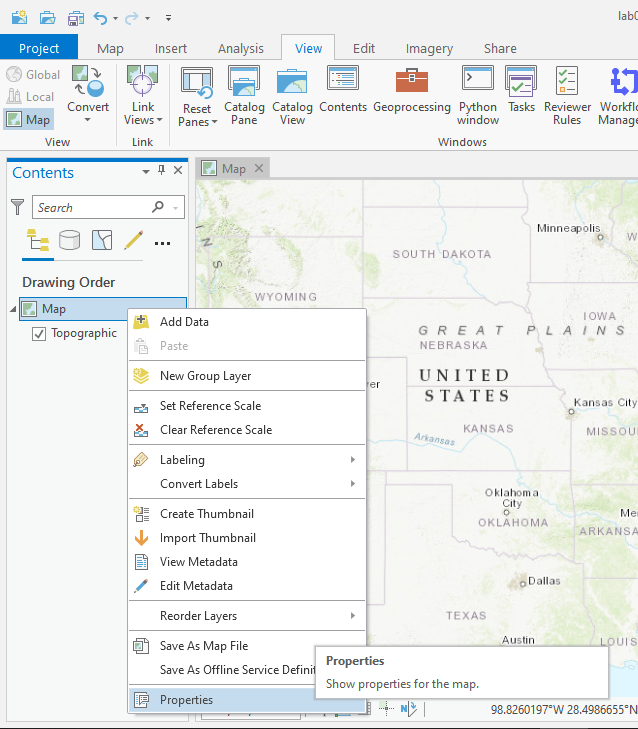
9. The Map Properties dialog box opens. On the General tab, change the name of this Map from Map to “Kansas”. Then click OK to close the Map Properties dialog box. You should now see that the Map tab has changed to be the Kansas tab as well as having updated in the Contents panel.
10. Click the x on the Kansas Map tab to close the map window. To get this back, in the Catalog pane, you see a Maps folder. Expand this, and you’ll see a list of all the Maps you have available in this particular project. You should have only one: the Kansas Map. You can add this map back into the view by coming to this location and double-clicking the Map.
- A fresh map template loads in a standard topographic map, but this can easily be changed on the Map tab under the Basemap icon. Take a second and explore the different options here.
- Navigating around the map is a critical skill you need in order to be a competent practitioner. Fortunately, Google controls became pretty standard and you likely know most of them at this point simply though intuition and general exposure.
- While the Explore button is on, you can left click to pan around the map. Both the right click and the scroll wheel zooms the map in and out.
Does the zoom seem backwards to you? You can change this (The Projects tab > Options > Navigation)
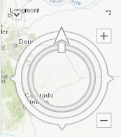
- There is also a Google Earth style navigation compass. If you right click in the map and select Navigator. This opens a navigator compass on the map which allows you to rotate and navigate around the map with a click. Clicking on the arrow reorients yourself northward.
1
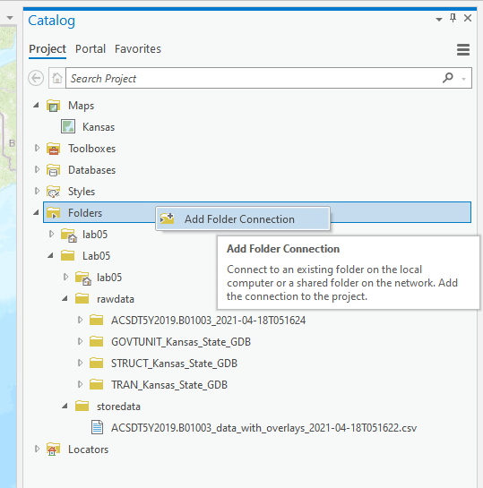
- In the Catalog pane, expand the Folders option, and you see the folders and data available for this project. If you explore your folders, you’ll notice that none of your data is visible. To add data without moving your data between folders manually, right-click on the Folders option and choose Add Folder Connection. From there, navigate to the folder you’ve stored your data in (in this case, the Lab05 folder).
- Expand the geodatabases to verify that it contains the three feature classes you’ll be working with in this lab: Trans_AirportPoint, GU_CountyOrEquivalent, and Trans_TrailSegment.
- Return to the Map. Its corresponding area in the Contents pane is empty, so let’s add some data to work with.
- Click on the Map tab at the top of the screen, and then within the Layer group, click on the Add Data icon (
 ) and select Data. In the dialog box, navigate to the rawdata folder, then the GOVTUNIT_Kansas_State_GDB.gdb geodatabase, and then in the GovernmentUnits you’ll find the GU_CountyOrEquivalent layer. Click OK (or double-click) to add it to the map.
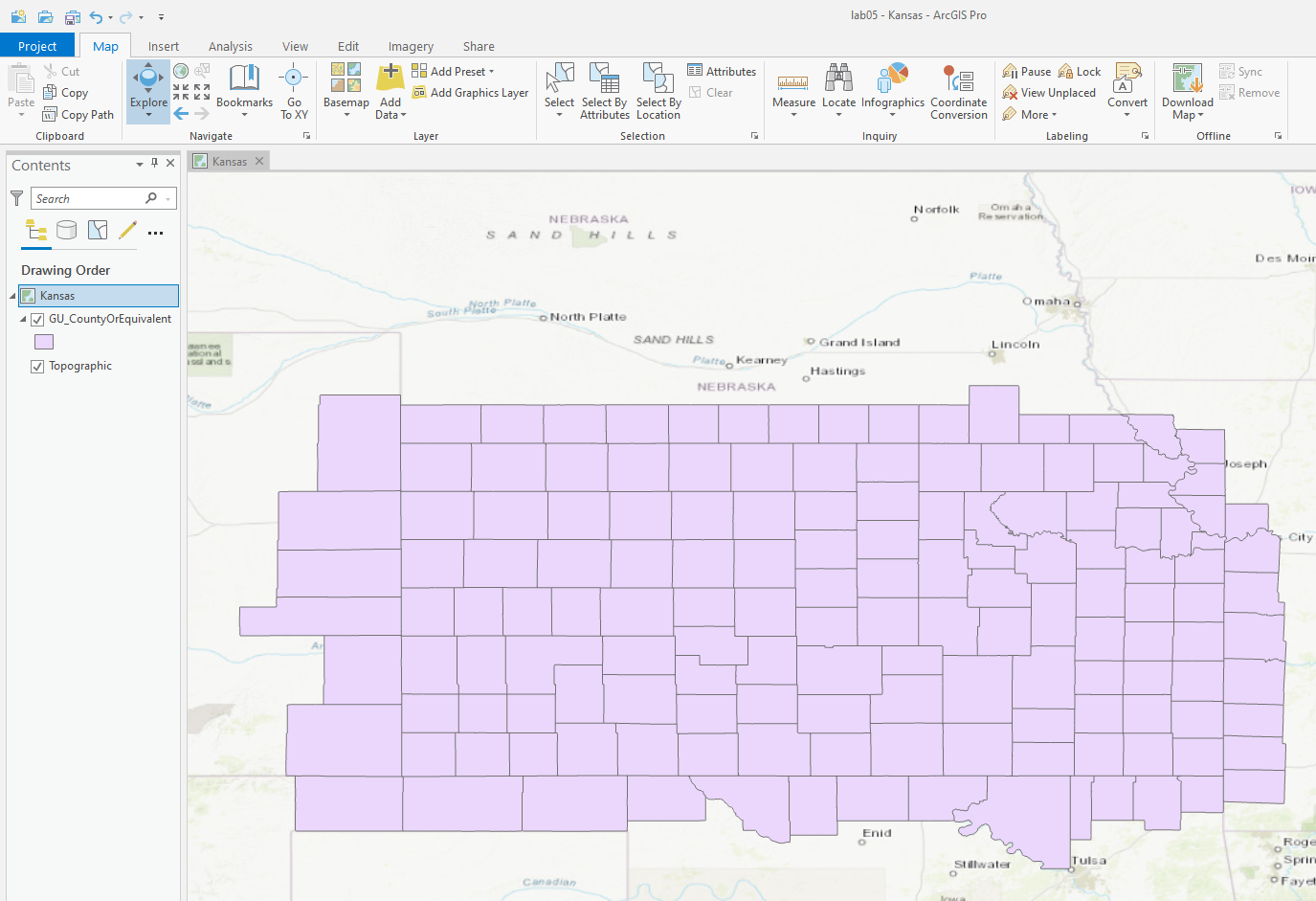
- You now see the GU_CountyOrEquivalent feature class listed in the Layers panel and its contents (a set of polygons displaying each of the counties in Kansas) displayed in the Map View. In the Layers panel, you see a checkmark in the box next to the layer. When this checkmark is displayed, the layer is shown in the Map View, and when the checkmark is removed, the layer is not displayed.
- Let’s add two more layers from the CalData geodatabase: CalAirports (a point layer) and CalTrails (a line layer). All three of your layers are now in the Layers panel.
- You can manipulate the “drawing order” of items in the Layers panel by grabbing a layer with the mouse and moving it up or down in the Layers panel. Whatever layer is at thebottom is drawn first, and the layers above it in the Layers panel are drawn on top of it. Thus, if you move the CalBounds layer to the top of the Layers panel, the other layers are no longer visible in the Map View because the polygons of the CalBounds layer are being drawn over them.
- Next, you need to get some basic information about your GIS layers. Right-click on the CalBounds layer and choose Show Feature Count. A number in brackets appears after the CalBounds name, indicating how many features are in that layer. If each feature in the CalBounds layer represents a county in California, then this is the number of counties in the dataset.
- Repeat step 5 for the CalAirports and CalTrails layers and examine their information.
Question 1 How many airports are represented as points in the CalAirports dataset? (Remember that each feature is a separate polygon.) How many trails are represented as lines in the CalTrails dataset?
- Notice that the symbology generated for each of the three objects is simple: Points, lines, and polygons have been assigned a random color. You can significantly alter the appearance of the objects in the Map View to customize your maps.
- Right-click on the CalBounds layer and select Properties.
- In the Properties dialog box, select the Symbology tab. Here, you can alter the
appearance of the states by changing their style and color, as well as elements of how the
polygons are outlined.

- Select one of the suggested appearances for your polygons. To select a different color for your layer, first click on Fill and then clicking on the solid color bar beside the Color pull-down menu and choose the color you want. Clicking once on Simple fill brings up more options for adjusting the color, border color, border thickness, and so on. These options allow you to alter the CalBounds layer to make it more appealing. After you’ve selected all the options you want, click Apply to make the changes and then click OK to close the dialog box.
- Repeat step 4 to change the appearances for the CalAirports and CalTrails feature classes. Note that you can also change the points for the airports into shapes such as stars, triangles, or a default airport symbol, and you can change the size and color of the airports. Several different styles are available for the lines of the trails as well.
- Chapter 2 discusses the importance of projections, coordinate systems, and datums. All of the information associated with these concepts can be accessed using QGIS. Right-click on the CalBounds feature class and select Properties. Click on the Information tab in the dialog box. Information about the layer (also known as the metadata, or “data about the data”) is shown. The top of the dialog box gives a variety of information, including some shorthand about the coordinate system being used. Carefully read through the abbreviated information to determine what units of measurement are being used for the CalBounds layer.
- Click OK to exit the CalBounds Properties dialog box.
Question 2 What units of measurement (feet, meters, degrees, etc.) are being used in the CalTrails dataset?
Question 3 What units of measurement (feet, meters, degrees, etc.) are being used in the CalAirports dataset?
- QGIS allows you to specify the projection information used by the entire project. Because your layers are in the U.S. National Atlas Equal Area projection, you need to tell QGIS to use this projection information while you’re using that data in this lab. To do this, select the Project pull-down menu and then choose Properties.
- In the Project Properties dialog box, select the CRS tab (which stands for Coordinate Reference System).
- In the filter box, type US National Atlas to limit your search to find the U.S. National Atlas Equal Area projection, which is just one of the hundreds of supported projections.
- In the bottom panel, select the US National Atlas Equal Area option.
Question 4 To which “family” of projections does the U.S. National Atlas Equal Area projection belong? Hint: QGIS shows a hierarchical system of projections that can help you answer this question.

- Click Apply to make the changes and then click OK to close the dialog box.
- Each of your three layers is represented by points (airports), lines (trails), and polygons (the counties), but each layer also has a corresponding set of attributes that accompanies the spatial features. As noted in the chapter, these non-spatial attributes are stored in an attribute table for each layer. To get started working with this non-spatial data, in the Layers panel, right-click on the CalBounds layer and choose Open Attribute Table.

- A new window opens, showing the CalBounds attribute table. Each of the rows of the table is a record representing an individual feature (in this case, a single polygon of a California county), and the columns of the table are the fields representing the attributes for each of those records. By perusing the attribute table, you can find information about a particular record. However, with 58 records, it could take some time to find specific information. One way to organize the table is to sort it: To do this, scroll across the CalBounds attribute table until you find the field called County_Name, click the County_Name table header, and the table sorts itself into alphabetical order by the name of the county. Click on the County_Name table header a second time, and the table sorts itself into reverse alphabetical order. Click it a third time to return the sorting of the table to alphabetical order.
- With the table sorted, scroll through it to find the record with the County_Name attribute San Diego. Each county has a FIPS code assigned to it; this is a numerical value that is a government designation to uniquely identify things such as states, counties, and townships. The FIPS code information for each California county is located in this attribute table.
Question 5 What is the county FIPS code for San Diego County?
- While there are a lot of records in the CalBounds attribute table, QGIS allows you to add further attributes to them. This can be done by taking another table that contains additional non-spatial information and joining it to the CalBounds attribute table. Tobegin, the first thing you need to do is add to QGIS a table of non-spatial data with which to work.
- From the Layer pull-down menu, choose Add Layer and then choose Add Delimited Text Layer.
- In the Data Source Manager dialog box, click the Browse button next to File Name, navigate to the C:\Chapter5QGIS folder and choose the CAPop.csv file, and click Open.
- Under File Format, select the radio button for CSV (comma separated values).
- Expand the options for Geometry definition and select the radio button for No geometry (attribute only table) because this is only a table of values, not something that will be a spatial layer.
- Leave the other settings as their defaults. At the bottom of the dialog box you can see a preview of what your added table will look like. If everything looks okay, click Add.
- A new item called CAPop is added to the Layers panel. This is a table that contains a new set of attributes. Click Close in the Data Source Manager dialog box if it is still open.
- Right-click on CAPop and choose Open Attribute Table. You see the new non-spatial table open in QGIS; it contains a field with the county’s FIPS code, the name of that county, and the population of that county. Before you can join two tables together, they need to contain the same field; in this case, the CAPop table contains a field called N that contains the name of the county, and the CalBounds layer’s attribute table contains a field called County_Name that contains the same information. Because these two tables (the spatial data from CalBounds and the non-spatial data from CAPop) have a field in common (i.e., they both have a field containing the name of each county), they can be joined together.
- To perform the join, right-click on the CalBounds layer, select Properties, and select the Joins tab.

- At the bottom of the Joins dialog box, click the green plus button to indicate that you want to join a table to the layer with which you’re working.
- In the Add Vector Join dialog, for Join Layer, select CAPop (which is the table containing the information you want to join to the spatial layer).
- For Join Field, select N (which is the name of the county name field in the CAPop table).
- For Target Field, select County_Name (which is the name of the county name field in the CalBounds layer).
- Put a checkmark in the Joined Fields box and put checkmarks next to the CAFIPS, N, and Pop2010 options to join the data from the Pop2010 field from CAPop to CalBounds.
- Put a checkmark in the Custom Field Name Prefix box so that any of the joined fields will start with the prefix CAPop_, which will help you keep them separate.
- Leave the other options alone and click OK to perform the join. Then click OK in the Layer Properties dialog box to close it

- Open the CalBounds layer’s attribute table and scroll across to the far right. You now see the population values from the CAPop table joined for each record in the attribute table (i.e., each county now has a value for population joined to it).18. Now that CAPop_Pop2010 is a field in the attribute table, you can sort it from highest to lowest populations (or vice versa) by clicking on the field header, just as you can do to sort any other field (in the same way you sorted the counties alphabetically by name). Keeping this ability in mind, answer Questions 5.6–5.9.
Question 6
What is the 2010 population of Los Angeles County?
Question 7
What is the 2010 population of the California county with FIPS code 065?
Question 8
What county in California has the lowest 2010 population, and what is that population value?
Question 9
What county in California has the third-highest 2010 population, and what is that population value?
- You’ll now just focus on one area of California: San Diego County. In the CalBounds attribute table, scroll through until you find San Diego County and then click on the header of the record on the far-left of the attribute table.
- Back in the Map View, you see San Diego County now highlighted in yellow.

- QGIS provides a number of tools for navigating around the data layers in the view. Click on the icon that shows a magnifying glass with three arrows to zoom the Map View to the full extent of all the layers. It’s good to do this if you’ve zoomed too far in or out in the Map View or need to restart.
- The other magnifying glass icons allow you to zoom in (the plus icon) or out (the minus icon). You can zoom by clicking in the window or by clicking and dragging a box around the area you want to zoom in on.

- The hand icon, which is the Pan tool, allows you to “grab” the Map View by clicking on it and dragging the map around the screen for navigation.
- Use the Zoom and Pan tools to center the Map View on San Diego County so that you’re able to see the entirety of the state and its airports and trails.
- Return to the CalBounds attribute table and hold down the Ctrl key on the keyboard while clicking the header record for the county again to remove the blue highlighting. Then close the attribute table. 5.8 Interactively Obtaining Information
- Even with the Map View centered on San Diego County, there are an awful lot of point symbols there, representing the airports. You are going to want to identify and use only a couple of them. QGIS has a searching tool that allows you to locate specific objects from a dataset.
- Right-click on the CalAirports layer and select Open Attribute Table. The attribute table for the layer appears as a new window.
- You need to find out which of these 1163 records represents San Diego International Airport. To begin searching the attribute table, click on the button at the bottom that says Show All Features and choose the option Field Filter. A list of all of the attributes appears; choose the one called Name.
- You can now search through the attribute table on the basis of the Name field. At the bottom of the dialog box, type San Diego International Airport.
- Click on the Enter key on the keyboard. The record where the Name attribute is “San Diego International” appears as the only record in the attribute table. Click on the record header next to the Name field (the tab should be labeled 269), and you see the record highlighted in dark blue, just like when you selected San Diego County previously. This indicates that you’ve selected the record.
- Drag the dialog box out of the way so that you can see both it and the Map View at the same time.
- You can see that the point symbol for the San Diego International Airport has changed to a yellow color. This means it has been selected by QGIS, and any actions performed on the CalAirports layer will affect only the selected items, not all the items in CalAirports. However, all that you’ve done so far is locate and select an object. To obtain information about it, you can use the Identify Features tool (the icon on the toolbar with a white cursor pointing to the letter i in a blue circle). Identify Features works only with the layer that is selected in the Map Legend, so make sure CalAirports (i.e., the layer in which you want to identify items) is highlighted in the Map Legend before choosing the tool
- Select the Identify Features tool and then click on the point representing San Diego International Airport (zooming in as necessary). A new panel called Identify Results appears, listing all the attributes for the CalAirports layer. If you click on the View Feature Form button at the top of the panel, you can see all the field attribute information that goes along with the record/point representing San Diego International Airport.

Question 10
What is the three-letter FAA airport classification code for San Diego International Airport?
- Close the Identify Results panel after you’ve answered the question.
- Rather than dealing with several points on a map and trying to remember which airport is which, it’s easier to simply label each airport so that its name appears in the Map View.QGIS gives you the ability to do this by creating a label for each record and allowing you to choose the field with which to create the label. To start, right-click on the CalAirports layer in the Map Legend and select Properties.
- Click on the Labels tab.
- From the pull-down menu at the top of the dialog box, choose Single labels.
- From the pull-down menu next to Label with, choose Name.

- For now, accept all the defaults and click Apply and then click OK. Back in the Map View, you see that labels of the airport names have been created and placed near the appropriate points.
- Change any of the options—font size, color, label placement, and even the angle—to set up the labels so that you can easily examine the map data.
- With all the airports now labeled, it’s easier to keep track of them. Your next task is to make a series of measurements between points to find the Euclidian (straight-line) distance between airports around San Diego. Zoom in tightly so that your Map View contains the airports San Diego International and North Island Naval Air Station.
- Select the Measure Line tool from the toolbar (the one that resembles a gray ruler with a line positioned over the top).

- You see that the cursor has turned into a crosshairs. Place the crosshairs on the point representing San Diego International Airport and left-click the mouse. Drag the crosshairs south and west to the point representing North Island Naval Air Station and click the mouse there. The distance measurement appears in the Measure box. If you click on the Info text in the dialog box, you see that you are measuring “ellipsoidal” distance, referred to as the “surface” distance as measured on a sphere. Note that each line of measurement you make with the mouse counts as an individual “segment,” and the value listed in the box for “Total” is the sum of all segments.
Question 11
What is the ellipsoidal distance from San Diego International Airport to North Island Naval Air Station?5. Clear all the lines of measurement by clicking on New in the Measure box.
- Zoom out a bit so that you can see some of the other airports in the region, particularly Montgomery Field and Brown Field Municipal Airport.
Question 12
What is the total ellipsoidal distance in miles from San Diego International Airport to Montgomery Field, then from Montgomery Field to Brown Field Municipal Airport, and then finally from Brown Field Municipal Airport back to San Diego International Airport?
- When you’re using QGIS, you can save your work at any time and then return to it later. When work is saved in QGIS, a QGZ file is written to disk. Later, you can reopen this file to pick up your work where you left off. Saving to a QGZ file is done by selecting the Project pull-down menu and then selecting Save.
- Files can be reopened by choosing Open from the Project pull-down menu.
- Exit QGIS by selecting Exit QGIS from the Project pull-down menu.
- Start QGIS, and it opens in its initial mode. The left-hand column (where you see the word “Layers”) is referred to as the Map Legend; it’s where you see a list of available data layers. The blank screen that takes up most of the interface, called the Map View, is where data will be displayed.

Important note: If you don’t see the Map Legend on the screen (or if other panels are open where the Map Legend should be), you can change which panels are available to view. From the View pull-down menu, select Panels and then you can place an x next to the name of each panels that you want to see on the screen. To begin, make sure that the Layers panel has an x next to its name.
Important note: Before you begin adding and viewing data, you need to examine the data you have available to you. To do so in QGIS, you can use the QGIS Browser—a utility designed to enable you to organize and manage GIS data. Important note: Before you begin adding and viewing data, you need to examine the data you have available to you. To do so in QGIS, you can use the QGIS Browser—a utility designed to enable you to organize and manage GIS data.
- If the Browser panel is not open, from the View pull-down menu, select Panels and then place an x next to Browser Panel.
- The Browser panel can be used to manage your data and to get information about it. In the Browser tree (the section going down the left-hand side of the dialog box), navigate to the C: drive and open the Chapter5QGIS folder. Verify that you have the CalData.gdb folder (which is the file geodatabase) and the CAPop.csv file (which is the table containing population data). Next, expand the CalData.gdb geodatabase by clicking the arrow next to it. You have three feature classes available: CalAirports, CalBounds, and CalTrails.

- Next, you need to add some data to the Layers panel. The first layer you need to add is the CalBounds layer. You can do this in one of two ways: a. You can drag and drop the CalBounds layer directly from the Browser panel into the Layers panel. b. From the Layer pull-down menu, choose Add Layer and then choose Add Vector Layer. In the Add Vector Layer dialog box, click on the radio button for Directory, and from the Type pull-down menu choose OpenFileGDB. This will allow you to chooseindividual files from within the file geodatabase. Next, click Browse and navigate to the C:\Chapter5QGIS folder. In that folder click on the CalData folder and then click on Select Folder. Next, click on Add. You see a list of the different layers that are within the file geodatabase and from which you can choose. To begin, choose CalBounds and click OK.

- You now see the CalBounds feature class listed in the Layers panel and its contents (a set of polygons displaying each of the counties in California) displayed in the Map View. In the Layers panel, you see a checkmark in the box next to the CalBounds feature class. When the checkmark is displayed, the layer is shown in the Map View, and when the checkmark is removed, the layer is not displayed.
- Add two more layers from the CalData geodatabase: CalAirports (a point layer) and CalTrails (a line layer). All three of your layers are now in the Layers panel.
- You can manipulate the “drawing order” of items in the Layers panel by grabbing a layer with the mouse and moving it up or down in the Layers panel. Whatever layer is at thebottom is drawn first, and the layers above it in the Layers panel are drawn on top of it. Thus, if you move the CalBounds layer to the top of the Layers panel, the other layers are no longer visible in the Map View because the polygons of the CalBounds layer are being drawn over them.
- Next, you need to get some basic information about your GIS layers. Right-click on the CalBounds layer and choose Show Feature Count. A number in brackets appears after the CalBounds name, indicating how many features are in that layer. If each feature in the CalBounds layer represents a county in California, then this is the number of counties in the dataset.
- Repeat step 5 for the CalAirports and CalTrails layers and examine their information.
Question 1 How many airports are represented as points in the CalAirports dataset? (Remember that each feature is a separate polygon.) How many trails are represented as lines in the CalTrails dataset?
- Notice that the symbology generated for each of the three objects is simple: Points, lines, and polygons have been assigned a random color. You can significantly alter the appearance of the objects in the Map View to customize your maps.
- Right-click on the CalBounds layer and select Properties.
- In the Properties dialog box, select the Symbology tab. Here, you can alter the appearance of the states by changing their style and color, as well as elements of how the polygons are outlined.
- Select one of the suggested appearances for your polygons. To select a different color for your layer, first click on Fill and then clicking on the solid color bar beside the Color pull-down menu and choose the color you want. Clicking once on Simple fill brings up more options for adjusting the color, border color, border thickness, and so on. These options allow you to alter the CalBounds layer to make it more appealing. After you’ve selected all the options you want, click Apply to make the changes and then click OK to close the dialog box.
- Repeat step 4 to change the appearances for the CalAirports and CalTrails feature classes. Note that you can also change the points for the airports into shapes such as stars, triangles, or a default airport symbol, and you can change the size and color of the airports. Several different styles are available for the lines of the trails as well.
- Chapter 2 discusses the importance of projections, coordinate systems, and datums. All of the information associated with these concepts can be accessed using QGIS. Right-click on the CalBounds feature class and select Properties. Click on the Information tab in the dialog box. Information about the layer (also known as the metadata, or “data about the data”) is shown. The top of the dialog box gives a variety of information, including some shorthand about the coordinate system being used. Carefully read through the abbreviated information to determine what units of measurement are being used for the CalBounds layer.
- Click OK to exit the CalBounds Properties dialog box.
Question 2 What units of measurement (feet, meters, degrees, etc.) are being used in the CalTrails dataset?
Question 3 What units of measurement (feet, meters, degrees, etc.) are being used in the CalAirports dataset?
- QGIS allows you to specify the projection information used by the entire project. Because your layers are in the U.S. National Atlas Equal Area projection, you need to tell QGIS to use this projection information while you’re using that data in this lab. To do this, select the Project pull-down menu and then choose Properties.
- In the Project Properties dialog box, select the CRS tab (which stands for Coordinate Reference System).
- In the filter box, type US National Atlas to limit your search to find the U.S. National Atlas Equal Area projection, which is just one of the hundreds of supported projections.
- In the bottom panel, select the US National Atlas Equal Area option.
Question 4 To which “family” of projections does the U.S. National Atlas Equal Area projection belong? Hint: QGIS shows a hierarchical system of projections that can help you answer this question.

- Click Apply to make the changes and then click OK to close the dialog box.
- Each of your three layers is represented by points (airports), lines (trails), and polygons (the counties), but each layer also has a corresponding set of attributes that accompanies the spatial features. As noted in the chapter, these non-spatial attributes are stored in an attribute table for each layer. To get started working with this non-spatial data, in the Layers panel, right-click on the CalBounds layer and choose Open Attribute Table.

- A new window opens, showing the CalBounds attribute table. Each of the rows of the table is a record representing an individual feature (in this case, a single polygon of a California county), and the columns of the table are the fields representing the attributes for each of those records. By perusing the attribute table, you can find information about a particular record. However, with 58 records, it could take some time to find specific information. One way to organize the table is to sort it: To do this, scroll across the CalBounds attribute table until you find the field called County_Name, click the County_Name table header, and the table sorts itself into alphabetical order by the name of the county. Click on the County_Name table header a second time, and the table sorts itself into reverse alphabetical order. Click it a third time to return the sorting of the table to alphabetical order.
- With the table sorted, scroll through it to find the record with the County_Name attribute San Diego. Each county has a FIPS code assigned to it; this is a numerical value that is a government designation to uniquely identify things such as states, counties, and townships. The FIPS code information for each California county is located in this attribute table.
Question 5 What is the county FIPS code for San Diego County?
- While there are a lot of records in the CalBounds attribute table, QGIS allows you to add further attributes to them. This can be done by taking another table that contains additional non-spatial information and joining it to the CalBounds attribute table. Tobegin, the first thing you need to do is add to QGIS a table of non-spatial data with which to work.
- From the Layer pull-down menu, choose Add Layer and then choose Add Delimited Text Layer.
- In the Data Source Manager dialog box, click the Browse button next to File Name, navigate to the C:\Chapter5QGIS folder and choose the CAPop.csv file, and click Open.
- Under File Format, select the radio button for CSV (comma separated values).
- Expand the options for Geometry definition and select the radio button for No geometry (attribute only table) because this is only a table of values, not something that will be a spatial layer.
- Leave the other settings as their defaults. At the bottom of the dialog box you can see a preview of what your added table will look like. If everything looks okay, click Add.
- A new item called CAPop is added to the Layers panel. This is a table that contains a new set of attributes. Click Close in the Data Source Manager dialog box if it is still open.
- Right-click on CAPop and choose Open Attribute Table. You see the new non-spatial table open in QGIS; it contains a field with the county’s FIPS code, the name of that county, and the population of that county. Before you can join two tables together, they need to contain the same field; in this case, the CAPop table contains a field called N that contains the name of the county, and the CalBounds layer’s attribute table contains a field called County_Name that contains the same information. Because these two tables (the spatial data from CalBounds and the non-spatial data from CAPop) have a field in common (i.e., they both have a field containing the name of each county), they can be joined together.
- To perform the join, right-click on the CalBounds layer, select Properties, and select the Joins tab.

- At the bottom of the Joins dialog box, click the green plus button to indicate that you want to join a table to the layer with which you’re working.
- In the Add Vector Join dialog, for Join Layer, select CAPop (which is the table containing the information you want to join to the spatial layer).
- For Join Field, select N (which is the name of the county name field in the CAPop table).
- For Target Field, select County_Name (which is the name of the county name field in the CalBounds layer).
- Put a checkmark in the Joined Fields box and put checkmarks next to the CAFIPS, N, and Pop2010 options to join the data from the Pop2010 field from CAPop to CalBounds.
- Put a checkmark in the Custom Field Name Prefix box so that any of the joined fields will start with the prefix CAPop_, which will help you keep them separate.
- Leave the other options alone and click OK to perform the join. Then click OK in the Layer Properties dialog box to close it

- Open the CalBounds layer’s attribute table and scroll across to the far right. You now see the population values from the CAPop table joined for each record in the attribute table (i.e., each county now has a value for population joined to it).18. Now that CAPop_Pop2010 is a field in the attribute table, you can sort it from highest to lowest populations (or vice versa) by clicking on the field header, just as you can do to sort any other field (in the same way you sorted the counties alphabetically by name). Keeping this ability in mind, answer Questions 5.6–5.9.
Question 6
What is the 2010 population of Los Angeles County?
Question 7
What is the 2010 population of the California county with FIPS code 065?
Question 8
What county in California has the lowest 2010 population, and what is that population value?
Question 9
What county in California has the third-highest 2010 population, and what is that population value?
- You’ll now just focus on one area of California: San Diego County. In the CalBounds attribute table, scroll through until you find San Diego County and then click on the header of the record on the far-left of the attribute table.
- Back in the Map View, you see San Diego County now highlighted in yellow.

- QGIS provides a number of tools for navigating around the data layers in the view. Click on the icon that shows a magnifying glass with three arrows to zoom the Map View to the full extent of all the layers. It’s good to do this if you’ve zoomed too far in or out in the Map View or need to restart.
- The other magnifying glass icons allow you to zoom in (the plus icon) or out (the minus icon). You can zoom by clicking in the window or by clicking and dragging a box around the area you want to zoom in on.

- The hand icon, which is the Pan tool, allows you to “grab” the Map View by clicking on it and dragging the map around the screen for navigation.
- Use the Zoom and Pan tools to center the Map View on San Diego County so that you’re able to see the entirety of the state and its airports and trails.
- Return to the CalBounds attribute table and hold down the Ctrl key on the keyboard while clicking the header record for the county again to remove the blue highlighting. Then close the attribute table. 5.8 Interactively Obtaining Information
- Even with the Map View centered on San Diego County, there are an awful lot of point symbols there, representing the airports. You are going to want to identify and use only a couple of them. QGIS has a searching tool that allows you to locate specific objects from a dataset.
- Right-click on the CalAirports layer and select Open Attribute Table. The attribute table for the layer appears as a new window.
- You need to find out which of these 1163 records represents San Diego International Airport. To begin searching the attribute table, click on the button at the bottom that says Show All Features and choose the option Field Filter. A list of all of the attributes appears; choose the one called Name.
- You can now search through the attribute table on the basis of the Name field. At the bottom of the dialog box, type San Diego International Airport.
- Click on the Enter key on the keyboard. The record where the Name attribute is “San Diego International” appears as the only record in the attribute table. Click on the record header next to the Name field (the tab should be labeled 269), and you see the record highlighted in dark blue, just like when you selected San Diego County previously. This indicates that you’ve selected the record.
- Drag the dialog box out of the way so that you can see both it and the Map View at the same time.
- You can see that the point symbol for the San Diego International Airport has changed to a yellow color. This means it has been selected by QGIS, and any actions performed on the CalAirports layer will affect only the selected items, not all the items in CalAirports. However, all that you’ve done so far is locate and select an object. To obtain information about it, you can use the Identify Features tool (the icon on the toolbar with a white cursor pointing to the letter i in a blue circle). Identify Features works only with the layer that is selected in the Map Legend, so make sure CalAirports (i.e., the layer in which you want to identify items) is highlighted in the Map Legend before choosing the tool
- Select the Identify Features tool and then click on the point representing San Diego International Airport (zooming in as necessary). A new panel called Identify Results appears, listing all the attributes for the CalAirports layer. If you click on the View Feature Form button at the top of the panel, you can see all the field attribute information that goes along with the record/point representing San Diego International Airport.

Question 10
What is the three-letter FAA airport classification code for San Diego International Airport?
- Close the Identify Results panel after you’ve answered the question.
-
Rather than dealing with several points on a map and trying to remember which airport is which, it’s easier to simply label each airport so that its name appears in the Map View.QGIS gives you the ability to do this by creating a label for each record and allowing you to choose the field with which to create the label. To start, right-click on the CalAirports layer in the Map Legend and select Properties.
-
Click on the Labels tab.
-
From the pull-down menu at the top of the dialog box, choose Single labels.
-
From the pull-down menu next to Label with, choose Name.

-
For now, accept all the defaults and click Apply and then click OK. Back in the Map View, you see that labels of the airport names have been created and placed near the appropriate points.
-
Change any of the options—font size, color, label placement, and even the angle—to set up the labels so that you can easily examine the map data.
- With all the airports now labeled, it’s easier to keep track of them. Your next task is to make a series of measurements between points to find the Euclidian (straight-line) distance between airports around San Diego. Zoom in tightly so that your Map View contains the airports San Diego International and North Island Naval Air Station.
- Select the Measure Line tool from the toolbar (the one that resembles a gray ruler with a
line positioned over the top).

- You see that the cursor has turned into a crosshairs. Place the crosshairs on the point representing San Diego International Airport and left-click the mouse. Drag the crosshairs south and west to the point representing North Island Naval Air Station and click the mouse there. The distance measurement appears in the Measure box. If you click on the Info text in the dialog box, you see that you are measuring “ellipsoidal” distance, referred to as the “surface” distance as measured on a sphere. Note that each line of measurement you make with the mouse counts as an individual “segment,” and the value listed in the box for “Total” is the sum of all segments.
Question 11
What is the ellipsoidal distance from San Diego International Airport to North Island Naval Air Station?5. Clear all the lines of measurement by clicking on New in the Measure box.
- Zoom out a bit so that you can see some of the other airports in the region, particularly Montgomery Field and Brown Field Municipal Airport.
Question 12
What is the total ellipsoidal distance in miles from San Diego International Airport to Montgomery Field, then from Montgomery Field to Brown Field Municipal Airport, and then finally from Brown Field Municipal Airport back to San Diego International Airport?
- When you’re using QGIS, you can save your work at any time and then return to it later. When work is saved in QGIS, a QGZ file is written to disk. Later, you can reopen this file to pick up your work where you left off. Saving to a QGZ file is done by selecting the Project pull-down menu and then selecting Save.
- Files can be reopened by choosing Open from the Project pull-down menu.
- Exit QGIS by selecting Exit QGIS from the Project pull-down menu.
All you have to turn into blackboard for this week is the final image you created above.