Cartography primer
Some of this content is gratefully pilfered and modified for my own needs from Elizabeth Wesley.
Cartography, the art, science, and technology of map making, is a sequence of courses and a profession unto itself. I won’t even attempt to do it real justice here, but I will try and make a short primer you can follow to make a more interesting and visually appealing map. Use these rough steps to help guide your process.
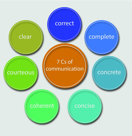
As a (primarily) visual media, maps can be an effective means of communicating spatial phenomenon and relationships in a concise and attractive manner. Therefore, in order to create an effective map we have to understand what it means to be an effective communicator. Having a clear idea of the map’s message is essential. Before you can decide how to say something you need to know what you want to say. What is your message? Who are you talking to? Use the 7 C’s of communication from open.edu to help frame and guide your internal monolog.
Maps are visual representations of often complex ideas and relationships. In contrast, the visual language syntax you can deploy to communicate those ideas are comparably sparse. In English speaking locals, our eyes are trained to read things from left to right and top to bottom, and this training loosely translates to visual interpretation. Therefore, you need to make conscious decisions on how you vary elements to guide the viewer through the map so that they interpret the map’s meaning in the way that you intend. A few of the most common elements are outlined below from https://splitcomplementary.blogspot.com/2012/08/new-and-improved-elements-and.html
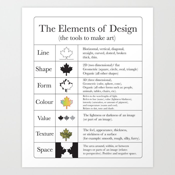
Likewise, these elements and their variations follow a few core Principles of design are the ways that you can use the elements of design. These are the ways that you will vary the elements in order to convey the message of your map.

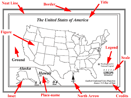
Most maps have many elements in common. While not all maps need to contain all the elements, they all require some. Map elements provide information essential to the interpretation of the map. All maps should be able to stand on their own, meaning that a viewer requires no additional information to understand the map than is available on the map itself. If someone found your map on the ground would they know what it meant?
some of the most critical elements needed for an effective, attractive, and honest map:
- Have an informative title. If your map shows all the counties in Texas that are predominately Democratic, don’t name it ‘Map of Texas’. Name it ‘Predominantly Democratic Texas Counties’!
- Your legend does not need to be titled ‘Legend’. If you are showing Democratic counties in blue and Republican counties in red, your legend might be named ‘Political party affiliation’. Often, the legend does not require a title at all. (This one is a biggie, although it might not be the most offensive thing you see in a day, a legend titled “Legend” will piss most cartographers and geographers off to no end)
- Make sure that the legend entries have informative names. Seeing ‘tx_counties_dem’ looks sloppy and may be confusing. Rename layers sensibly so that there is no ambiguity.
- Make full use of the space on the page. While you don’t want your map to be crowded, there is no reason to leave excessive white space around the map figure. Zooming in on the data of interest is often a good place to start.
- Experiment with different arrangements of your map elements. Not only should they fit well together, there is an information hierarchy that should be visually enforced. The title and the data you want to emphasize are the most important; they should stand out!
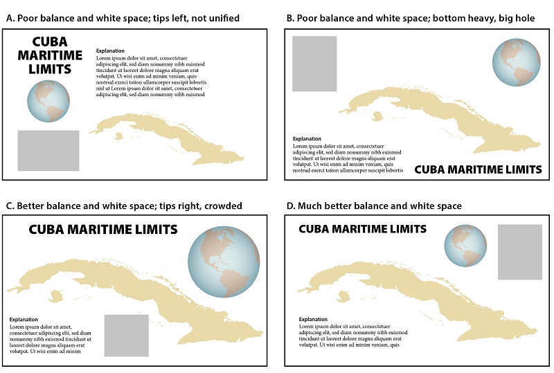
Figure 4 from https://gistbok.ucgis.org/bok-topics/visual-hierarchy-and-layout
- You can also change the page layout to be either landscape or portrait, and changing dimensions of an image is also an option. Depending on the shape of your area of interest, one may be more appropriate than the other.
- Make sure that your data is visible. If you are mapping points that represent all the schools in a Texas city, don’t make the points so large that you can’t make out their location. Likewise, don’t make them so small that they are difficult to see.
- Most scale bars are adjustable. You can change the number of subdivisions as well as the units. Make them simple and legible! They should be easy to use. Also, depending on the map projection (if it does not preserve distance) and the purpose of the map, a scale bar may not be needed.
- Likewise, a north arrow is not always needed. If the map projection does not preserve direction, a north arrow is inappropriate as north varies over the map.
- It is a good practice to include the source of your data on the map. The text should be small and unobtrusive but it is important that you be transparent and show that your message is trustworthy.
- CHECK YOUR SPELLING! Although it’s insert current year here, you’ll continually find yourself surprised by just how many different platforms don’t have even a basic form of spellcheck built in. When in doubt, write the text out in word and copy-paste it over.
- Before you export your map as an image, make sure to clear any selections you have map.
- As we move forward by learning about different kinds of maps there will be many more things to add to this list. However, these are basic principles that apply to every map that you will make.
These are examples of a basic GIS map. The primary purpose of this kind of map to is to relay information; however, maps must be readable to get their point across!
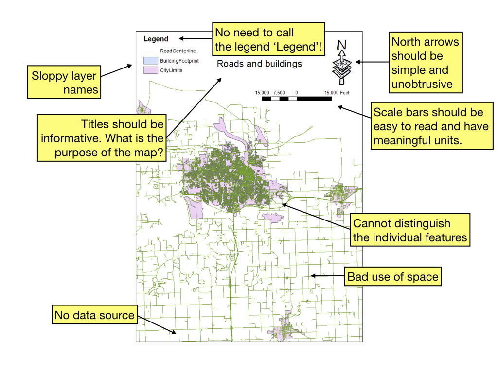 The standard map a student might submit the first time they’ve ever opened GIS. It’s classically bad but you’re learning so it’s forgiven. If this is what your final map for the class looks like, you’re in for a rude awakening :)
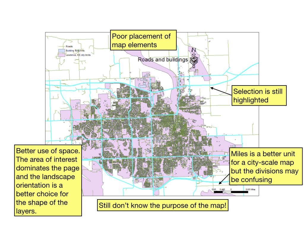 A bad (but better) map. Typically indicative of a map made in a rush simply because a simple screenshot was not appropriate. If this is what your final map for the class looks like, you’re in for a rude awakening :)
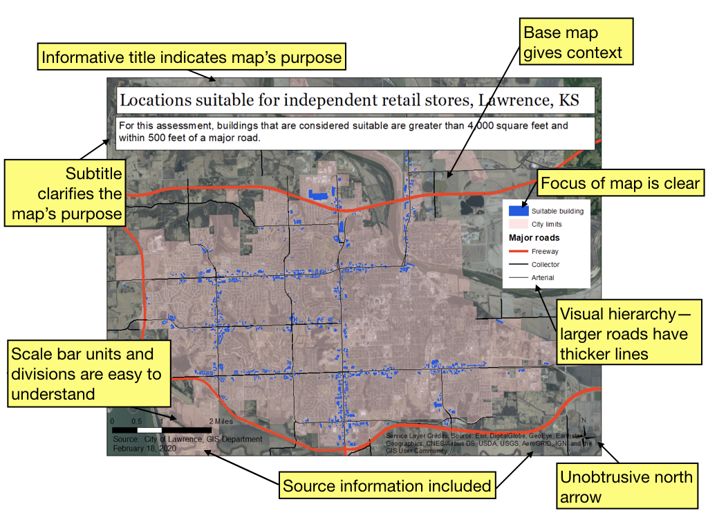 This map could certainly be improved but includes all the elements necessary to interpret it.
In no particular order here are some online resources that may be helpful in developing your cartographic skill. Just like public figures employ speach writers to ensure that their message resonates, mapmakers need to employ cartographic skills to ensure that their message is properly interpreted. A quality map is not only informative but also beautiful and inspiring!
A great companion page from ESRI for more info(https://www.esri.com/arcgis-blog/products/product/mapping/design-principles-for-cartography/)
Cartography and Visualization—UCGIS
When Maps Lie—City Lab
Good and Bad Maps—Penn State
ESRI Free Cartography Course (online)—April 22-June 3, 2020
Maps We Love—ESRI
Edward Tufte—A master of data visualization
https://unearthlabs.com/blog/making-maps-101/
Finally, a couple of my all-time favorite maps Although these are not the kind of informational maps that are usually map in a GIS, they certainly illustrate the possibilities of cartography!
Napolean’s March to Moscow, Charles Joseph Minard, 1869, https://www.edwardtufte.com/tufte/ Figure 9: Napolean’s March to Moscow, Charles Joseph Minard, 1869, https://www.edwardtufte.com/tufte/
The alluvial valley of the lower Mississippi River, Harold Fisk, 1944, http://www.radicalcartography.net/index.html?fisk Figure 10: The alluvial valley of the lower Mississippi River, Harold Fisk, 1944, http://www.radicalcartography.net/index.html?fisk